What is Abstraction?
Abstract photography is a type of photography that does not depict the physical world as we see it. It is created by using photographic equipment, processes or materials in a way that transforms the appearance of objects, perspective, movement and light. Abstract photography consists of images created using photography materials and equipment that don't have an immediate association with the physical world.
When i see abstract photographs I always notice either strange yet fascinating textures, a range of bright lively colours or dull black and white images, and a variety of shapes and dimension. I think that abstract photography is always very captivating and the images mostly always have a deeper meaning and create a certain type of feeling.
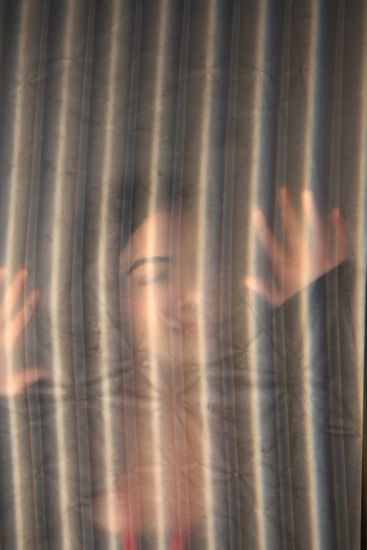
For example the first photo on the very left of my Pinterest board creates a feeling of abnormal, uncanny feeling. it does this because of the hands pressed against the glass suggesting the people are trying to get out and are in danger pleading for help, and the black and white makes it seem a bit spooky and all of the black outlines of people in the image emerge to look like some sort of monster.
When i see abstract photographs I always notice either strange yet fascinating textures, a range of bright lively colours or dull black and white images, and a variety of shapes and dimension. I think that abstract photography is always very captivating and the images mostly always have a deeper meaning and create a certain type of feeling.
For example the first photo on the very left of my Pinterest board creates a feeling of abnormal, uncanny feeling. it does this because of the hands pressed against the glass suggesting the people are trying to get out and are in danger pleading for help, and the black and white makes it seem a bit spooky and all of the black outlines of people in the image emerge to look like some sort of monster.

The white paper test
In this task I had to Make twenty four unique, beautiful photographs of one piece of white paper. I could not cut or tear the paper, but i could fold it, roll it, or crumple it. I shot on a white background in a studio with spotlights and soft light. I could use colour filters on the spotlights, to add more hues. I explored lighting and changed the lighting for each photograph.


Best Edits

|

|

WWW: I really like the last photo (the red one) as the light looks so luminous and the paper almost looks as if its floating, as its standing on its very corner. The contrast between the background and the light shining on the paper makes the paper look glowing, it spotlights the paper.
EBI: some of my photos are a bit blurry so I should have tries to use the focus lens a better on the camera to adjust the focus.
EBI: some of my photos are a bit blurry so I should have tries to use the focus lens a better on the camera to adjust the focus.
Brendan Austin

|
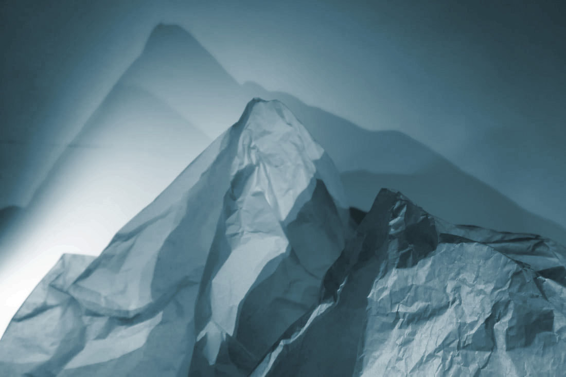
Brendan Austin creates imaginary landscapes out of crumpled pieces of paper. He calls them 'Paper Mountains'. Austin examines what we mean by nature and the way humans have impacted upon it. "The isolated desert city running on oil generators, the mars like landscapes of a volcanic environment and the mountains made from paper all attempt to start a conversation concerning the loss of meaning and reality." The resulting images appear both recognisable as landscapes but also suggest a sense of artifice. Humble materials are made to carry an important message. |
My photographs
Best edits
|
|
|
|
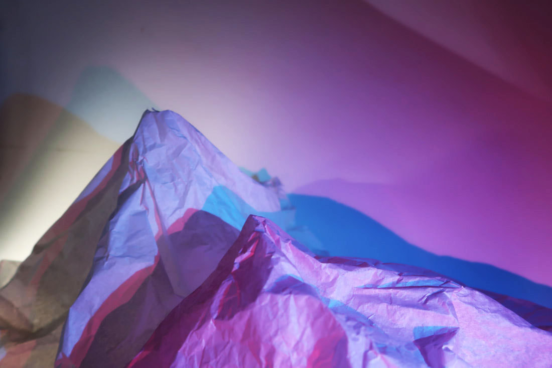
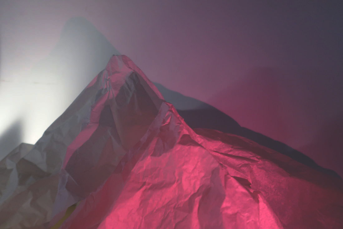
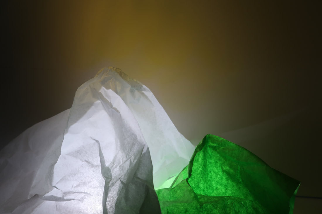
WWW: I like how I shaped the paper to create a mountain or hill. I also like how I used flashlights and different colours as it gives the photo more life and also the light and shadows contrast with each other creating more dimension and depth within the photo.
EBI: I could have tried to experiment with photos in black and white like Brendan Austin because when the photos are in B&W the contrast is even more extreme and the photographs look sleek and more mountain like.
EBI: I could have tried to experiment with photos in black and white like Brendan Austin because when the photos are in B&W the contrast is even more extreme and the photographs look sleek and more mountain like.
Tamara Lorenz
For this set of photographs I looked at the work of Tamar Lorenz, who was born in 1976 in Oberhausen. Her work mainly focuses on abstract photography. She got a diploma in 2000 at Dortmund university of applied sciences in visual communication. She completed her postgraduate studies in media art at the academy of media arts in collage between 2001 and 2004. In her most recent photographs she creates work that have the look of abstract paintings, by staggering backdrops and playing skilfully with different shade and light. in her photography, Lorenz virtually dissolves dimensional reality.
|
|

|
My photographs |
Best Edits |
|
WWW: I like how I used the paper that I was given to make unique and intriguing shapes. The colours are very lively and bright like in Tamara Lorenzs'
EBI: I could have tried to play more with the shapes made, by making them look distorted, unusual and therefore more abstract. |

|


Edward Weston
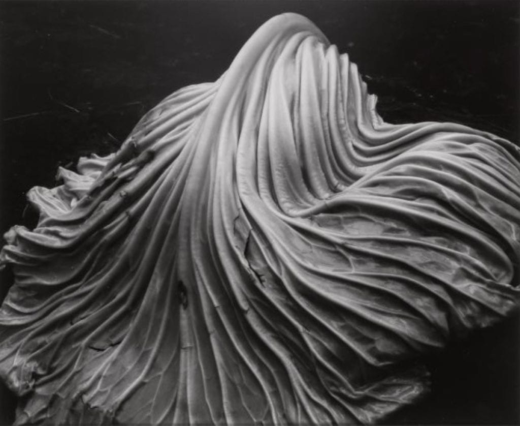
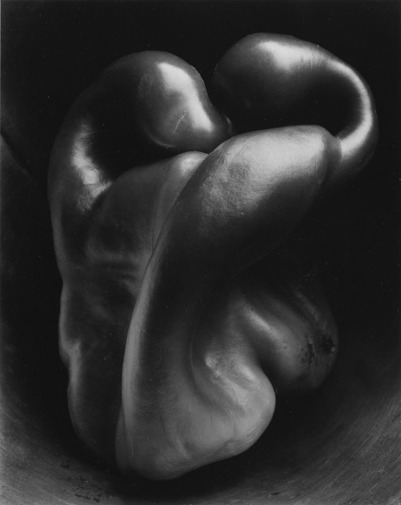
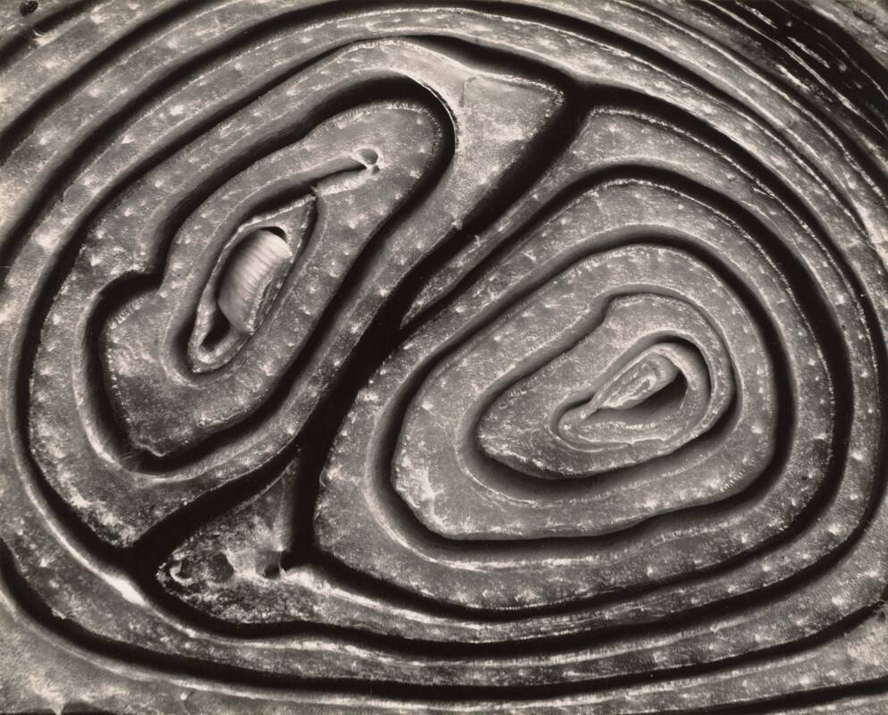
These are some of Edward Weston's photographs. Edward Weston creates photographs that transform his subjects into abstractions of shapes and patterns. Weston pioneered a modernist style characterized by the use of a large-format camera to create sharply focused and richly detailed black-and-white photographs. His images look deformed and make the objects seem like something else. He uses a low exposure and long shutterspeed to represent the true nature of his subjects.
|
|
|
Weston natural light
Weston studio light
Body and nature
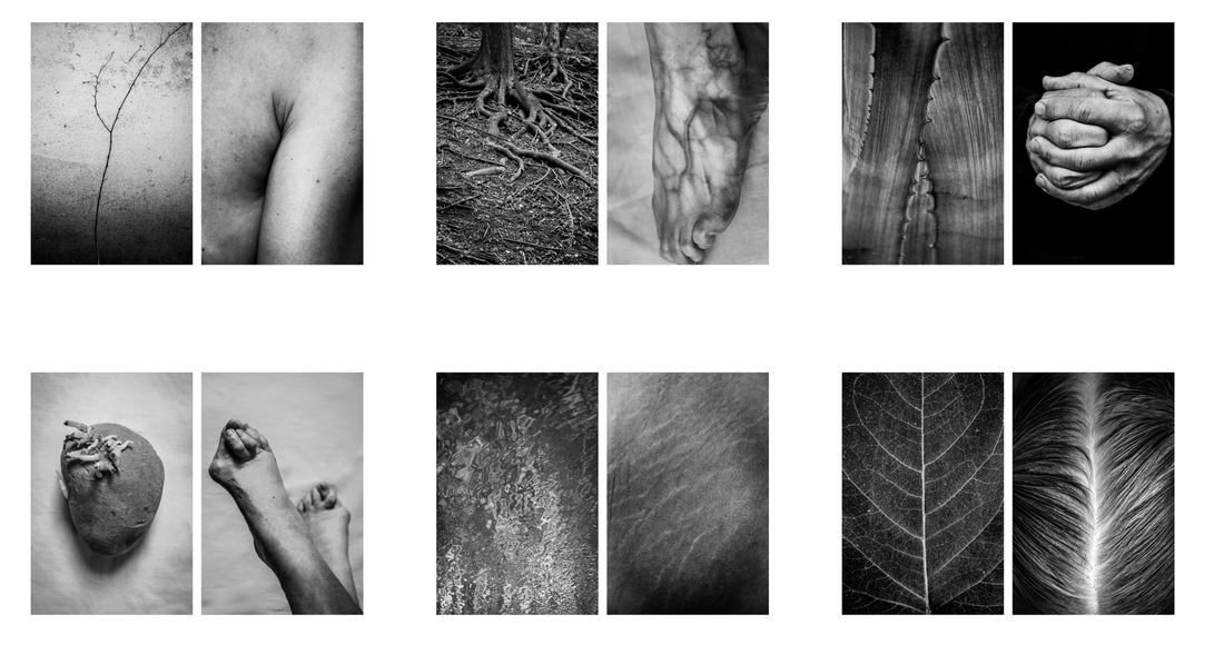
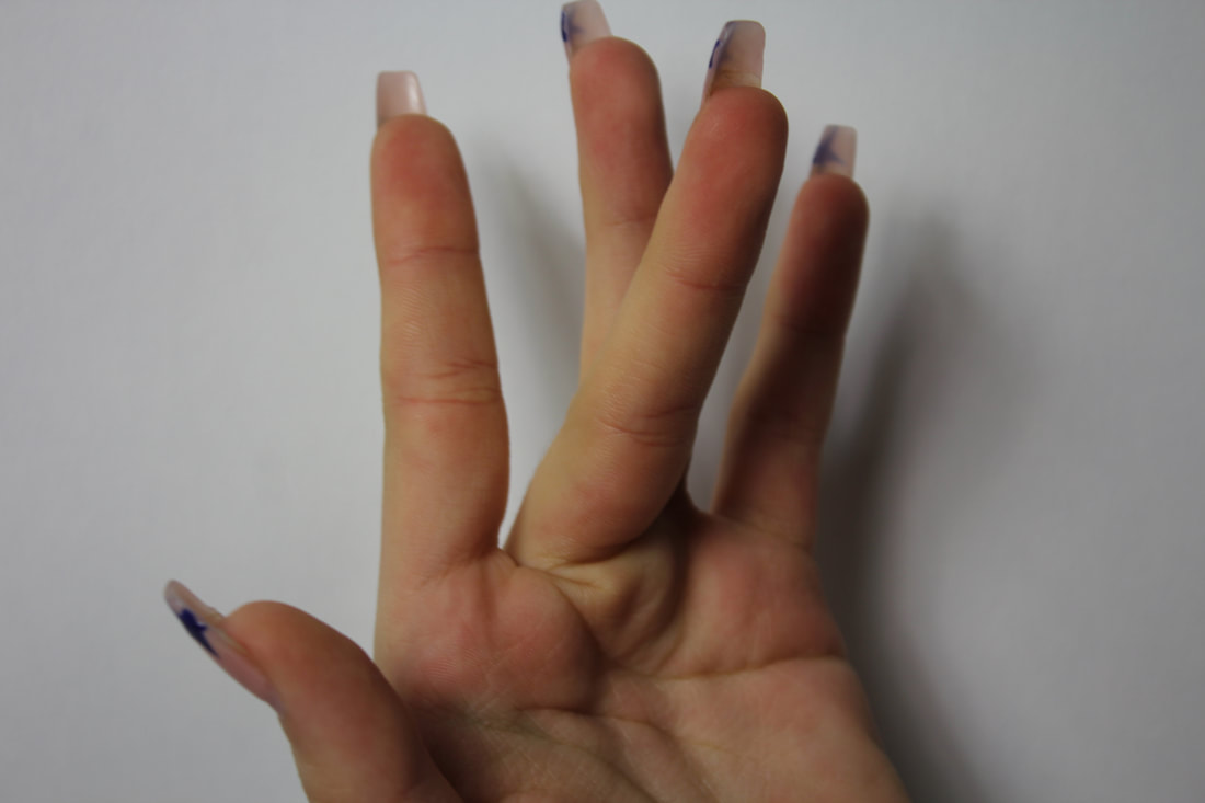
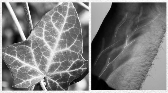
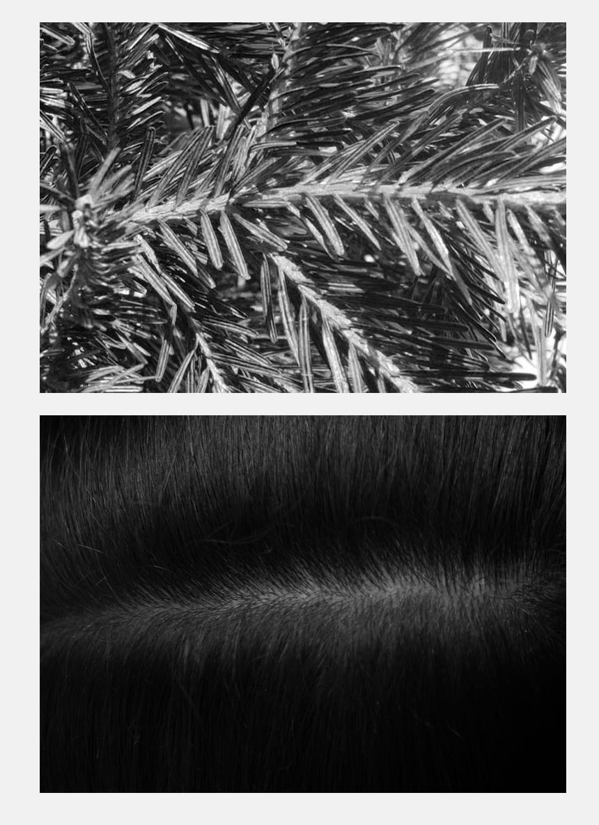
Alicja Brodowicz
Alicja's is a polish photographer who's main focus is on subjective documentary and fine art photography. She hunts for similarities between the human body and nature and then created diptychs of her findings.
she says-
"I photograph the human body – the microcosm,Its’ fragments: hair, scars, texture of skin, wrinkles. I am interested in individual particularities; I look for distinguishing features and irregularities. Imperfections are my favorites.”
“I photograph nature – the macrocosm,Surface of water, grass, tree bark, dry leaves. I combine the two images, looking for converging lines, textures, similarities in layout and analogies in composition between the microcosm and the macrocosm. I look for unity between the human body and the nature.”
Nature photographs


Body photographs


Best edits

|
|
WWW: For my final edits I turned my photographs into black and white, I did this because I love the way it looks in black and white, because the two shades contrast really well with each other and makes the photo look more detailed and sophisticated. It makes the photos look very detailed and better quality in my eyes. Also the body vs nature comparisons look better in black and white because it makes them have more similarities an therefore look more alike. I tried to imitate nature with different hand movements and gestures and thought about body parts which could emulate things we see outside I the environment.
EBI: I could have tried to make the hand gesture of the plant a little more similar as the leaves of the plant and the fingers don't match completely. The plant looks more open and spread out compared to the hand I photographed.
EBI: I could have tried to make the hand gesture of the plant a little more similar as the leaves of the plant and the fingers don't match completely. The plant looks more open and spread out compared to the hand I photographed.
Erwin Blumenfeld
Erwin Blumenfeld was Born in Berlin in 1897 and is regarded as one of the most influential photographers of the twentieth century. An developer ad experimenter , he produced an extensive body of work throughout his thirty-five year career including black and white, celebrity portraiture, portraits and nude, advertising campaigns and his renowned fashion photography. Blumenfeld got great inspiration from the Dadaists, incorporating experimental techniques like solarization, multiple exposures, and photomontage into his darkroom practice.
His photos all have their own meaning and style, for example his piece of work named "Vogue Paris, Eiffel Tower", shot in May 1939, is Erwin Blumenfeld's most famous fashion photograph. After moving to New York in 1941 to escape the Nazis, Erwin Blumenfeld contributed extensively, and for decades, to an international array of Condé Nast publications including Vogue and Harper's Bazaar. This photo captures the women's beauty and femininity, Erwin always tried to express the women's charm and attractiveness in his photos because as he said in a documentary he "loves women".
In the 30 century when the photo is taken women had the vote, education and divorce reforms and at least the right to be lawyers and MPs. Skirts got shorter and so did hair, women smoked cigarette. So this photo imitates the little bit more of freedom they fought for and received in this period. you can see in the photo she seems free and happy, she's on top of the world looking down at everyone and has the most amount of authority in this photo. Even though women had more freedom there still wasn't equality between men and women and maybe Erwin is trying to illustrate this from the way she is separated from the rest of society, she's trying to escape to a peaceful non worry place.
In the photo named "Somerset house" there is so much colour yet the photo is so simplistic. Erwin Blumenfeld says in his documentary that he's "not afraid of blank space" we see this in the photograph since around the women there is nothing going on. The women has colour paper cloths in her hand and infant of her, they are very vividly and brightly coloured to give more life to the photo. The hat gives and the hair all tightly back gives the women a very slick, smart look. The red lipstick gives the women a sexy look as the colour red suggests passion, love, and sexuality.
|
Vogue Paris, Eiffel Tower

|
Erwin Blumenfeld at Somerset House-
June 1st 2013 
|
Response 1
Erwin Blumenfeld
|

|
For this set of photographs I was instructed to take similar photos to these by Erwin as they are very intriguing, unique and challenging. These photos taken by Erwin Blumenfeld distort the face and play with different reflections, sections of the face, repetition and manipulation of the mind. The mirrors and different pieces of textured glass which he uses in these photos create a strange fascinating look for the photographs.To successfully imitate these photos I used some of the same equipment, such as glass mirror and windows but I also played with using plastic pieces and coloured glass.
|
My photographs
Best Edits

|

|
WWW: I like how my photos are very similar to the artists as I tried to get pieces of glass which gave the same effect and illusion for the photograph.
EBI: I think to make this photo better I could have used some red lipstick on the models because this is what Erwin Blumenfeld does and I think it really adds a pop of colour to the photograph and makes the models look more elegant, feminine and passionate as this is what the colour red associates with. I feel like it would have made the photo look more alive and given an edgy look to it. |
Response 2
Bill Jacobson
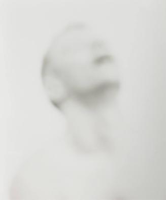
Bill Jacobson was born in 1955 in Norwich, Connecticut and he is widely known for his out of focus photographs of both the figure and the landscape. He began taking his unclear rather foggy photographs in 1989. These early works, titled Interim Portraits, feature shadowy, pale figures that evoke the loss experienced by many during the height of the AIDS epidemic.
His photos look quite out of the ordinary and surreal, the models in the photos are completely blurred. He completes this effect by using an object in between the camera and model so that the photo looks unfocused, pasty and a bit textured. I feel like the meaning behind this photo could be that the model doesn't know their identity and their hiding themselves away from reality. |

|
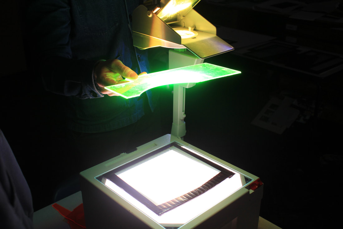
My set up

|
|
For this set up we had a projector, white background and a glass panel placed infant of the chair where the model sat. We used torches to shine colour lights on the glass and model and used coloured and patterned glass infant of the projector light as you can see on the second video. This was so we could experiment with all different type of textures and colours within the photo.
|
My photographs
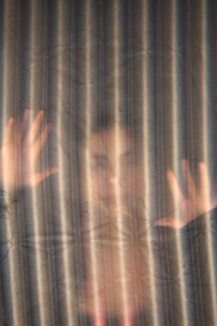
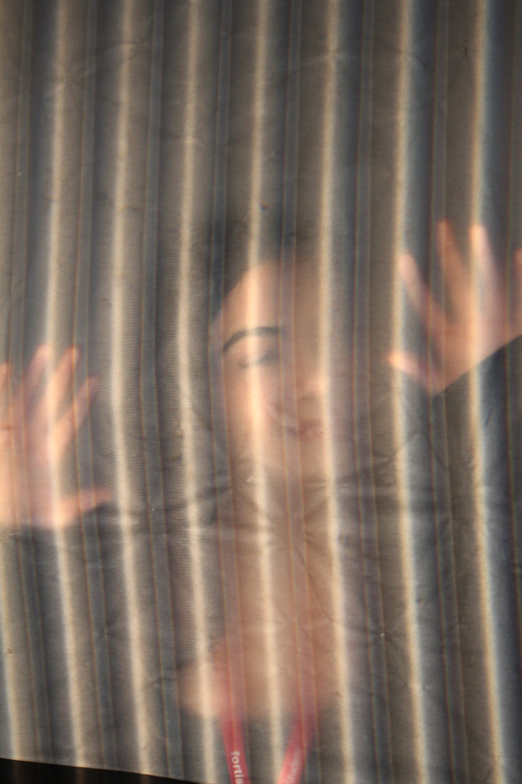
In my set of photos I tried to create the same effect of having a blurry look, however I developed some a little by adding a pop of colours coming from different directions and using different angles to make the lights hit different parts of the face creating shadows and highlights


Best Edits

|

|
|
WWW: I like how I used different materials to get different textures for the photographs. For example for the first best edit I used parchment paper which gave the photo a blurred matte look, like the photographs that Bill Jacobson creates. Then for the next best edit I used a piece of striped glass under the projector so it created glowing lines within the photo, I also used two pieces of coloured glass (blue and red) and used the phone flash to shine the colour onto each side of the face. This elevated the photo making it more intriguing and complex. Finally, for the last best edit I used a piece of plastic, this was different compared to the glass and parchment paper because it gave a completely different style. it produced a glossy smooth look. Also when editing I increased the exposure to extenuate the highlights of the photograph which resulted in the photo looking more shiny and fascinating.
EBI: I could have taken more images with the parchment paper and used lights for those images as well.
EBI: I could have taken more images with the parchment paper and used lights for those images as well.
Johnny Kerr
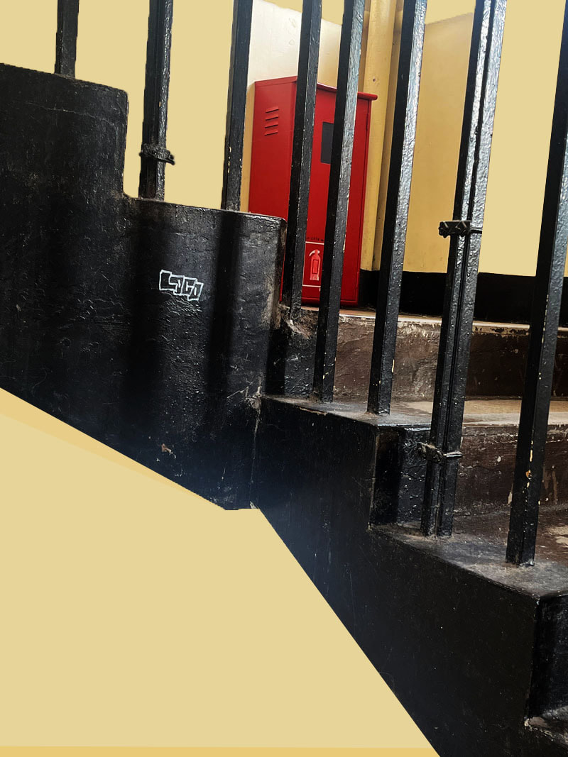
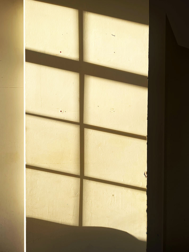
Johnny Kerr's first passion was soccer, however now he is known for being an American artist and art educator, his best known sets of photographs is his abstract photographic arrays that reveal the colourful poetry hidden amid a seemingly mundane Arizona metropolis. He is self-taught in the craft of photography, cites his lifelong study of art, his graphic design experience, and his appreciation for minimalism as having the largest influences on his work. Johnny’s imagery often explores the abstract qualities of his subjects, placing them, to varying degrees, outside of their literal context. His use of space reflects his affinity for quietude, while his continued evolution of style and subject matter represent an authentic pursuit of curiosity.
His photographs look very non realistic and conceptual, the shapes look very linear and ideal as the lines are all extremely sharp, precise and clear within the photos. The colour are very vibrant and contrasted with each other
His photographs look very non realistic and conceptual, the shapes look very linear and ideal as the lines are all extremely sharp, precise and clear within the photos. The colour are very vibrant and contrasted with each other
|
|
My photographs
|
|
WWW: i like the different shapes i captured around the school as they all look very abstract. I also really like the colours in some of the photos as they are very vibrant looking. Also some of the objects in the photos really pop in the image as the colours are very lively and bold so it stand out in the photograph EBI: I could have tried to capture shadows in more of the photos. because I really love the photograph where the light from the window hits the wall and creates a sharp, precise shadow that looks a bit distorted and unique looking. I could have tried to capture more of these shadows, and shadows from different objects. |
Best Edits

|

|


|
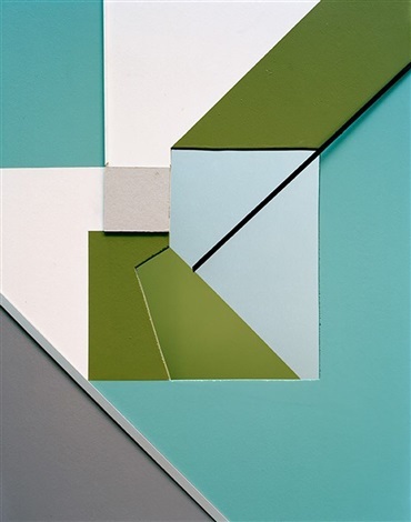
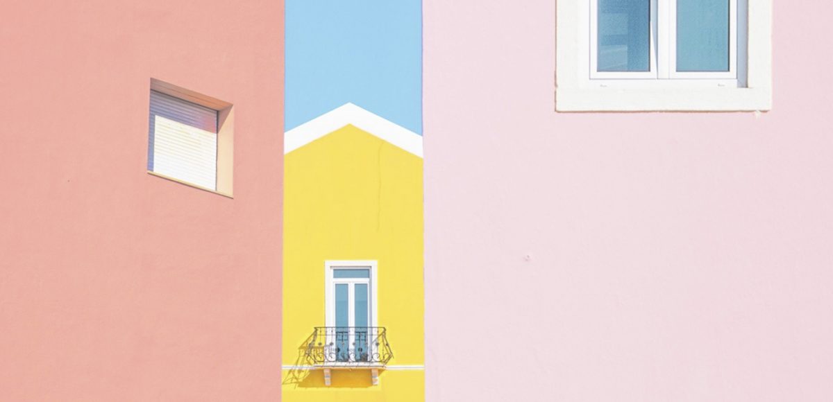
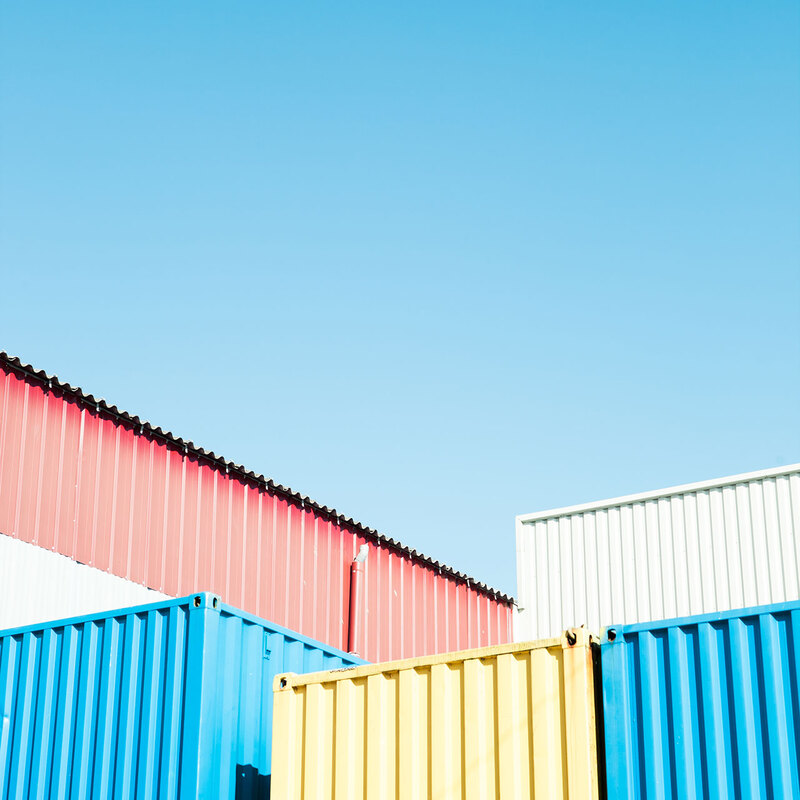
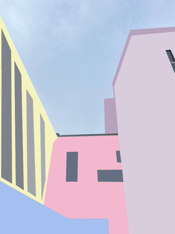
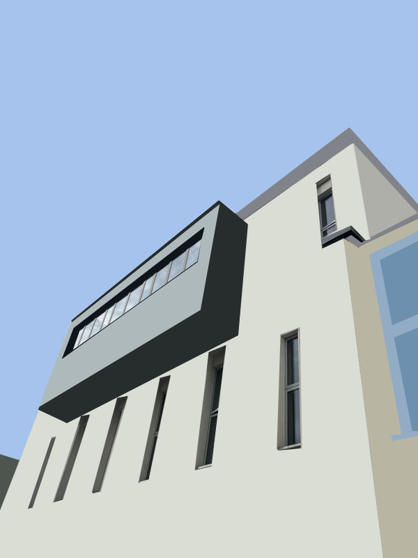
Matthieu Venot
Matthieu Venot is a passionate artist in terms of creativeness, who was born in France in 1979, he draws and has since his childhood, learns guitar and musical composition. He began photography at the age of 35, when he was a sound engineer in the musical world. To this day he is known for the very personal aesthetic of his photographs. In just 5 years, it has acquired worldwide notoriety and an ever growing internet community of over 120,000 followers.
He solely focuses on abstarct architectual photography; Abstract architectural photography is about finding the most interesting elements of the exterior or interior of a building or structure and capturing them in unique ways. This type of architecture photography focuses on shape, forms, textures, colour, light and perspective. Working with many media such as photography, painting, sound, drawing, he likes to arrange spaces and, during exhibitions, immerse visitors in his unique universe. Theses Visuals are graphic, refined and borrowed from poetry.
Matthieu Venot has exhibited around the world in places such as Miami, Hong Kong, the Netherlands, Switzerland, Belgium and France.
|
|
My photographs


Best Edits
|
|
WWW: I really like how I edited these because it looks very neat, intriguing and abstract all at the same time. For the first two best edits I used pastel colours in photoshop to give the same effect as Matthieu Venot, the pastel colours look very appealing and fun, they look very similar to the photographers work and give the same aesthetic feeling and look as his work. The two last best edits also look very abstract, I used the same colours as what the buildings were in photoshop by selecting the colour of the part I was filling in so that it looked more realistic but still very conceptional at the same time. I kept the windows unfilled to give more of a more natural edit that still looks different and more surreal from its original form.
EBI: I really like how the pastel edits came out because it gives the photo a childish innocent look and I like the unfilled/unedited windows from the last two best edits; So what I could've done is experimented with the pastel colour and the unedited windows because they were my two favourite elements if the photos. it would give off a innocent, fun bubbly yet somewhat realistic look and would looked very appealing to look at.
EBI: I really like how the pastel edits came out because it gives the photo a childish innocent look and I like the unfilled/unedited windows from the last two best edits; So what I could've done is experimented with the pastel colour and the unedited windows because they were my two favourite elements if the photos. it would give off a innocent, fun bubbly yet somewhat realistic look and would looked very appealing to look at.
Moma exhibition
For homework we were asked to go to an exhibition in the holiday an since I was in New York near one of the best museums of modern art in the world I thought I would go and have a look at it and take in all of the amazing pieces and creations. I thought all of the 3D statues and shapes placed at different open parts of the room all looked very abstract and surreal. They look quite strange but very fascinating at the same time; The paintings and drawing hung up on the ceiling all had descriptions of the meanings and idea behind the work which helped me get a better idea of what the piece of work was trying to say and made me look at it deeply and pick up little details.

|
The Museum of Modern Art opened in November 1929 with its first exhibition, Cézanne, Gauguin, Seurat, Van Gogh. Since that time the Museum has presented more than 3,500 exhibitions. MoMA's collection contains almost 200,000 works from around the world spanning the last 150 years. The collection includes an ever-expanding range of visual expression, including painting, sculpture, printmaking, drawing, photography, architecture, design, film, and media and performance art. Master printer and publisher Jacob Samuel has brought etchings —prints created by transferring ink from a metal plate to paper—into the 21st century through collaborations with more than 60 contemporary artists. Some of the artists had never made prints; others had hated the process. But with Samuel’s guidance, they all adapted this historic technique to their artistic visions. Encompassing abstraction, figuration, and a diverse range of visual styles and approaches, the works in New Ground reflect Samuel’s success in making the tradition of old master printmaking relevant and inspiring today.
Vincent van Gogh's "The Starry Night" is arguably one of the most famous paintings at MoMA. This iconic masterpiece captures the artist's unique style and emotional intensity. The swirling brushwork and vibrant colours depict a nocturnal landscape with a tumultuous sky filled with stars. |
My photographs
These are some of the pictures I took of the art I saw when I was at the exhibition


Homework
Brad Solan
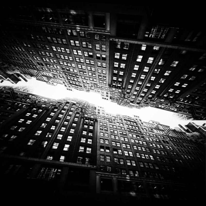
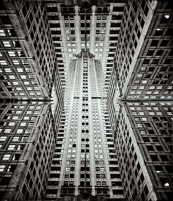
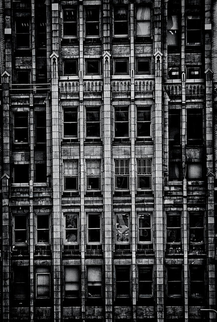
Brad Solan is an Oregon-based photographer Brad Sloan fell in love with Manhattan’s urbanscape on a 3-day trip to New York City and managed to capture some spectacular shots of the Big Apple in that short amount of time. Sloan, who modestly refers to photography as his hobby, turns oft-photographed streets and landmarks into incredible images of architecture that seem like surreal, continuous skylines straight out of the film Inception. The angular, reflective, and soaring architecture provides a sense of the city, but Sloan’s artistic renderings present something beyond the norm. The photographer’s cleverly manipulated, monochromatic images translate both the enormity of the structures as well as an inexplicably eye-catching geometric pattern. The skyscrapers are both mirror images of one another and seemingly unique entities separated by a thin stream of skylight. In some cases, there isn’t even a separation, but rather a continuous path of buildings populating the frame
For this homework piece I focused on buildings and the structure of them, I will be mirroring all of the original photographs and experimenting with the different reflections the images can make. its very interesting and I can explore the different patterns and shapes the buildings provide, I will be keeping all of my images black and white so you can focus on all of the details and contrast of the light and dark colours on the buildings
For this homework piece I focused on buildings and the structure of them, I will be mirroring all of the original photographs and experimenting with the different reflections the images can make. its very interesting and I can explore the different patterns and shapes the buildings provide, I will be keeping all of my images black and white so you can focus on all of the details and contrast of the light and dark colours on the buildings
|
|
|
My photographs
|
For my photographs I captured different types of buildings in New York, such as blocky looking brick buildings, glass buildings and structured buildings made out of other material. They all look very massive and fascinating. The angular, reflective, and soaring architecture provides a sense of the city, but Sloan’s artistic renderings present something beyond the norm. For my best edits which are presented after my unedited photographs I will be mirroring all of the original photographs and experimenting with the different reflections the images can make. I can experiment with the different patterns and shapes the buildings provide, I will be turning all of my images black and white so you can focus on all of the details and contrast of the light and dark colours on the buildings |
|
|
|
|
Best edits
To mirror all of my images:
I first opened a blank page on photoshop, white A4 page
Then, I copy and pasted the photo I wanted to use for my best edit 4 times, so I had 4 images of the same photograph on the screen
I then went to edits at the top left corner of my computer and I went onto transform
On this it goes you 5 options to choose from ( Rotate 180 degrees, Rotate 90 degrees clockwise, Rotate 90 degrees counter clockwise, Flip horizontal, Flip vertical)
I experimented with the different options so that I could see the most impressive way it could be flipped and mirrored.
When I got what I wanted I flattened the image by pressing onto layer> flatten image
Some of my photographs I only used two of the same image and flipped it horizontally, as this gives a more simple klick and for some of the images it fit the photograph I used better, and looked more interring and fascinating.

|

|


|

|

|

|

|
WWW: I really like the way I did all in Black and White as well as just normal, because some of the photographs I prefer in black and hwote as it makes every detail really sad out because of the strong contrast. I love the one on the bottom second most as the photo is extremely well focused so every detail is visible and so precise. I love the tone of black and white as it's quite cool toned and not too dark yet still dark enough to see the contrast in tones. The building looks almost as if it's coming out at you, it looks almost 3D from the way it's mirrored.
EBI: some of my photos aren't extremely focused. They were before the editing but when putting 4 copies of the photo and reducing the size of each copy, and then when finishing editing and getting it back to its original size the focus got a bit blurry and the photo looks more pixilated compared to when I first started editing the photo. I should have tried to find a way to fix this or used photos which were more concentrated so that the final result came out better.
EBI: some of my photos aren't extremely focused. They were before the editing but when putting 4 copies of the photo and reducing the size of each copy, and then when finishing editing and getting it back to its original size the focus got a bit blurry and the photo looks more pixilated compared to when I first started editing the photo. I should have tried to find a way to fix this or used photos which were more concentrated so that the final result came out better.
Homework
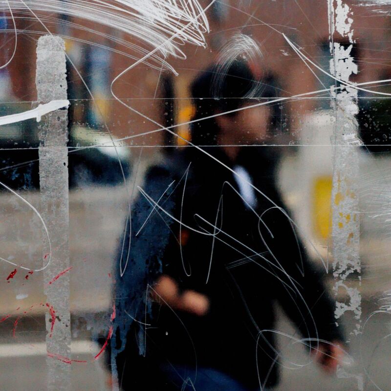
Stephen Calcutt
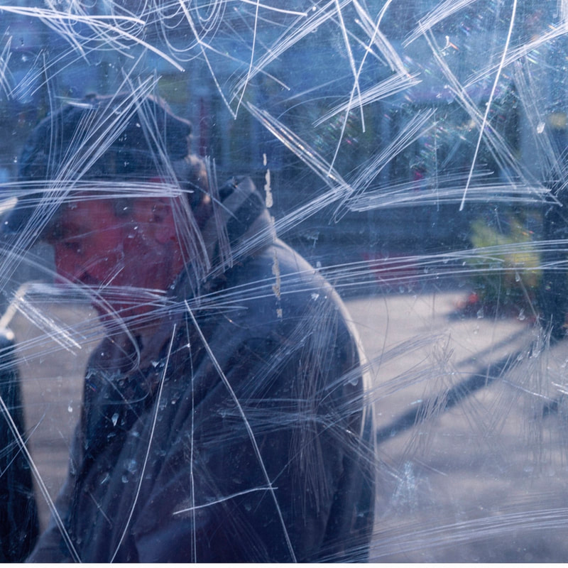
Mini Bio. Stephen Calcutt was born on May 6, 1952 in England. Stephens unique form of street photography is a consequence of frequenting bus stops and shelters around the City of Birmingham.
"I have an MA in Visual Communication,I'm a multimedia artist whose unique work is rooted in street photography. I create wall art, installation , photography, film, music, sound and fashion ."
Stephen uses the graffiti etched windows as a lens. he merges the graffiti and the view beyond, focusing his camera on the etched lines putting the view beyond out of focus. The graffiti and view to merge into a single plane. He creates a new perspective that retains and emphasises the energy of the graffiti. Its swirls, zigzags, lines and curves. The graffiti etched and scrawled in the bus stop windows seem to be expressions of frustration, anger, love or hate. However, unlike its cousin the more colourful graffiti that is emblazoned across the walls of buildings and is often seen as art, it is very mundane. He feels a windows full potential he uses the clear barrier between himself and the elements compromised when the view beyond is distorted, obscured and blurred by the marks, writing and scratches.
|
|
|
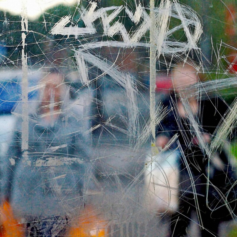
My photographs
In my photographs I didn't capture as many scratches because there weren't many scratched or messy looking glass on the bus stops, shops etc. but I still captured some cracks and writing on the glass, and more focused on getting peoples faces behind the glass and reflections of objects infant of the glass which reflected onto the clear glass in the photo giving it more life and making it more interesting.


Best Edits

|

|

|
WWW: I really like the first best edit as the cracks look very captivating and contrast with the rest of the photo as it looks quite brightly exposed and stands out in the photo. I also like where the model is placed in the photo as the crack is in the middle of her face which gives the photo a proportional neat look which contrasts with the messy look of the crack. the second photo captures the tree as well as the person behind the glass which I really like, their is a bit of blue projected onto her face from a blue light which gives the colour a bit of a cool toned calm lighting which is quite nice. in the third photo I captured people in their workplace, in a bagel shop, it shows their work environment and the lighting looks quite warm and friendly
EBI: In the last photograph I could have tried photograph from a better angle (more from the left) so I got a bit more of their faces, so it gave more of a backstory of how they feel working in the shop and so the photo was a bit more interesting and the audience could have interpreted it in their own way.
EBI: In the last photograph I could have tried photograph from a better angle (more from the left) so I got a bit more of their faces, so it gave more of a backstory of how they feel working in the shop and so the photo was a bit more interesting and the audience could have interpreted it in their own way.
Strand 1
Pinterest inspiration board
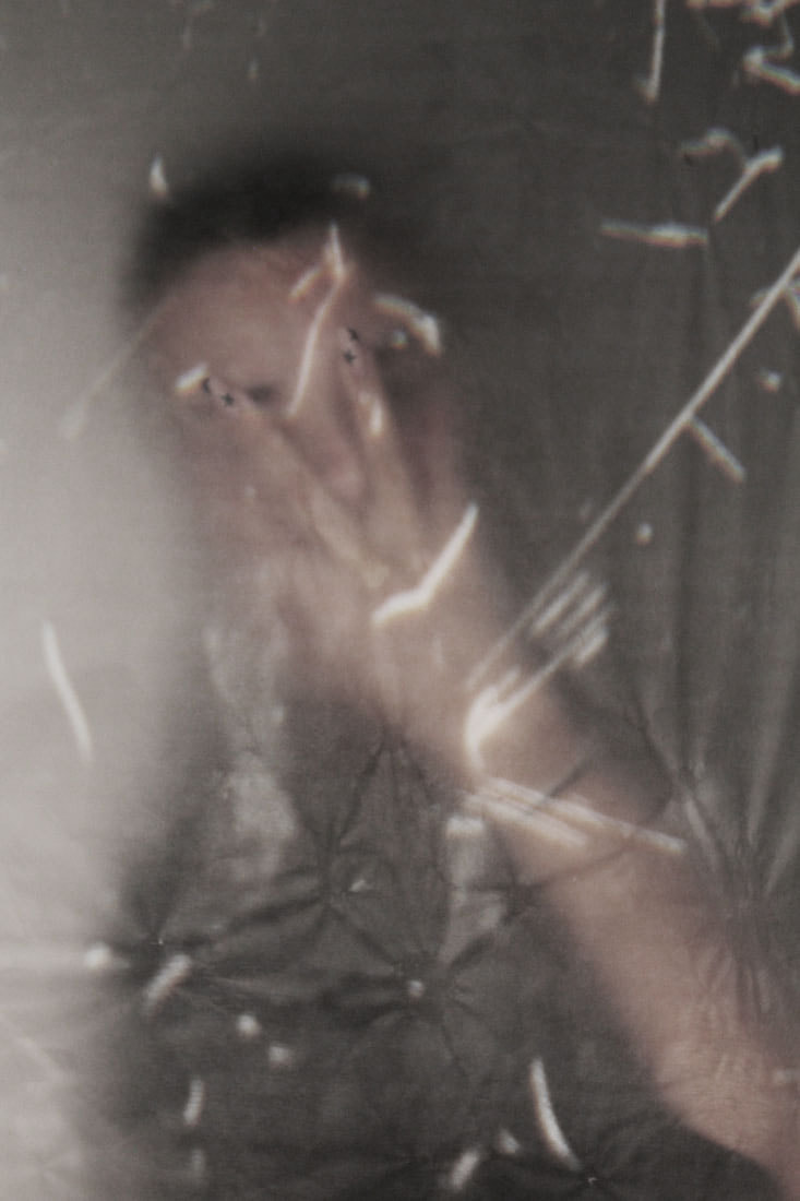
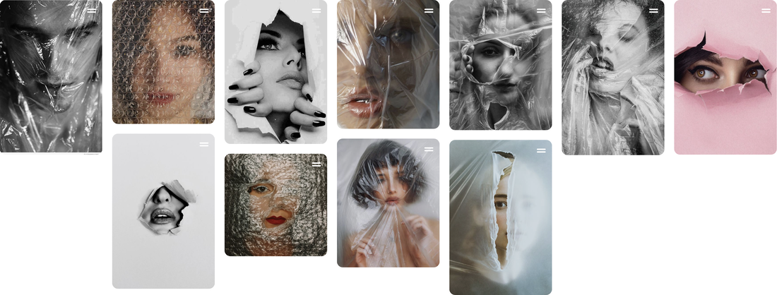
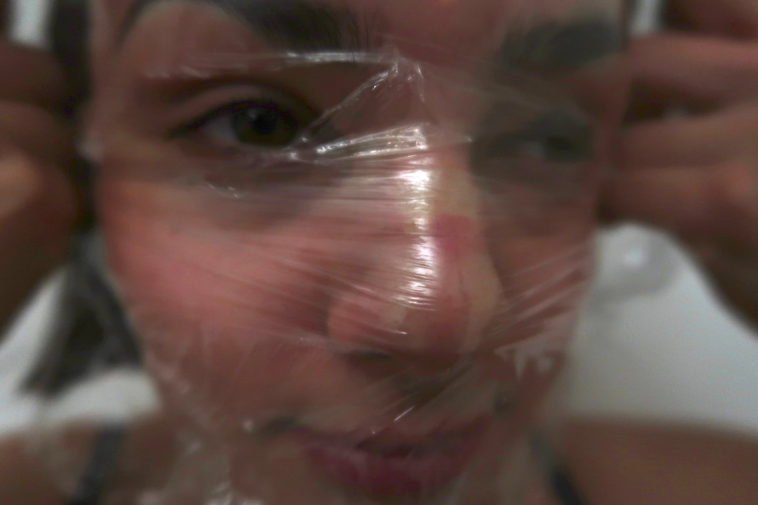
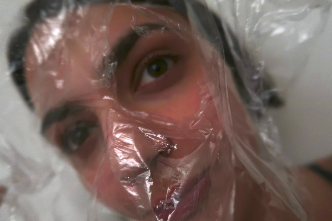
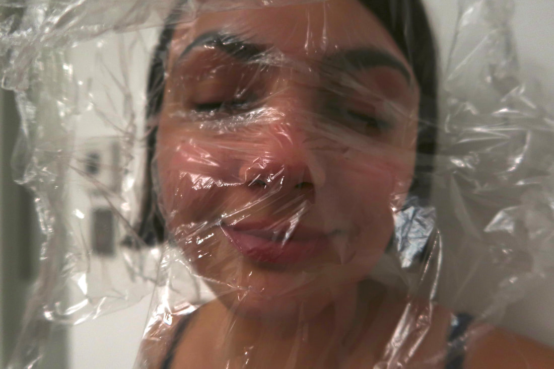
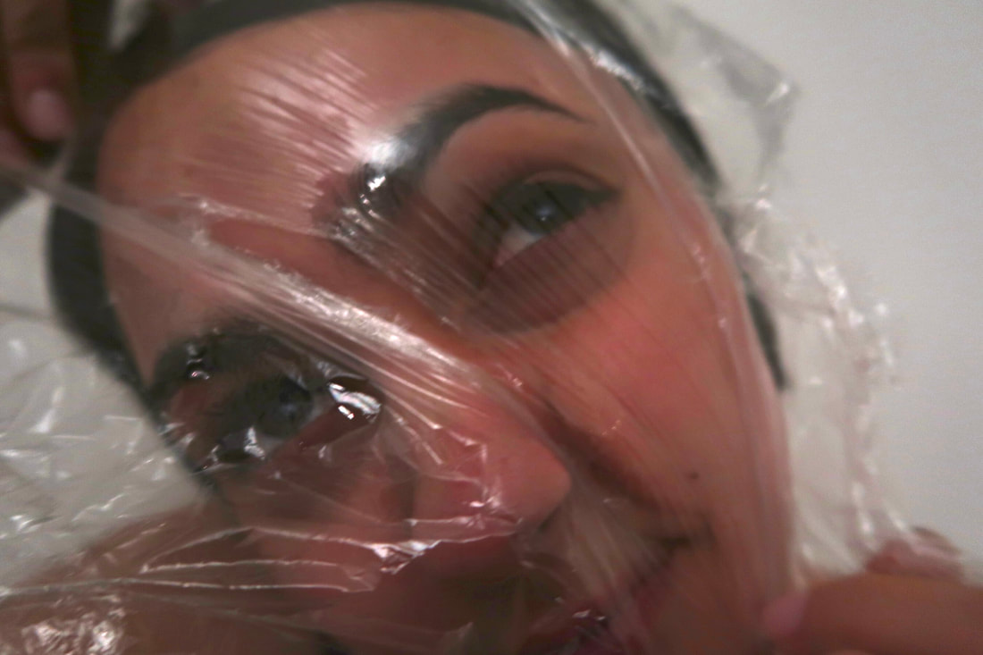
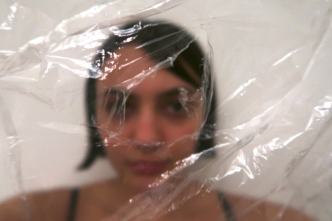
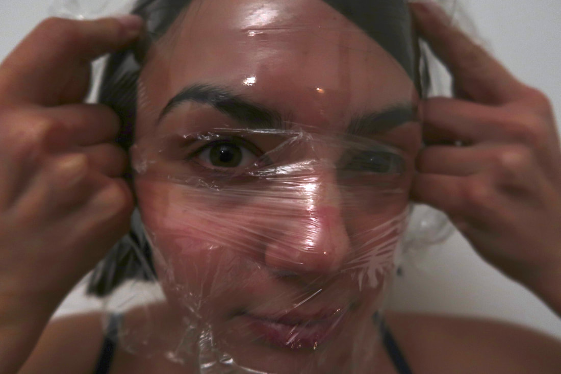
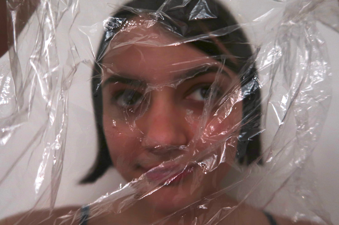
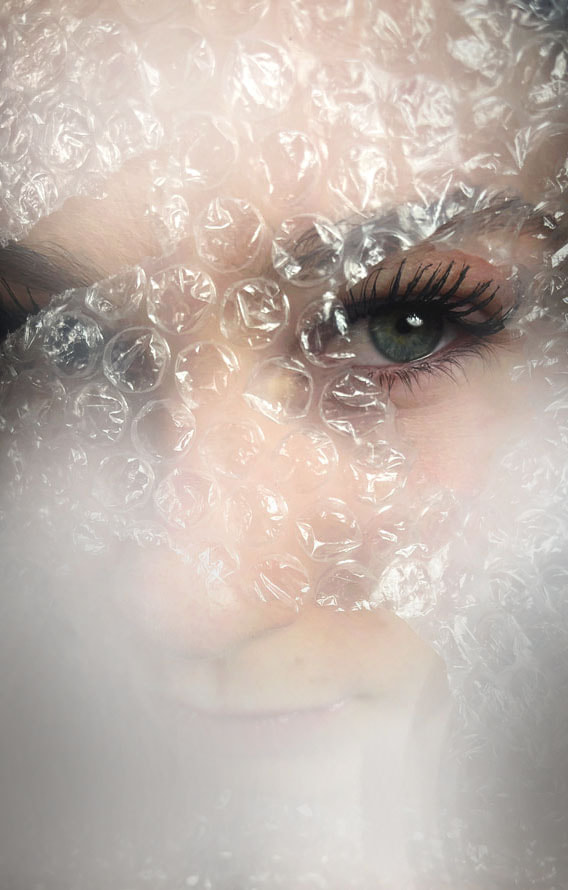
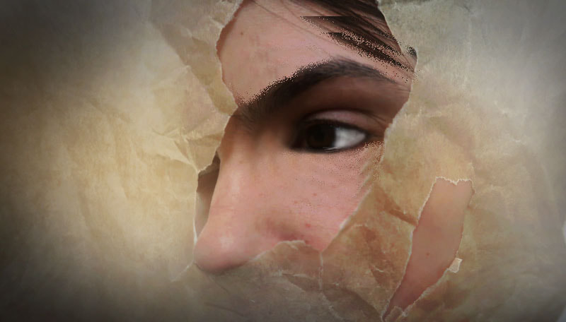
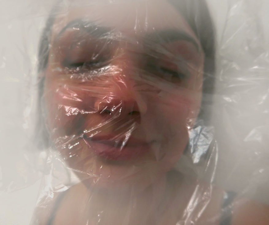
I loved all of these images and wanted to create something similar as they inspired me and I felt like they looked quite interesting and unique. I like the parchment paper ones as I like the way that only certain parts of the face are shown peeking out of the ripped paper and the rest is hidden. I feel like it suggests hiding from reality or hiding insecurities. The ripped paper creates dimension within the photo as some parts are building out and ported towards the camera, some do the opposite and some of the persons features in the photo are either coming out from the paper or are hidden by the paper, this all creates depth within the photo. I also really liked the plastic photographs as it looks very fascinating within th photo. it looks very textured, as in some of the photos it looks shiny or glossy and a bit sticky whereas in others it looks blurred, matt and rough. The holes in the parchment paper suggests that the models in the photo are gasping for air and it also creates different focuses in the photo, as in some of them the camera is focused on where the hole is t=rather than the material and in others its more focused on the rest of the face and different features. The bubble rap photos look very interesting as it creates a bumpy looking surface in the photo, it looks like bubbles infant of the persons face. it blurs the model face giving the photo quite a mysterious look and story behind the photo. I thought I would be able to experiment with the different textures, contrast and depth in my photographs so that's why I chose these images to inspire me with my work as they use these different methods and details.
My photographs
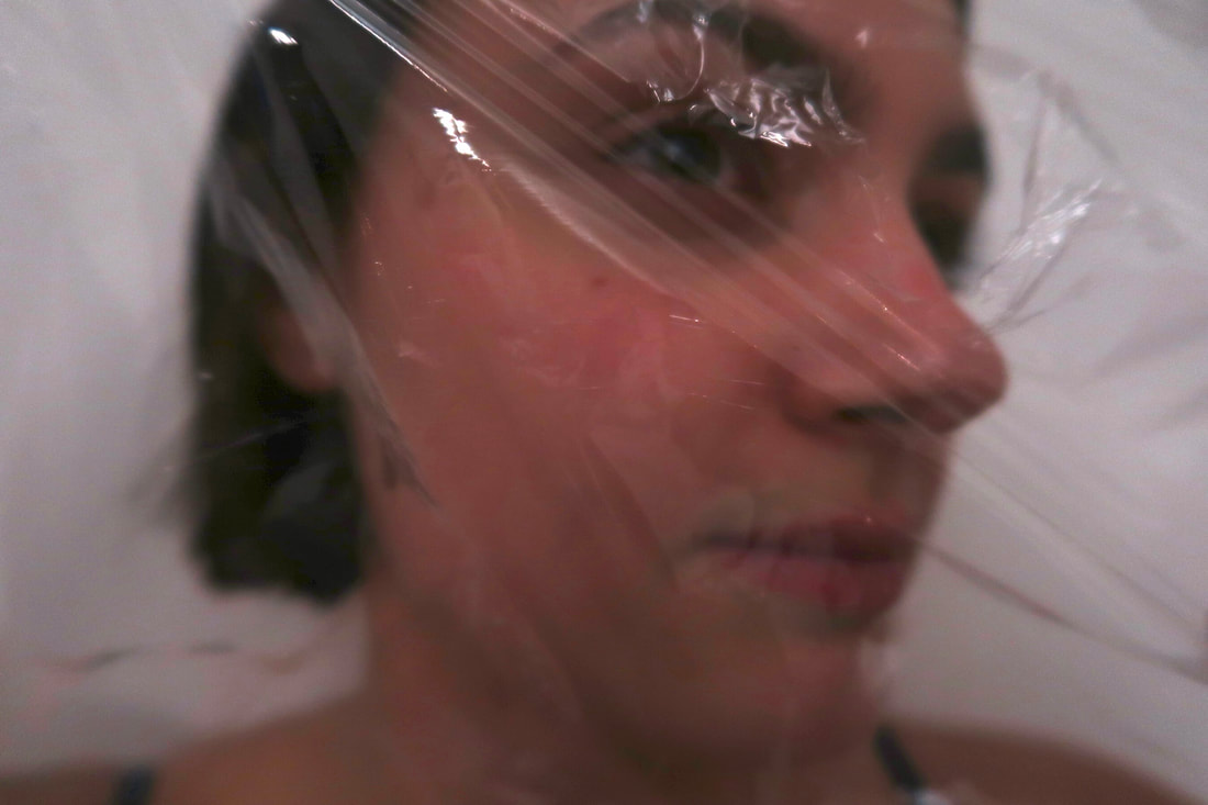
In my photographs I captured the three different elements with the three different materials: parchment paper, cling film and bubble rap. they each present a different texture and look. I took a series of photos with all three materials which different angles, different focuses, different facial expressions, some close ups and some shots from more far away.


|
|
|
|
|
|
WWW: I love all best edits as they look very unique and intriguing. The first one with the bubble rap looks very interesting as in half the photo the bubble wrap is very visible and gives quite a cool texture. The circular bubbles fit together in a hexagonal, interlocking pattern like a honeycomb. Then towards the bottom there's quite an opaque white colour which blends out from the bubble wrap, it gives quite a blurry look and makes the photo look frosty and foggy and gives it quite a mysterious look. In photoshop I increased the contrast so her eyes in the photo really stood out from the rest of the photograph and capture the audiences attention in the gap of the bubble wrap. it is very well focused as well as I used the standard rule of thumb which is to make the shutter speed equal to your focal length when hand-holding your camera. For example, if you are shooting with a 200mm lens then you want to keep your shutter speed at 1/200 sec or above to avoid any blur occurring from camera shake. I used a 100mm lens so my shutter speed was at 1/100 sec. I also used a small aperture of f/16 to get everything in focus. My ISO was on 100 as it was a sunny day outside and quite a lot of light was coming into the room so I needed a low ISO. All of these settings on my camera connected very well as they all link and none of them out balance each other, they were quite perfect.
For the 2 other best edits I used the same settings on my camera as they were shot on the same day. I really like the parchment paper one as I like how the models nose kind of peeps out of the parchment paper which give the holograph more dimension and depth as the other parts of her face are behind the parchment paper and the rest hidden. the parchment paper looks ripped and. a bit ruffled. In photoshop I edited some of her face to make it look like a painting and give it more of a mysterious and surreal look.
The last photo looks quite calming, peaceful yet somehow still a bit odd. the cling film gives the illusion that the model in the photo is trapped, yet compared tp the other photos the model looks happy and tranquil, the photograph looks quite peaceful and in the other two the model looks a bit angry or numb. I wanted to present different emotions within my photos to create different storylines and feelings. The cling film gives the photo a shiny, glossy look, it makes the photo look a bit steamy.
EBI: The last photo could have been a bit better focused, however I dint alter the focus with the focal point on the camera, as I wanted one of my photos to focus on one part of the photo rather than the whole photo. so in a way it works as the nose is focused and the rest isn't, however I feel like the nose could have been a bit more in focused.
Strand 2
Multiple exposure
Pinterest inspirations
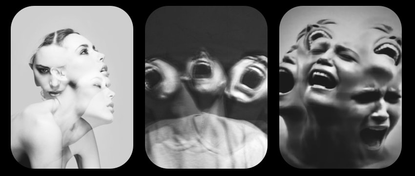
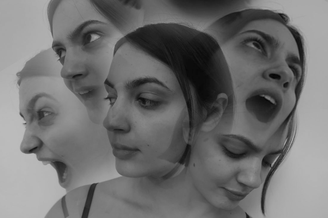
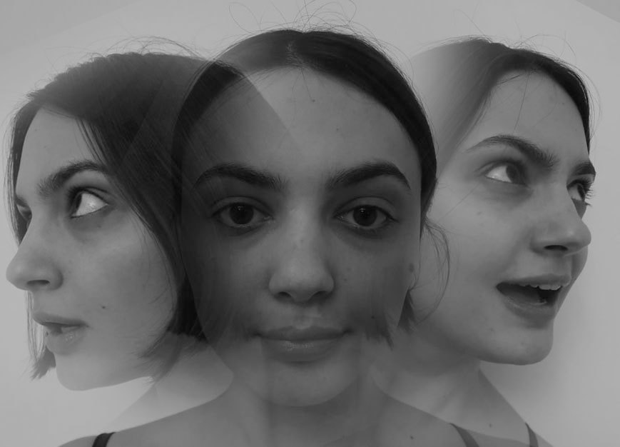
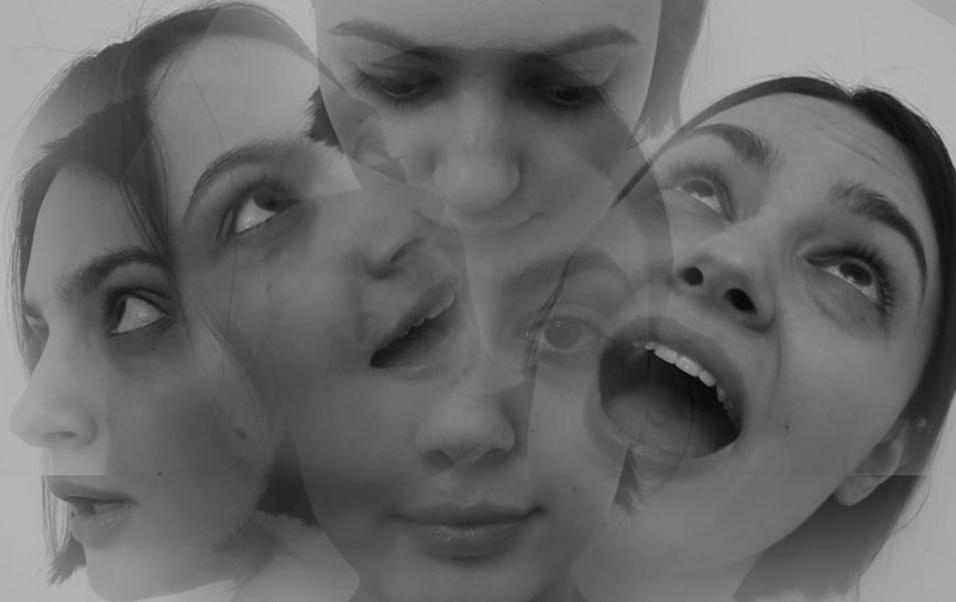
For my second strand I wanted to continue working on exposure as I think it's very abstract and interpretive. These image below all look very strange and a bit scary, the screams also makes the image look more dramatic and creates more of a stressful scary sensation.
My photographs
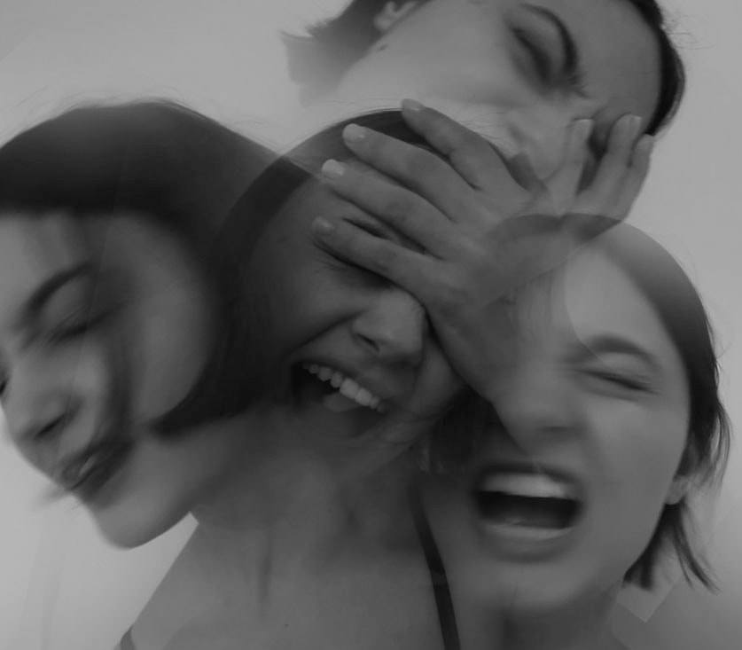
In this task I took plain photos of my model standing against a wall but with her face facing different directions and doing loads of facial expressions (mostly screaming like in the interest images). I got her to first look straight and then look round in a circle at different points in the room and I took some in focus and some with a higher shutter speed to be more blurry.
Best Edits
|
|
|
|
In photoshop I copy and pasted the photos I wanted onto the main image I was using for the middle of the image, Then I merged some together by blurring them by using the rubber tool and turning down the opacity so I was able to lightly blend them together rather than erase them too harshly making it look choppy or disjointed.
WWW: I like the top left image the most as it tells the best story, the model in the photo looks so distressed as she is screaming intensely, I like how the facial expressions are very clear and gives the backstory straight away and makes the photograph look more dramatic. I like how the head comes out from the main head in the middle for most of them as it makes it look more bewildering and uncanny as the heads are all coming out from the main head.
EBI: I feel like I could've edited the bodies below the heads way less and not rubbed them out as much as I did, because I could've made it look more joint to the photo in the middle, so it looked more like it was loads of heads all coming from one body. it does look like that in a way, however I feel like I could've achieved that even more.
Development 1
Pinterest board
For this first development I wanted to continue with double exposure which I presented in strand 2 as I thought there were more ways to develop, grow, improve and continue this idea. I feel like there was more options that linked and that I could expand on and explored. I also feel like my second strand could've been improved a lot so I wanted to build on and refine the idea that I already had and explore different photographers work and use my own creativity to make new captivating pieces. I like my first strand as well on distortion of the face through materials, however there weren't as many ways to develop that idea and I feel like I left it off on a good note and wanted to see how I could evolve the second strand more and make the images look even more abstract and distorted through editing, different techniques, movement and more.
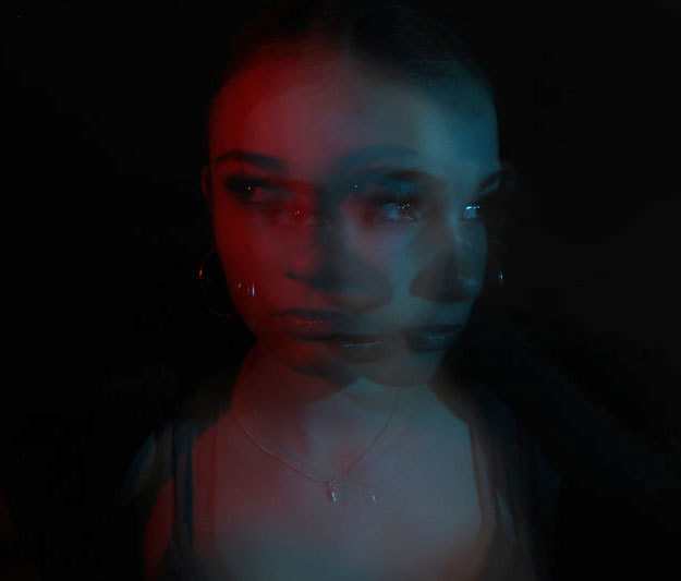
In the second strand when exploring multiple exposures my final edits were in black and white as I was creating quite a scary intense look and atmosphere. However I found these images on Pinterest and made a board, these images below are still using double exposure however they involve many colours and more of a positive vivid vibe. The colours really catches my eye, especially the pictures where it's one person with two different colours next to each other or overlapped with each other.
In the second strand when exploring multiple exposures my final edits were in black and white as I was creating quite a scary intense look and atmosphere. However I found these images on Pinterest and made a board, these images below are still using double exposure however they involve many colours and more of a positive vivid vibe. The colours really catches my eye, especially the pictures where it's one person with two different colours next to each other or overlapped with each other.

My photographs
I wanted to create this but use a camera and improve my skills with capturing double exposure on camera in one shot without having to edit it on photoshop. In strand 2 I took lain photos and used photoshop to create a double exposure look, but I found photographers who used a camera to get this and watched videos on this skill so I could take it in one shot.
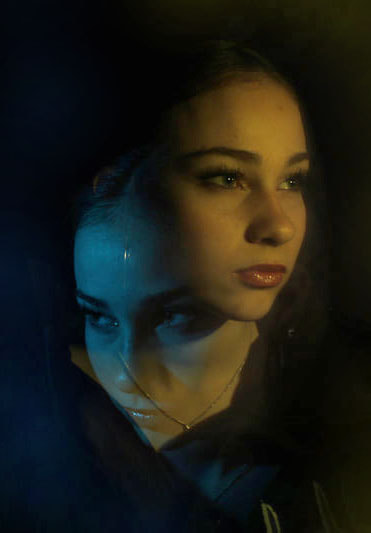
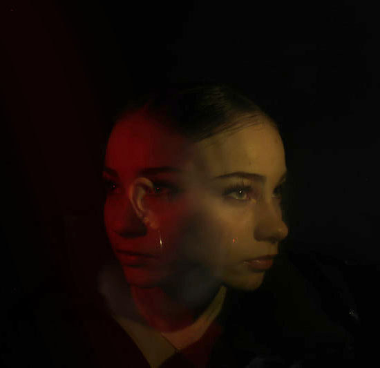
For my set up I had a black background, by using a big piece of black paper hung up on a wall. I used a tripod with a camera attached to the top. Then I went into the Canon EOS camera's menu and found the Multiple Exposure setting in the red camera menu, i clicked it and chose Enable. Then I chose to take 2 exposure so that the camera would take two shots in one. When I pressed the button to take the photo I got someone to use the flash of a camera and a piece of coloured glass, and flash it at the models face when they were turned the way I wanted them to face for the shot, then they went to the other Side of the model and do the same with a different colour. Afterwards I let go of the button which took the photo and that's the double exposed photo taken and fully processed.
For my set up I had a black background, by using a big piece of black paper hung up on a wall. I used a tripod with a camera attached to the top. Then I went into the Canon EOS camera's menu and found the Multiple Exposure setting in the red camera menu, i clicked it and chose Enable. Then I chose to take 2 exposure so that the camera would take two shots in one. When I pressed the button to take the photo I got someone to use the flash of a camera and a piece of coloured glass, and flash it at the models face when they were turned the way I wanted them to face for the shot, then they went to the other Side of the model and do the same with a different colour. Afterwards I let go of the button which took the photo and that's the double exposed photo taken and fully processed.


Best Edits
|
|
|
|
WWW: I really like how the photos are very saturated. Saturation describes the intensity of the colour. And lightness refers to how light or dark the colour is. A grayscale or black-and-white photo has no colour saturation, while a full-colour photo of a field of sunlit wildflowers might be extremely saturated. so in this case it means that my photos are extremely vivid, full of colour and life. The colours are very intense and bright. The colours really catch your eye and draw your attention in to particular parts of the face where the colour is more bright. I like the contrast between the background and the models faces in the photo as the colour really stands out compared to the black background as it is so high saturated. Also the black background was a good choice as it makes the colours pop because of the extreme contrast. For example in contrast a white background would have made the colours seem less vibrant as the models face and the background wouldn't have been as conflicted with each other.
EBI: Some of my photos are a bit badly focused so I could've tried to adjust my focal lens and also the first best edit could be a bit higher saturated so to complete this in the photo taking process I could've had the person flashing the light with the colour behind the flash lens to be quicker when going on either side, and going closer to the face to get a deeper bolder colour which looked more bright. Also I should've taken more photos and uploaded more onto my website to have more of a variety and more options for when editing.
EBI: Some of my photos are a bit badly focused so I could've tried to adjust my focal lens and also the first best edit could be a bit higher saturated so to complete this in the photo taking process I could've had the person flashing the light with the colour behind the flash lens to be quicker when going on either side, and going closer to the face to get a deeper bolder colour which looked more bright. Also I should've taken more photos and uploaded more onto my website to have more of a variety and more options for when editing.
Development 2
Bêtes de Mode by Helmo
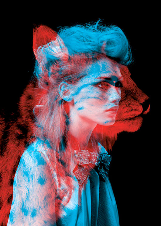
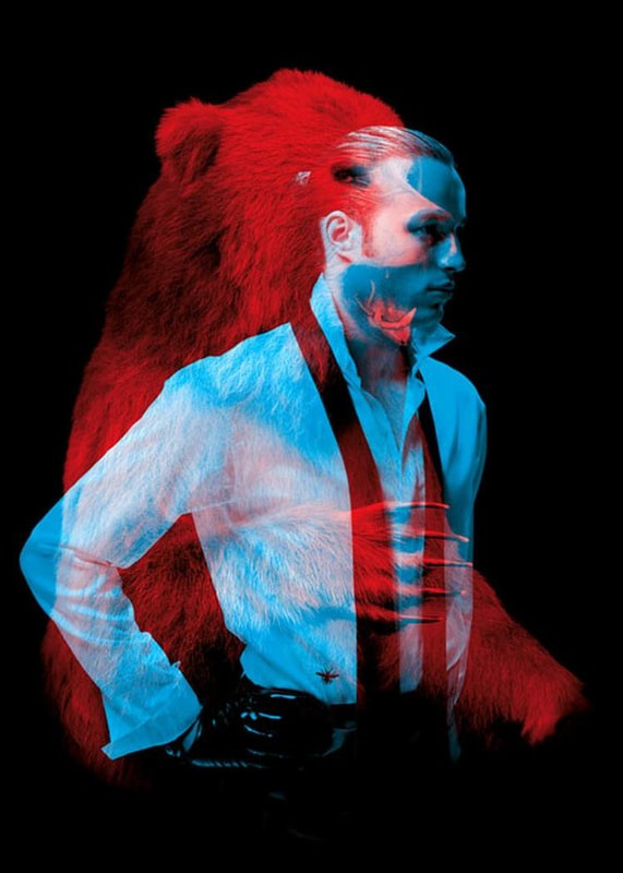
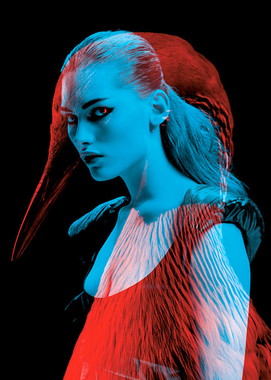
I got inspired by this artist who uses double exposure to reflect peoples animalistic sides, the animals shown reflect how the people act and are seen. so for the swan the woman is interpreted as very elegant and majestic. for the man the bear represents him as very powerful and strong but also confident. lastly the cheetah suggests the women is adventurous, independent and tough.
Each piece depicts a fashion model in blue, with a thematically complimentary animal superimposed in red, this technique is reminiscent of those old school 3D glasses,. To capitalize on the duotone effect, the installation featured colored gels to reveal just the model portrait or animal portrait, depending on which one the viewer looked through.
Each piece depicts a fashion model in blue, with a thematically complimentary animal superimposed in red, this technique is reminiscent of those old school 3D glasses,. To capitalize on the duotone effect, the installation featured colored gels to reveal just the model portrait or animal portrait, depending on which one the viewer looked through.
|
|
|
My photographs
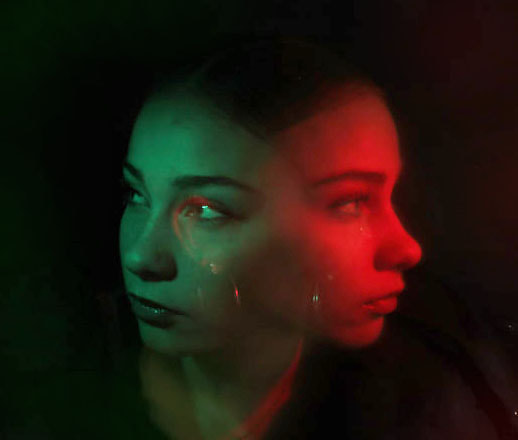
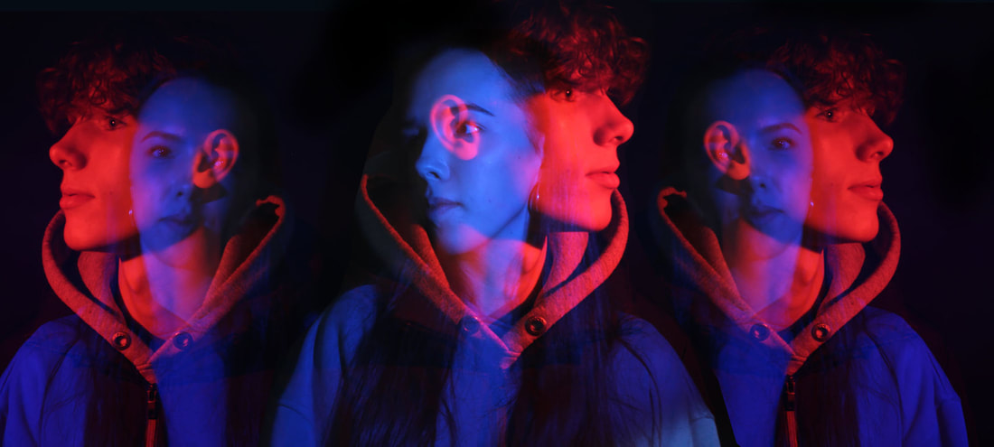
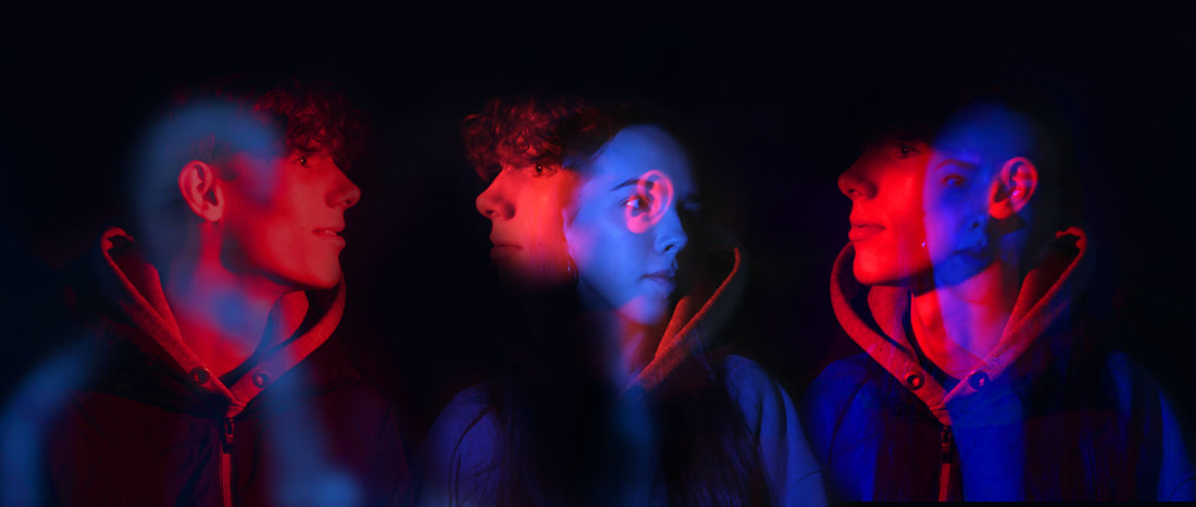
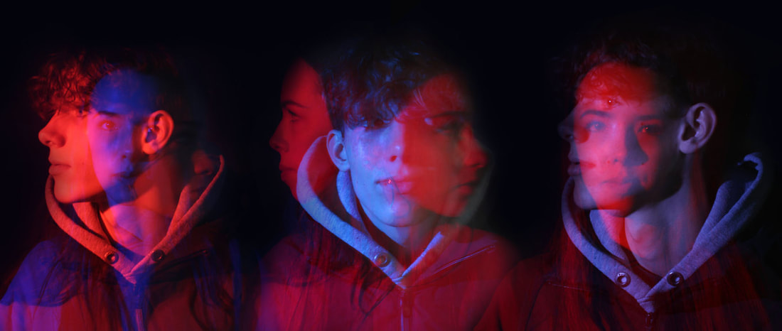
The two colours contrast very well with each other so these are the colours I wanted to focus on when taking my second development of photographs. But not only did I wanted to take the inspiration from Helmo with the colours I wanted to put my own take on this and instead of using animals like him just use people like i've done in my last development but when doing the edits in photoshop I wanted to get the already double exposed photographs and put 3 next to each other and see how this looked as I think this will look very surreal, strange yet distinctive.


Best edits
For these best edits for my second development I wanted to make a row of double exposure shots, I think this looks quite fascinating and captures different angles, saturations, and contrast of exposure. I really like how I put three next to each other because it looks very abstract.
To me it looks almost like a stimulation as there facial expression, the layout and the bright vibrant fake looking colours all look very robotic. It looks a bit like AI, as it almost doesn't look real and makes you feel a bit strange. For the final best edit I used my photos from the first development and put it in a row of three because u really liked the way the other ones came out and wanted to experiment with the range of colours I used from the first development.
To me it looks almost like a stimulation as there facial expression, the layout and the bright vibrant fake looking colours all look very robotic. It looks a bit like AI, as it almost doesn't look real and makes you feel a bit strange. For the final best edit I used my photos from the first development and put it in a row of three because u really liked the way the other ones came out and wanted to experiment with the range of colours I used from the first development.
|
|

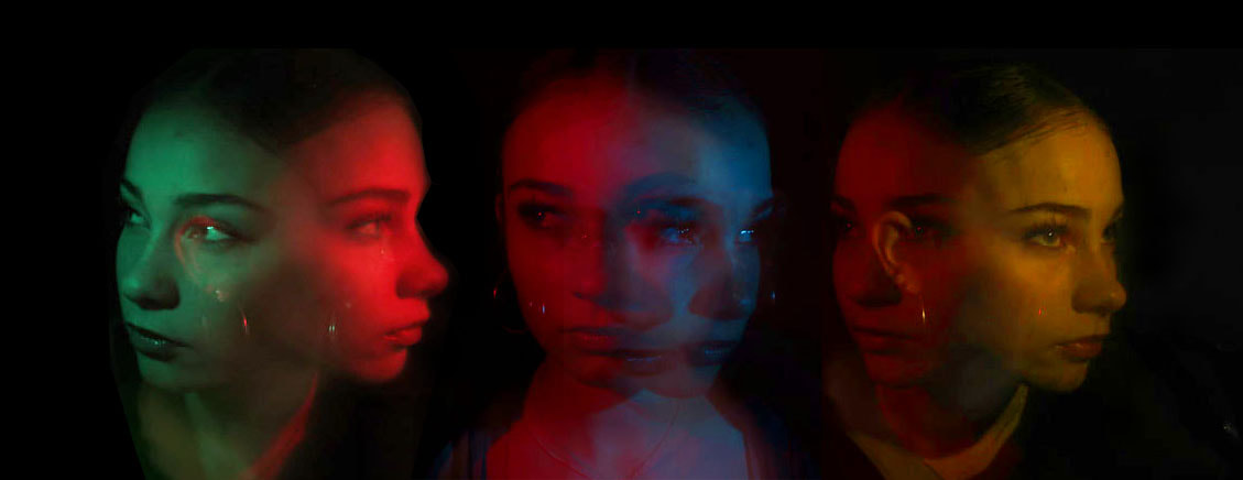
WWW: The black background was a good choice as it makes the colours pop because of the extreme contrast. For example in contrast a white background would have made the colours seem less vibrant as the models face and the background wouldn't have been as conflicted with each other. I really like how the photos are very saturated. Saturation describes the intensity of the colour. And lightness refers to how light or dark the colour is. A grayscale or black-and-white photo has no colour saturation, while a full-colour photo of a field of sunlit wildflowers might be extremely saturated. so in this case it means that my photos are extremely vivid, full of colour and life. The colours are very intense and bright. The colours really catch your eye and draw your attention in to particular parts of the face where the colour is more bright. I like the contrast between the background and the models faces in the photo as the colour really stands out compared to the black background as it is so high saturated. I like how the people in the photographs are extremely monotone without facial expression as it makes the images look more surreal and creepy looking. Even though they aren't telling a story through their face it brings quite an eery feeling and makes the audience feel intimidated and creates its own frightening, chilling intake.
EBI: I could have made tried to make the photographs a bit better focused, to do this when taking the photographs on the canon camera i could've had the person flashing the light with the colour behind the flash lens to be quicker when going on either side, and going closer to the face to get a deeper bolder colour which looked more bright. Also I should've taken more photos and uploaded more onto my website to have more of a variety and more options for when editing.
EBI: I could have made tried to make the photographs a bit better focused, to do this when taking the photographs on the canon camera i could've had the person flashing the light with the colour behind the flash lens to be quicker when going on either side, and going closer to the face to get a deeper bolder colour which looked more bright. Also I should've taken more photos and uploaded more onto my website to have more of a variety and more options for when editing.
