What is Structure?
In photography, the structure is the composition of an image as the seamless progression or rhythmic flow of its constituent elements. Structural photographers use careful composition, lighting, and perspective to emphasize the lines, shapes, textures, and patterns that define these structures. Structure Increase the amount of details in the image. Structure uses a unique algorithm to bring out the texture of objects throughout the photo, without affecting the edges of the objects. Sharpening Increase the amount of sharpness in the details of the image.
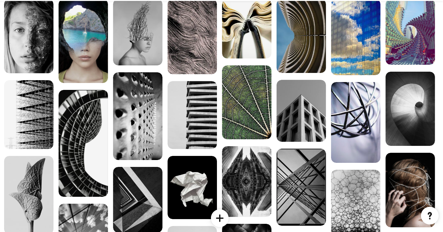
Structure in an image is the means by which order is created out of chaos. Photographically, I like to think of 'the structure of an image' as the flow or visual rhythm of elements. Controlling the structure of an image controls the order in which the elements are read, and in turn the idea or story implied by those elements.
When I see structured photographs I look at the different patterns, textures and shapes that the building or object creates. the structures have different edges, points, and curves. I think that abstract photography is always very captivating and the images mostly always have a deeper meaning.
Thomas Kellner
Thomas Kellner is a German fine-art photographer, curator and lecturer. Fine-art is a type of photography, as the field of photography has expanded significantly and in today's society anything that has artistic intent behind it, whether that be abstract, portrait or landscape photography, will be considered fine art.
From 1989 to 1996, Kellner studied Art and Social Science at the university of Siegen to become a teacher, but then he experimented pinhole camera photography and intensively studied the possibilities and limits of this technique. At the same time he experimented with other methods of photography such as salt-paper prints and cyanotype and he worked with various noble printing processes such as silver gelatine and gum bichromate. In 2003 and 2004 he was a visiting professor for Fine-art photography at the University of Giessen and later on In 2012 he held a teaching position for photography at the Paderborn University.From here on he travelled the world to places such as the United States, Latin America , Syria, China, where he photographed famous monuments such as the Golden Gate Bridge, Boston Athenaeum, and the Great wall of china in his special technique.
From 1989 to 1996, Kellner studied Art and Social Science at the university of Siegen to become a teacher, but then he experimented pinhole camera photography and intensively studied the possibilities and limits of this technique. At the same time he experimented with other methods of photography such as salt-paper prints and cyanotype and he worked with various noble printing processes such as silver gelatine and gum bichromate. In 2003 and 2004 he was a visiting professor for Fine-art photography at the University of Giessen and later on In 2012 he held a teaching position for photography at the Paderborn University.From here on he travelled the world to places such as the United States, Latin America , Syria, China, where he photographed famous monuments such as the Golden Gate Bridge, Boston Athenaeum, and the Great wall of china in his special technique.
|
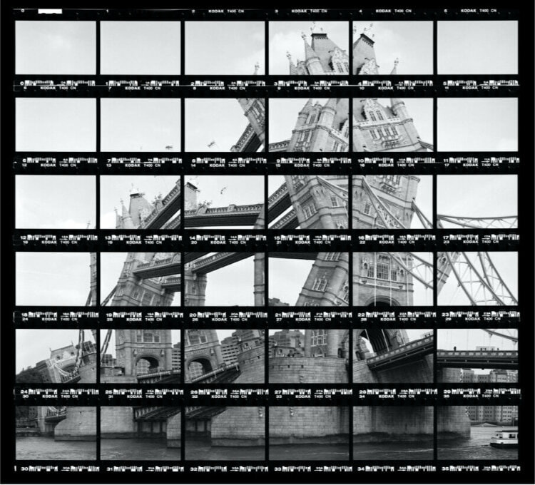
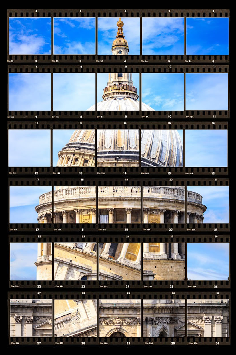
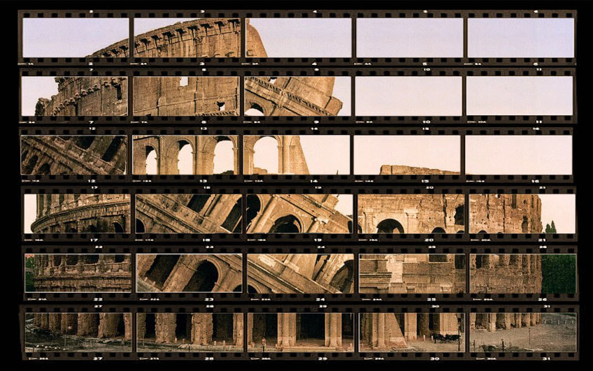
each picture has a dimension of 24 × 36 millimetres
|
each roll of film consists of 36 individual frames.

|
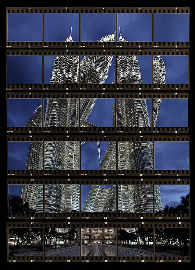
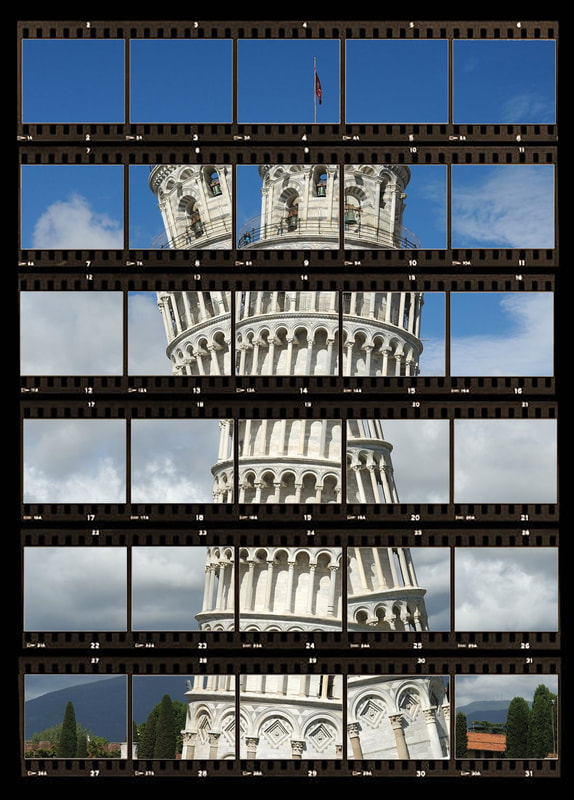
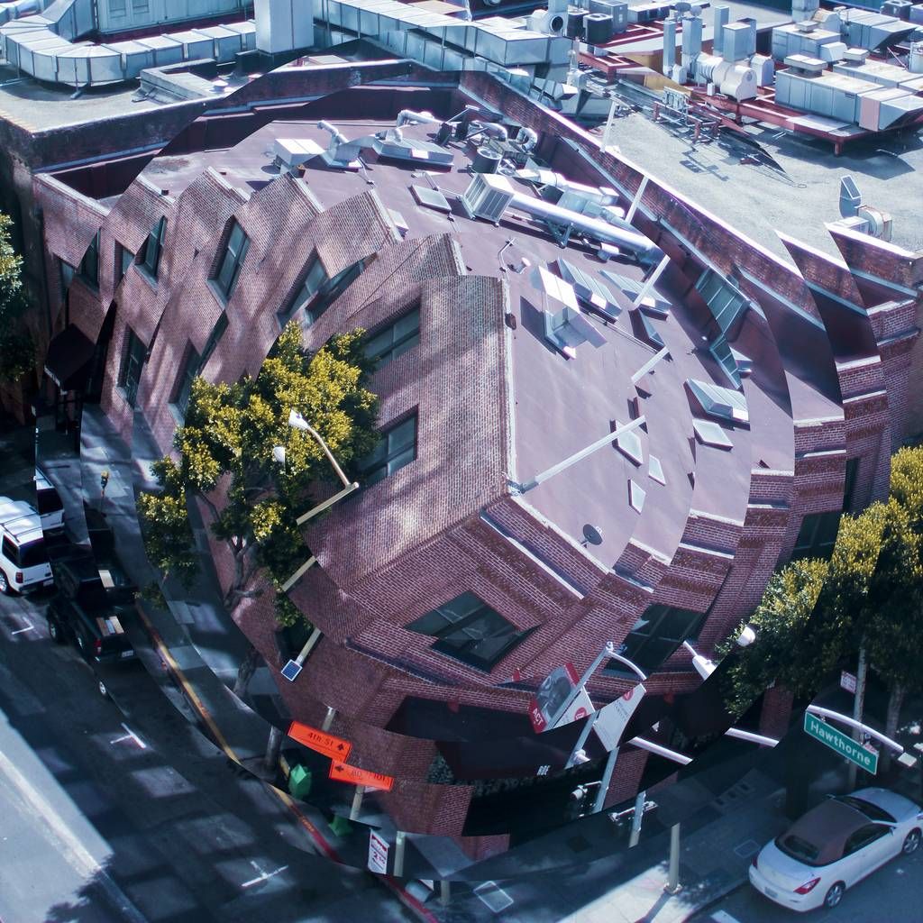
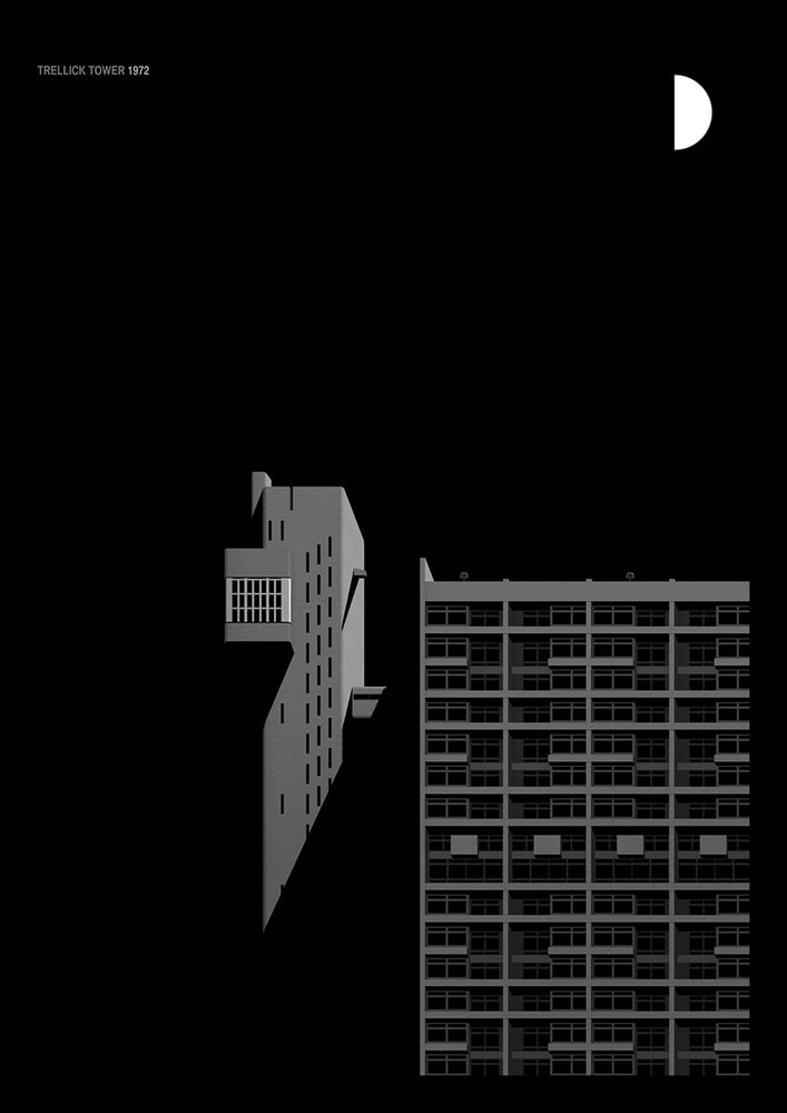
He created his own technique of using a contact sheet to make a selection of the photographed individual images to make an amazing photograph of a building which is twisted and disjoint within a contact sheet. (which is shown below). To do this Kellner works with a single-lens reflex camera and uses 35mm film small image rolls. In order to transport the film, perforations are made at the top and bottom of each frame, on which both the type of film used and the number of each frame are noted. After developing the film, Kellner cuts it into strips of equal length and assembles them into one large negative. This is then used to produce the contact sheet , on which the meta-information about the film and the respective number of the shot is still visible. |
Thomas Kellner got inspired by the idea of Cubism after Delaunay, he transfers the international movement of Deconstructivism from architecture to photography today. He photographs buildings, deconstructs and fragments them and assembles them into a heterogeneous conglomerate of forms.
Kellner 1st response
In this task I used already taken photographs of different famous buildings around the world and used a picture of a contact sheet above the photo as seen I the photos below. I picked photos from the internet which were very well focused, taken at different times of day and photos which would look interested twisting and messing around with.
To edit these photographs,
Firstly I opened the image of the building which I wanted to use
Then I opened a photo of a contact sheet an placed it on top of the original image
Then using the magic brush tool I selected all of the white blocks within the contact sheet using shift to make the process faster and deleted them revealing the image underneath the contact sheet, that's the basis done.
Then to make the building look twisted and look like a distorted structure, I firstly duplicated the layer of the building
Then I went onto that layer and deleted the bocks which I wanted to be twisted using the same magic brush tool
Additionally I selected the layer as a whole and turned it 45 degrees clockwise or anticlockwise
Finally I selected all the layers and went to the top left corner >layer>merge layers.
|
|
|
|
WWW: I like the way I changed the directions of some of the parts of the photo like the photographer as it makes the building look distorted and disjoint. The images chosen from online are all different from each other in terms of lighting, structure of building, sizes and either vertical or horizontal.
EBI: It would be even better if i used my own images instead of pictures of famous buildings from the internet. To evaluate this matter
EBI: It would be even better if i used my own images instead of pictures of famous buildings from the internet. To evaluate this matter
Kellner 2nd response
|
|
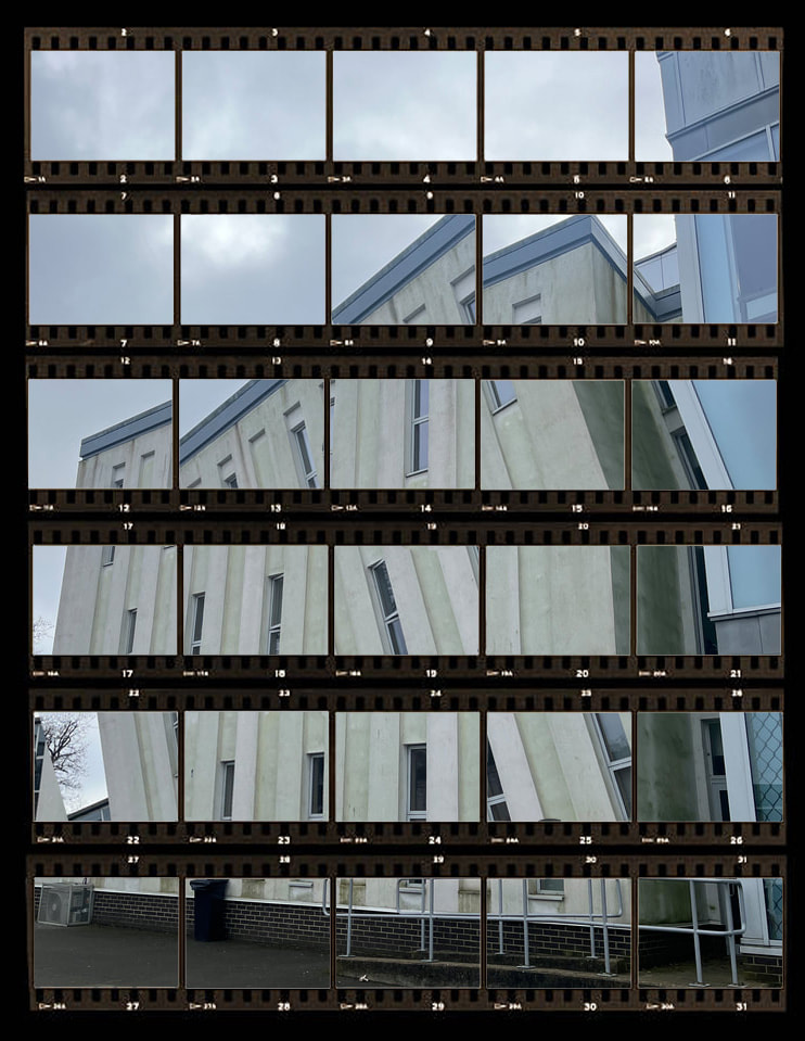
TASK ... In my second response i used the same methods and tried to get the same results as in the first response to Kellner. However this time i didn't use pictures of buildings from the internet, instead in my photography lesson i walked in the school premisis around south wig and north wing and took pictures of buildings or structures. I took pictures of the structures which looked fascinating or i thought would look good being twisted and a bit distorted, to do this i looked for complex shapes and formations like Kellner uses to create more abstract looking work.
|


Best Edits
|

|

|

|
WWW: I like the photo on the bottom right as i developed the work of Kellner and initial photos i took in response to him.
I did this by first opening a blank horizontal page on photoshop, uploading the original image of the building on top of it , shrinking it so its half the size of the blank page, then copy and pasting the picture onto the opposite side, pressing transform and then flip horizontal. Then i did the original process of copying and pasting the contact sheet on top of the image, and following the steps which i described before when explaining in the editing process i went through during my first response to Kellner.
EBI: I could have made some images look eve more distorted, for example the bottom left isnt very obvious, even though i did switch direections of lots of the indiidula sections of the photo. Maybe, the reason to this was that it is quite a basic building with a consistent structure repettivie building, so i could ahve used one of my other photographs or tried to capture a ore complex building, with gaps and different formations.
Kellner Homework
My Photographs
|
For my final response in regards to Kellners' work I developed the last two sections by going out into mussel hill and taking Photographs of the buildings local to me.
|
Picture of contact sheet from the internet
|
|
|
|
Best Edits
Nicholas Kennedy Sitton
|
Nicholas Kennedy Sitton is a photographer who brought an interesting new dimension and sense of demolition to society with his intriguing photographs. He took took fairly normal and uninteresting architectural photographs of buildings from different angles and then cut them out and twisted them around in editing to create a sense of distortion that made the buildings in the photos look like they were falling into each other.
He says "It creates a sense of falling into itself, like capturing a moment of demolition." 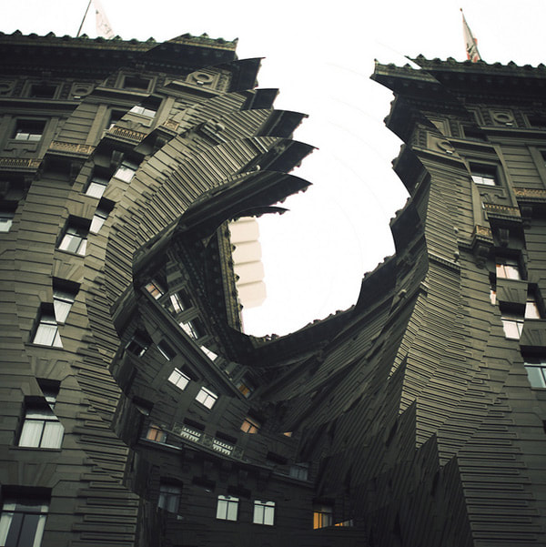
|
|
My photographs and GIFs
|
Editing process
1). Always begin by changing the image size. If it’s not going to be printed A4 (21cmx29cm and 200p/i) is fine. Change the measurements and click ‘Ok’. 2). Have the grid visible to help you gauge the size of the circles by pressing View>Show>Grid. Click and drag from the margin to position a horizontal and vertical guide. This will be the centre of your circle. 3). Select the Elliptical Marquee Tool. It might be hiding behind the rectangular marquee tool. With your fingers on ‘Shift’ and ‘Alt’ click on the centre point for your circle and drag until you have the largest size of circle you will need. 4). Edit>Copy, Edit>Paste, Edit>Transform>Rotate Alternatively press ‘Control’ and ‘T’ to free transform. 5). When you have finished any transformation you must select the tick at the top of the window. You won’t be able to complete any action until you’ve done this. 6). Choose your elliptical marquee tool again and, starting from the centre of the circle, create a circle slightly smaller than the first one. This is when the grid is useful. Repeat the actions making the circle smaller and smaller: Edit, Paste and Rotate via the Transform menu. 7). When you’re finished deselect the Grid, Clear guides, Now you can animate it. 
|
To make it into a GIF like below
1).You need the ‘Timeline’ window from the Windows menu. 2). Select 'Create Frame Animation',Make sure that you have your 'Layers' window open. 3). On your ‘Timeline’ window, select the frame icon. This will create a new frame for your animation. On your ‘Layers’ window deselect the last circle you created by clicking on the eye icon next to the name of the layer. Repeat until you have a sequence featuring all the layers. 4).You can select all of the frames and change how long each is played for by changing the time at the base of one frame. Select all the frames. There is a small menu icon in the top right corner of the Timeline window. Click to open the menu and select ‘Copy Frames’. 5). Select ‘Paste After Selection’ in the window that appears then click ‘Ok’. With the new set of copied images still selected, choose ‘Reverse Frames’ from the Timeline Window menu. 6). Save the animation (Gif) by going to File>Export>Save for Web (Legacy) Once you have changed the %, press return on your keyboard and see the new file size. If it’s below 10M click ‘Save’ 
|

|

|

|
|
|
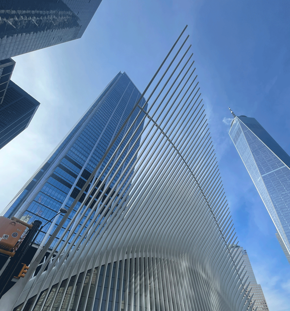
Structure of nature
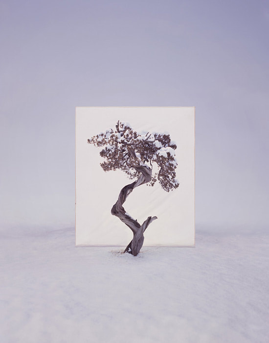
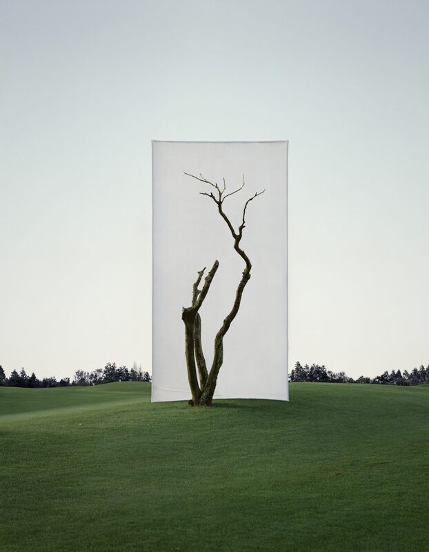
Myoung Ho Lee
|
MyoungHo Lee was born in 1975 in Daejon in South Korea and he studied Photography at the University of Chung-Ang in South Korea. Currently, he is a professor at the Photography Department of the Kyungill University. Myoung Ho Lees Photography-Art Project is to introduce natural sceneries intervened by installing a white canvas as a metaphor of the re-presence and re-produce. He makes us look at a tree and its structure in its natural surroundings, but separates the tree artificially from nature by presenting it on an expansive blanc white background. Myoung Ho Lee photographs solitary trees framed against white canvas backdrops in the middle of natural landscapes. He has produced an elaborate series of photographs that pose some unusual questions about representation, reality, art, environment and seeing.
|
|
Task
EXAMPLE:
|
In response to Myoung Ho Lee's work, I went to Coldfall Woods near my school and held up a white background as a backdrop for branches, logs and leaves. The contact sheet includes photos of nature by itself as well as photos against a white background. The photos below the contact sheets are my favourite chosen images, edited on photoshop. They were all brightened using the curve function, cropped, and were brought to be a bit more higher saturated so that the plants and nature in the photo look more lively and vivid and so the nature stood out a bit more from the background and pops.
The aperture setting (f-stop) that you use will have an impact on the amount of focal range in focus in front and behind your subject. This is known as the Depth of Field (DOF). It was a sunny day out in the woods so for my camera settings I had: Aperture: f/16, known as the “sunny 16 rule.” Shutter Speed: Shutter speed 1/100 seconds to correlate with the ISO ISO: I kept it low, around 100 to avoid overexposure and reduce noise. |
White page filling the frame
|
The context around which the photograph is taken.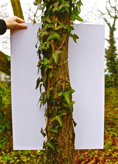
|
My photographs
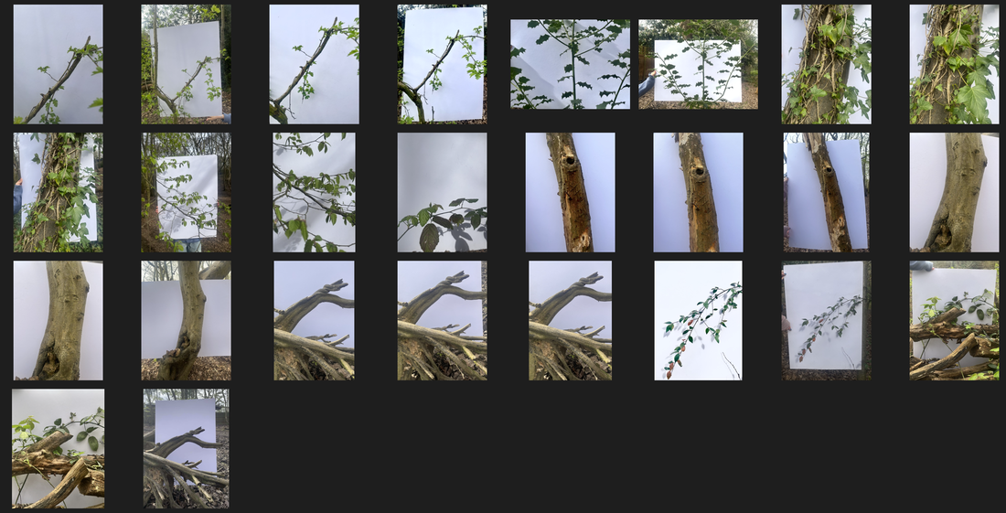
Best Edits
|
|
WWW: I like how my photos show both the external view with the full background and the more zoomed in view as it shows the context behind the photo and the wide beauty of nature. I think the exposure of the photographs is good as they are not over or under exposed; Also the saturation is good in the best edits as i increased contrast and vibrancy to the right amount so the plants became very contrasted with the white background and stand out. it made the plants look more alive and nature look more green and wild which drags people in. |
Response 2


Structure of nature


|
Response 2


Brutalist Structure
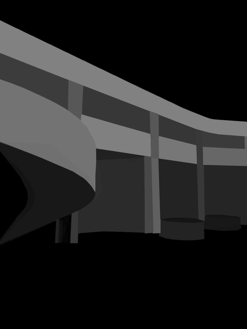
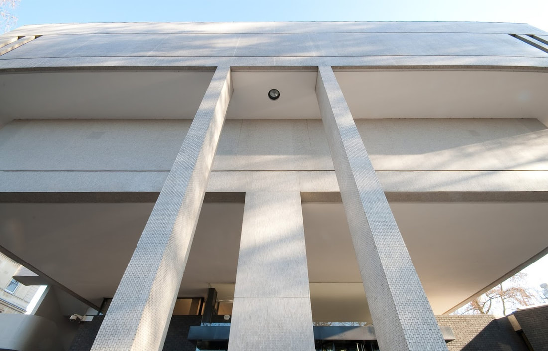
The term Brutalism was derived from the French ‘Béton brut’, or raw concrete, was a term coined for the futurist architecture being created by Le Corbusier and others like him. From this label the term Brutalism was created as a way to classify this style of architecture.The expression became associated with a movement emerging in postwar British architectural offices. The architecture itself is characterized by the large size of the buildings and the use of raw unfinished concrete. Brutalist buildings also make use of geometric forms in a way to attempt to communicate the buildings function and what the rooms behind the slabs of concrete are used for
The photography by Simon Phipps provides a unique perspective and portrays Brutalist architecture in a sensitive, realistic and distinctive manner. Phipps has spent the last 15 years photographing and documenting Brutalist and buildings in the UK, creating a survey of photographic images that demonstrate the breadth of this contentious architectural style.
For my task I had to capture the structure of brutalism in response to the work of Simon Phipps, I Visited one of the brutalist buildings and represent the structural makeup of brutalist architecture. I took a series of pictures that have a strong emphasis on line,perspective,and angle.
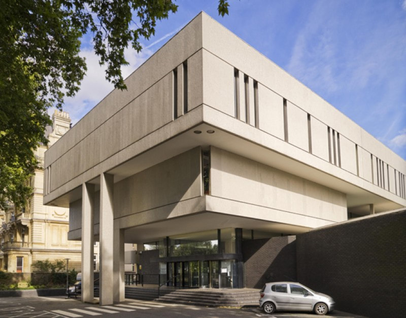
The Barbican
This city and the buildings within is an icon of Brutalist architecture, the Barbican is one of the UK's architectural treasures, it is a performing arts centre in the Barbican Estate of the City of London, England, and the largest of its kind in Europe.
The reason of the barbicans fame and acknowledgment is for its structure, the structure of the Barbican estate basically consists of concrete buildings, on top of massive columns, standing on bored pile foundations. The buildings are constructed of reinforced concrete for the most part, but there are some areas where pre-stressed concrete was needed. Construction for the Barbican Estate started in 1965 and took 11 years to complete. The complex, designed by architects Chamberlin, Powell and Bon, was Grade II-listed in September 2001. Today, the 40-acre Estate is home to more than 4,000 residents, living in over 2,014 flats.
In my photos I captured the complexity of the structures of these buildings highlighting the strong lines, edges and curves of these buildings using different perspectives and a range of angles to get the full image and intention behind the buildings.
My photographs


Best Edits


|


|


|
WWW: i like how i edited the pictures in photoshop to be in black and white using the grayscale method. The black and white creates more dimension and contrast within the photos as the distinction between the two shades make the photos look more in depth. The black and white accentuates the structure and from of the building by making it look more complex than it already is as the height and immenseness becomes more visible with the disparity within the photograph.
EBI: I could have got more closer angles, i could have captures more edges and curves to show a more close up view of the different angles that i could capture of specific parts of the buildings.
EBI: I could have got more closer angles, i could have captures more edges and curves to show a more close up view of the different angles that i could capture of specific parts of the buildings.
Thomas Danthony- Brutalism
|
|
|
My photographs
My Best edits
|

|

|

|
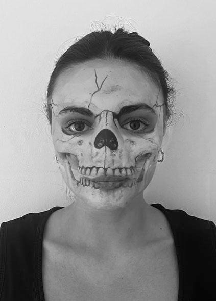
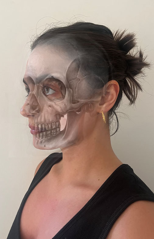
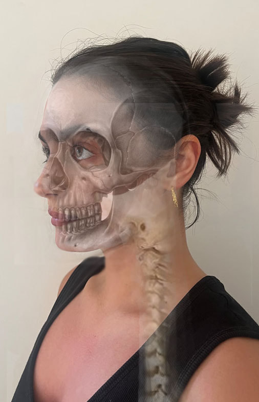
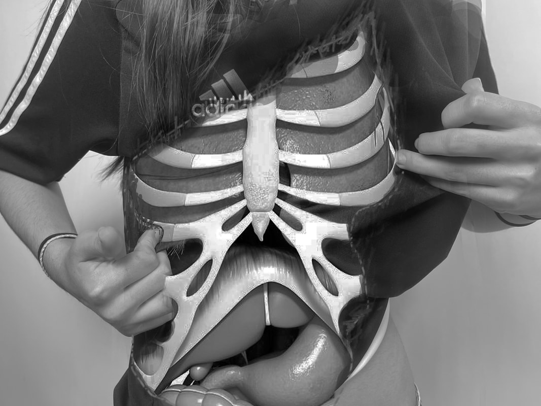
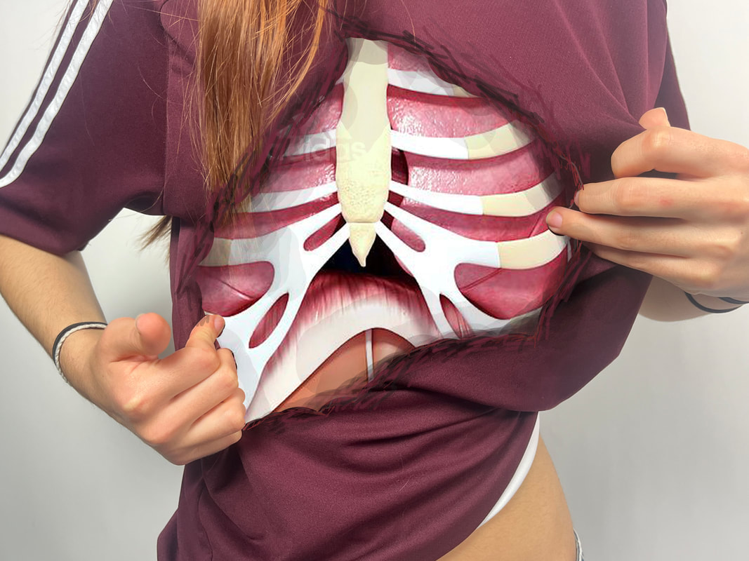
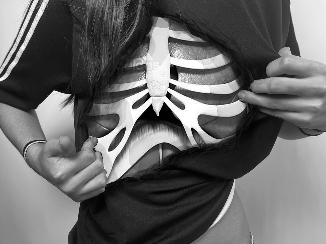
Danny Quirk
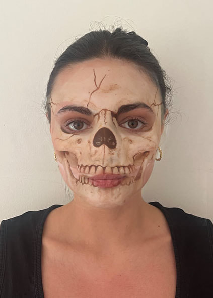
Danny Quirk is 25 years old and he specialises in an avant-garde style of illustration as an self taught medical illustrator.
He is a traditional artist, trained in photorealistic water colours, photorealistic and surreal acrylics, and very proficient in the Adobe Suite. He's had shows in major cities across the US, featured in numerous art and science magazines / blogs, including Juxtapoz, Behance, The Scientist, and even Smithsonian."
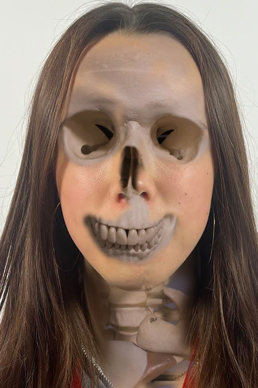
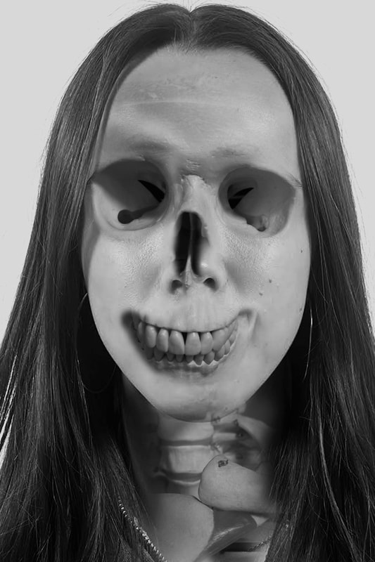
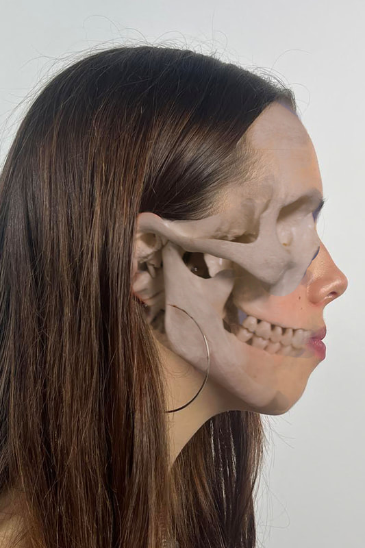
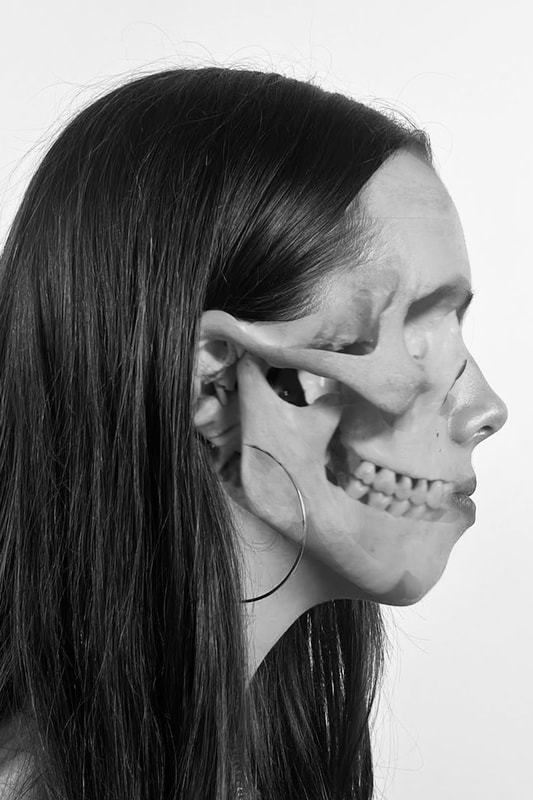
To carry out "educational gain" for both himself and his audience to get a deeper understanding of the inside of the body through the skin, he 'dissects with a paint brush' turning eye catching body paintings into anatomically accurate renditions of the body. In order to create his work, Danny quirk uses liquid latex and marker pens, he didn't use mediums such as clay, charcoal or paint.
This quote is the first thing on his website:
"I’m an artist, recent graduate, specialising in photo realistic watercolours, painting what the camera can’t capture. My work is perceivably on the darker side, but the actually is, it’s about exploration.
My anatomical works combine classic poses, in dramatic chiaroscuro lighting, with a very contemporary twist… illustrating what’s underneath the skin, and the portrayed figure dissects a region of their body to show the structures that lay beneath."
This quote explains the deeper meaning of his work and how its a bit dark, surreal and abstract as it shows the structure of the body in a very particular and scary way by stretching the skin to reveal the inner veins and bones which are the deeper structure of the body, which could put some people at unease however is so beautifully done
He is a traditional artist, trained in photorealistic water colours, photorealistic and surreal acrylics, and very proficient in the Adobe Suite. He's had shows in major cities across the US, featured in numerous art and science magazines / blogs, including Juxtapoz, Behance, The Scientist, and even Smithsonian."
To carry out "educational gain" for both himself and his audience to get a deeper understanding of the inside of the body through the skin, he 'dissects with a paint brush' turning eye catching body paintings into anatomically accurate renditions of the body. In order to create his work, Danny quirk uses liquid latex and marker pens, he didn't use mediums such as clay, charcoal or paint.
This quote is the first thing on his website:
"I’m an artist, recent graduate, specialising in photo realistic watercolours, painting what the camera can’t capture. My work is perceivably on the darker side, but the actually is, it’s about exploration.
My anatomical works combine classic poses, in dramatic chiaroscuro lighting, with a very contemporary twist… illustrating what’s underneath the skin, and the portrayed figure dissects a region of their body to show the structures that lay beneath."
This quote explains the deeper meaning of his work and how its a bit dark, surreal and abstract as it shows the structure of the body in a very particular and scary way by stretching the skin to reveal the inner veins and bones which are the deeper structure of the body, which could put some people at unease however is so beautifully done


My photographs
|
|
skull photograph from internet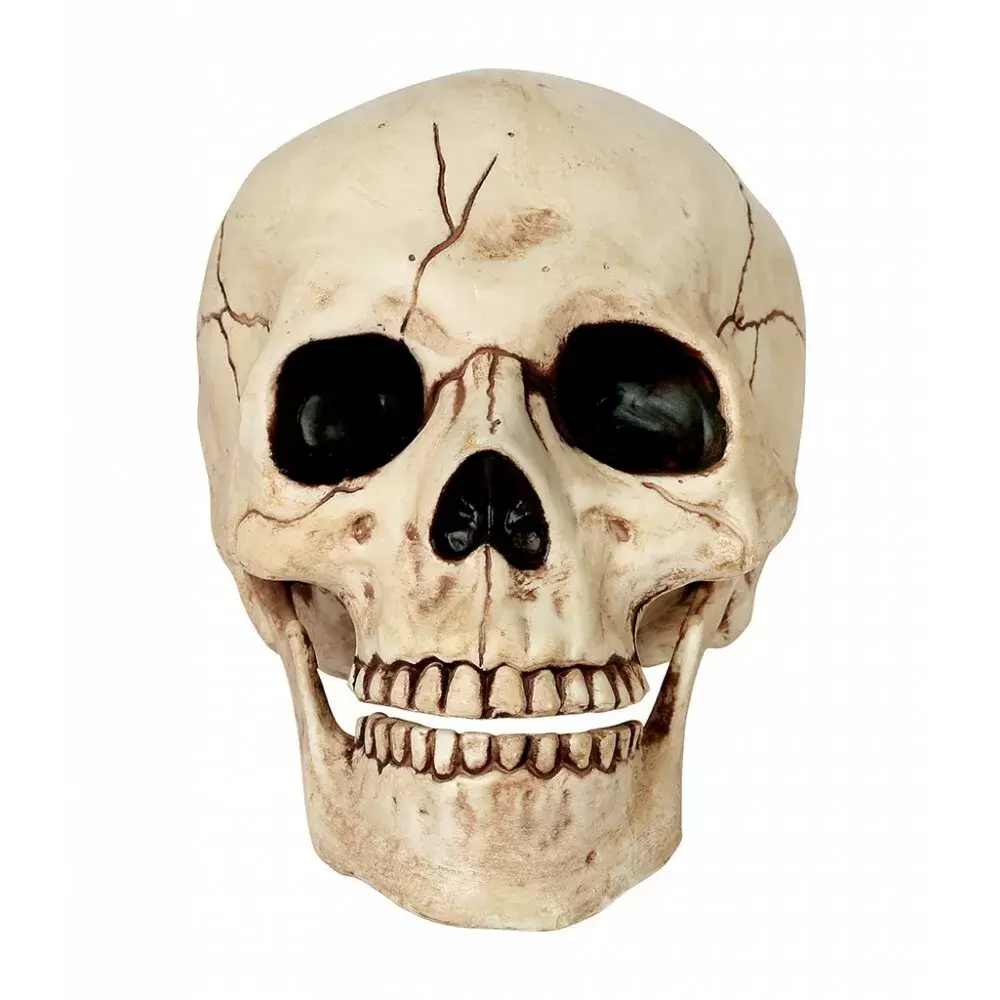
|


Best Edits
|
|
|
|
|
Strand 1
Bertrand-Burtynsky-Wolf
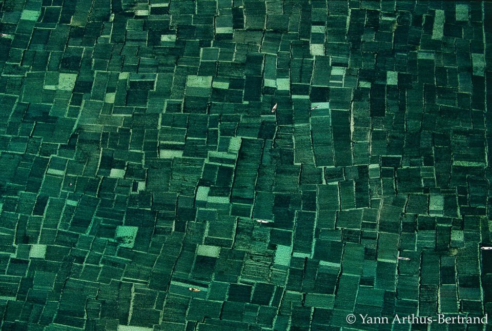
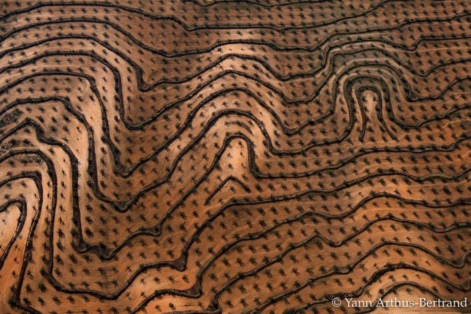
Burtynsky's early work consists of colour photographs of landscapes and the structures within, usually from relatively close up and with a focus on sensuous detail. He is the inaugural winner of the TED Prize for Innovation and Global Thinking in 2005. In 2016 he was the receiver of the Governor General's Awards in Visual and Media Arts for his work.
His work is usually shot form really high and focuses on a rlly wide view, however I think this makes the photo look like some sort of pattern, the far away shot makes the image look really packed and structured in an orderly form like a pattern.
I think that the photos below look like patterns I've seen and recognised so for this strand I wanted to take pictures of patterns similar to these photos and some other pieces he's done.
'Pattern photography utilizes elements that are repeated. The repetition of lines, shapes, tones, or colours can create interesting images. There are photographers who use the pattern as the main subject of an image while others use it to enhance the overall composition and look of the photograph.'
|
|
My photographs
For my first strand I wanted to explore with the different patterns, I thought patterns linked well with structure as they are created with shapes, different forms, and imagination, all of these thing constructed together make a certain shape and pattern. I took photographs of patterns I saw around and additionally I took some photographs of patterns I found in random books and different illusion books.


Strand 2
Danny quirk
|
Danny Quirk, was born on the 19th of July in 1982 and died quite young, he specialises in an avant-garde style of illustration as an self taught medical illustrator.
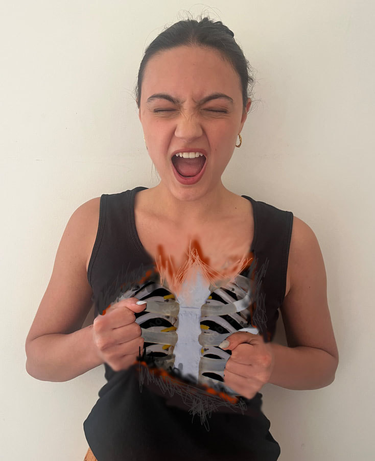
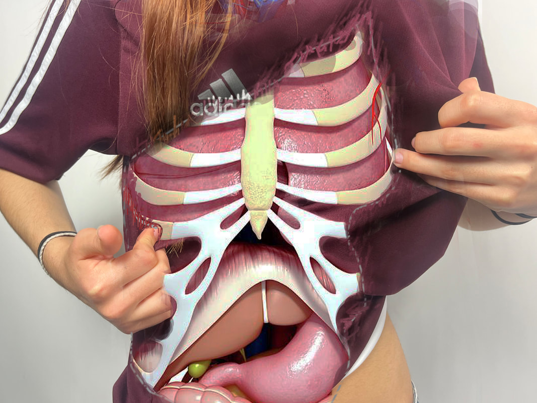
Danny Erik says that he is influenced more by music than visual artists, artists like Marilyn Manson, Tool, and System of A Down have influenced him the most; be it in their message and / or aesthetics. He looks to them as inspiration, to recreate that same feeling I have towards them in my viewers. Danny quirk tries to create pieces that engage people in dialogue, and that subsequent discussion becomes the introduction for others to his work. He's improved a lot as he's gone on working in the photography industry, nowadays he can deliver his message and achieving his technique in 3 to 1 shots , whereas when he first started it took him 5-4 shots. He's found ways to work smart, not hard; treating each piece like an experiment— taking note of things that work, and applying those to new pieces, while scrapping the things that don't work.When he got asked what he was most exited for this year he said, "Outdoing what I was capable of this time last year." This shows not only his passion for his career but also his determination. This links to structure as Danny Quirk s photos all include the structure of the body and he constructs his work by painting on the formation of the body within the model in his photo. The Massachusetts-based artist devised a way to bring human anatomy to life—by painting the bodies of live models with intricate illustrations of their musculoskeletal structures and vasculature, among other things. I wanted to pick him for my second strand, but also because I loved responding to his work earlier on in this project and creating work similar to him so I wanted to do it even better and improve. |
|
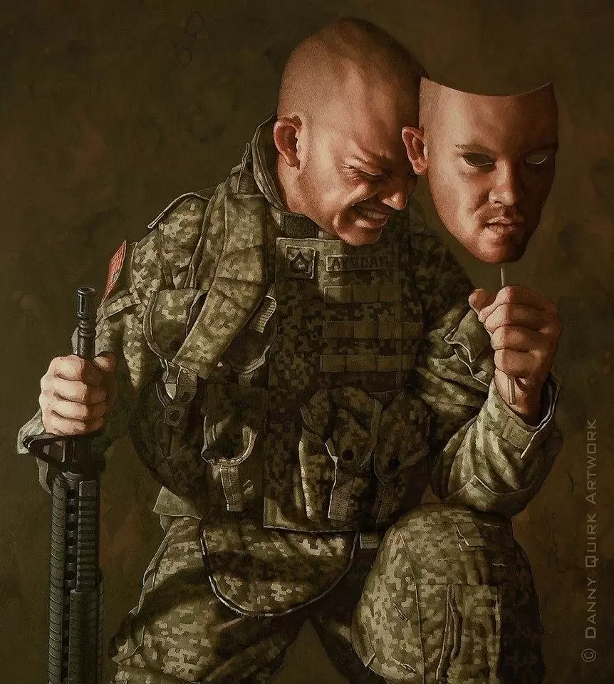
His favourite piece that he's made is his '(De)Facing PTSD' piece ( shown on the top right). The piece was made to be the mirror / microphone for those who suffer in silence, making vets' struggles heard in a way that they can connect to, and others can understand. The piece resonated with thousands of vets worldwide, and their responses flooded his email / inbox with tears and emotions that would erode even the most apathetic of souls.
My photographs


Best Edits
|
|
|
|
|
|
This was my first edit of the inside of the body and not face, I made my model in the photo use their hands as if they had ripped their shirt and there was no skin under but just their insides. I think this one doesn't look bad, however I decided to try again as I didn't edit very accurately since the rip should have been higher up making it more obvious that the shirt had been "broken apart". The rip isn't very obvious and I revealed too much of the body. Therefore I tried again, the edits are below, I think it looks way more realistic.
|
|
|
Strand 3
Brutalist buildings
The architectural style of brutalist buildings emerged during the 1950s in the United Kingdom, among the reconstruction projects of the post-war era. Brutalism is generally associated with rough, unfinished surfaces, unusual shapes, heavy-looking materials, straight lines, and small windows.Modular elements are frequently utilized to create masses that define specific functional zones, which are then combined into a cohesive whole. Brutalist buildings are characterised by minimalist constructions that showcase the bare building materials and structural elements over decorative design.
|
Royal college of Physicians
This building was designed by an architect named Sir Denys Lasdun and it was described as a 'battleship' at its 1964 opening, the RCP's London headquarters is a fascinating and distinct brutalist structure. With this bundling Denys Lasdun boldly reimagined how the headquarters of England's oldest medical college would be represented and designed around its occupants. The royal college of Physicians is a British professional membership body is a British professional membership body . This building is dedicated to improving the practice of medicine, particularly through the accreditation of physicians by examination. |
Brunswick centre
The Brunswick Centre was designed by Patrick Hodgkinson and (with the help of a young David Levitt and David Bernstein). It's a rise, high-density, inner-city neighbourhood, designed by Patrick Hodgkinson in the 1960sThe design of the Brunswick Centre is what is known as Brutalism, as it is simply exposed blocks of concrete. Hodgkinson wasn't a fan of Brutalism, and had originally wanted to construct the site out of brick.The Brunswick Centre is a residential and shopping centre in Bloomsbury, London, England located between Brunswick Square and Russell Square and is administratively in the London Borough of Camden.
|


My photographs
|
Royal college of Physicians
|
Brunswick centre
|
Best Edits
Royal college of Physicians


|


|

|


Brunswick centre


|


|


|
