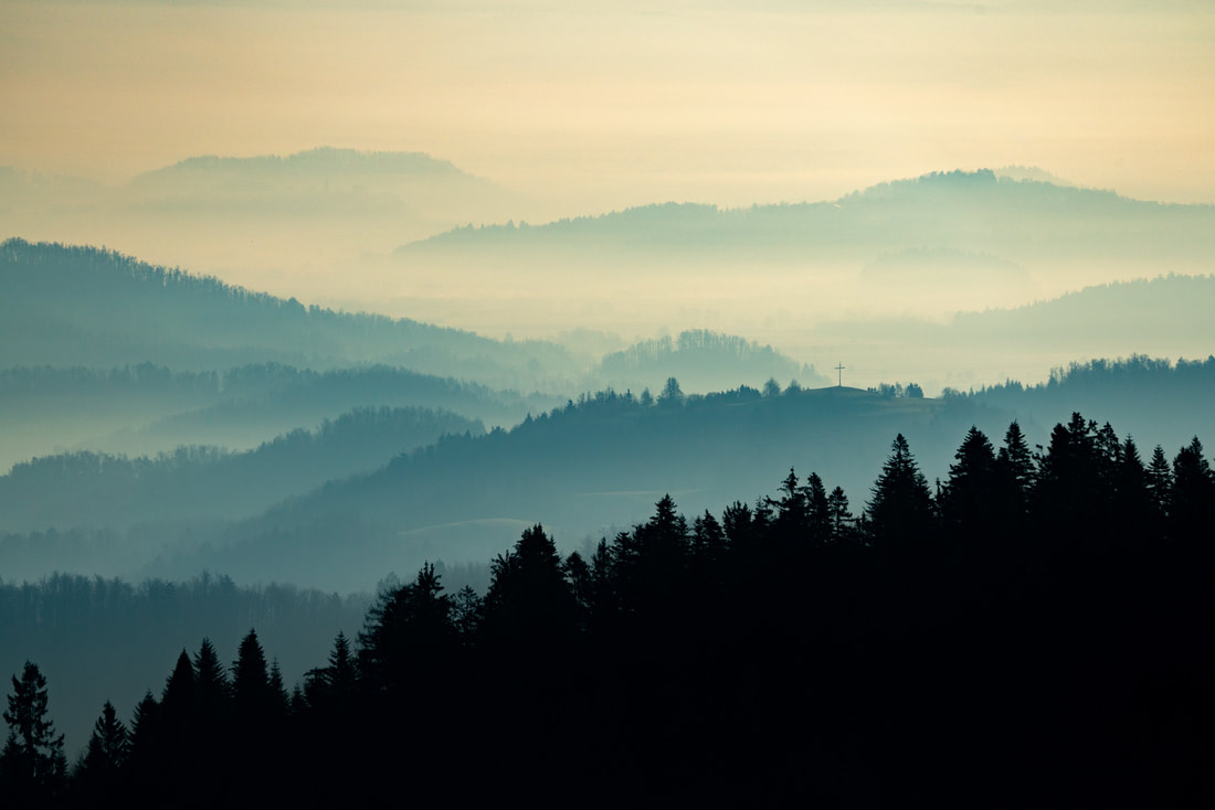
WWW
Careful presentation of your weebly throughout.
Excellent understanding of composition and control of the camera. Your perseverance with ideas means that many outcomes are refined and sophisticated.
Your responses to photographers' studies are appropriate. Your Weston, Kertesz and Saroff homework is particularly impressive.
EBI
The independent development is the only place where you perhaps needed to persevere again. It would have been better to choose objects that had a similar form, perhaps simpler natural objects. How could you have photographed the objects to avoid the shadow on the background?
TARGETS
Compare photographers across a project or within a piece of analysis. You could also create direct comparisons called: ‘Photographer and me” where you present a photo by you and a photo by your chosen photographer next to each other and discuss how you have been influenced.
Screen grab editing techniques.
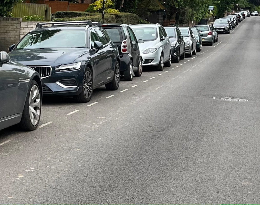
When you take photographs, try different compositions, distances and points of focus so you have a breadth to choose from.
Careful presentation of your weebly throughout.
Excellent understanding of composition and control of the camera. Your perseverance with ideas means that many outcomes are refined and sophisticated.
Your responses to photographers' studies are appropriate. Your Weston, Kertesz and Saroff homework is particularly impressive.
EBI
The independent development is the only place where you perhaps needed to persevere again. It would have been better to choose objects that had a similar form, perhaps simpler natural objects. How could you have photographed the objects to avoid the shadow on the background?
TARGETS
Compare photographers across a project or within a piece of analysis. You could also create direct comparisons called: ‘Photographer and me” where you present a photo by you and a photo by your chosen photographer next to each other and discuss how you have been influenced.
Screen grab editing techniques.
When you take photographs, try different compositions, distances and points of focus so you have a breadth to choose from.
LOOK UP HOMEWORK
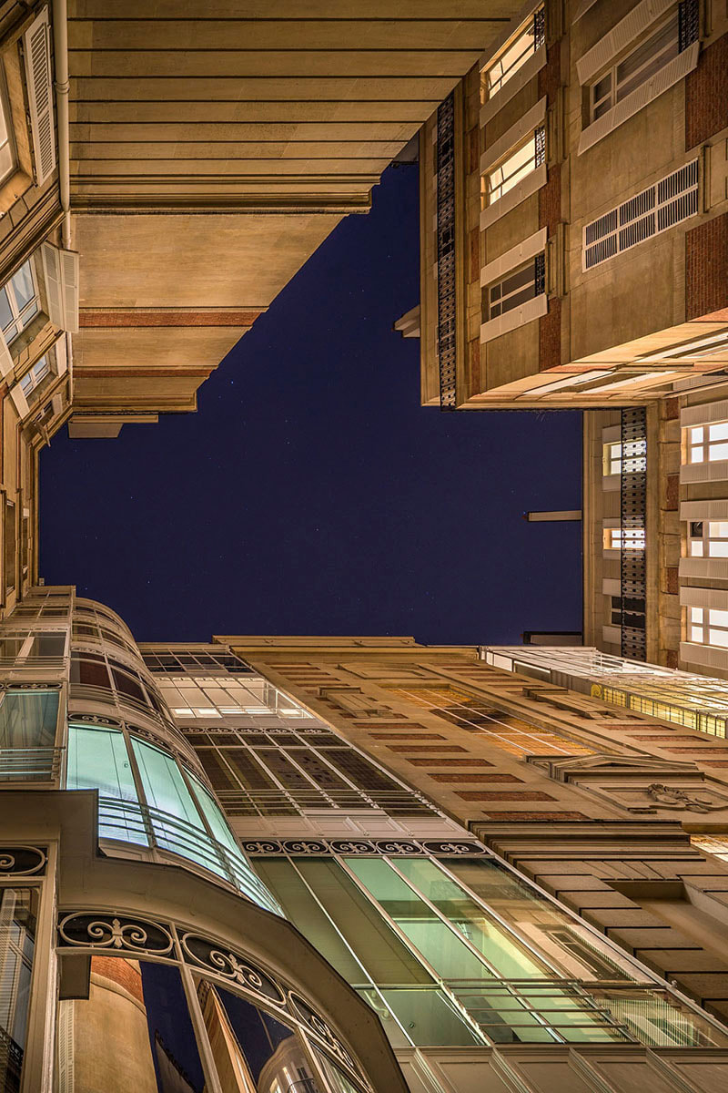
In this task i had to look up and photograph perspective of buildings. i had to take 20-30 photos using a phone or camera, however i don't have a camera so i used my phone and i took these photos from a low vantage point.
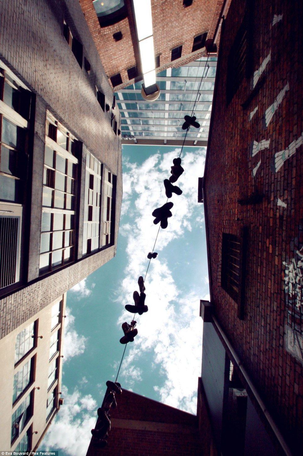
Here are some examples of look up photos taken by other photographers.

|
|
|
THESE ARE MY LOOK UP PHOTOS FOR THIS TASK:


BEST EDIT
BEFORE EDITING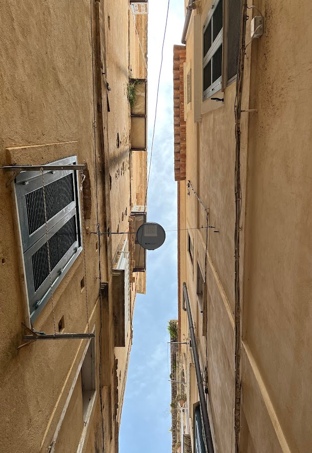
|
AFTER EDITING
|
WWW: I followed the task very well as almost all of my photos are looking directly up, rather than at 45% looking half way up. I also think I photographed loads of unique and well saturated photos with my phone in the environment I was in. I edited the photos well by making the sky less bright and making the picture as a whole more lively and chroma.
EBI: I could of tried to centre my images a bit better and made sure all of the sky in the images were focused on so they weren't too bright and to make the photos look more professional.
EBI: I could of tried to centre my images a bit better and made sure all of the sky in the images were focused on so they weren't too bright and to make the photos look more professional.
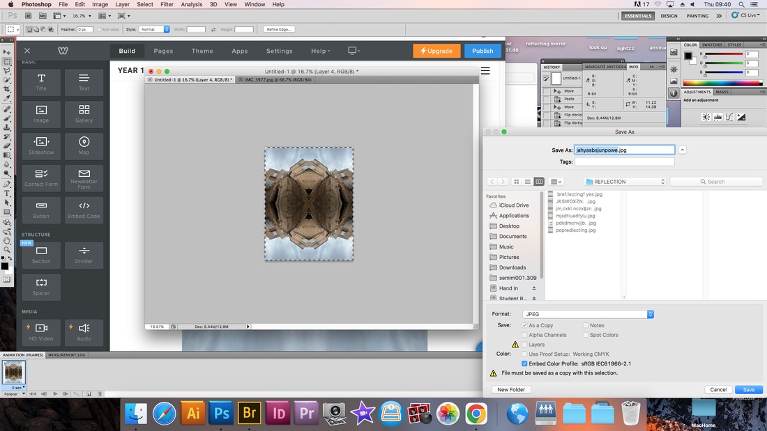
REFLECTION
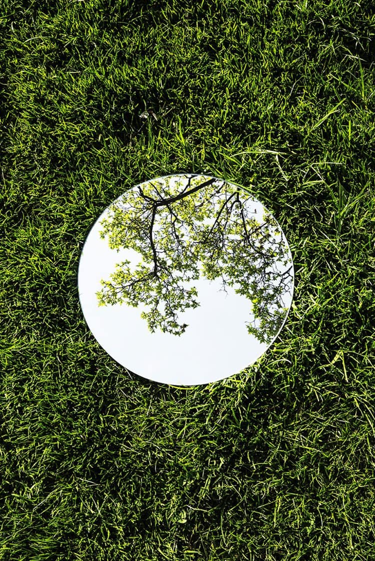
In this task i had to create a series of mirrored images from the 'Look Up' images i took during the holiday. i did this Using the work of Andy Yeung for inspiration
When photographing i had to remember to pay attention to the following things:
I had to make sure to use the edge of buildings to create a dramatic effect
I had to make sure the ISO was set to a minimum of 400
I also had to get low and experiment with different angles and crops
When photographing i had to remember to pay attention to the following things:
I had to make sure to use the edge of buildings to create a dramatic effect
I had to make sure the ISO was set to a minimum of 400
I also had to get low and experiment with different angles and crops
Some Examples
Before
|
After
|
Before
|
After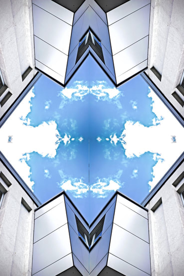
|
MY SCREEN GRAB PROCESS
|
|

MY REFLECTION IMAGES
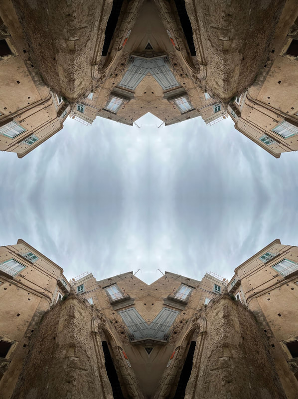
|
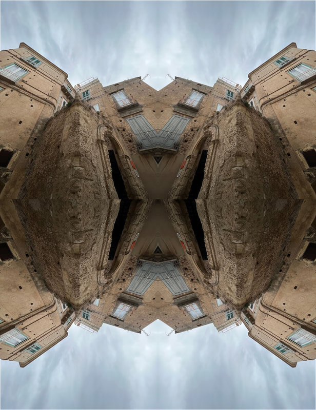
|
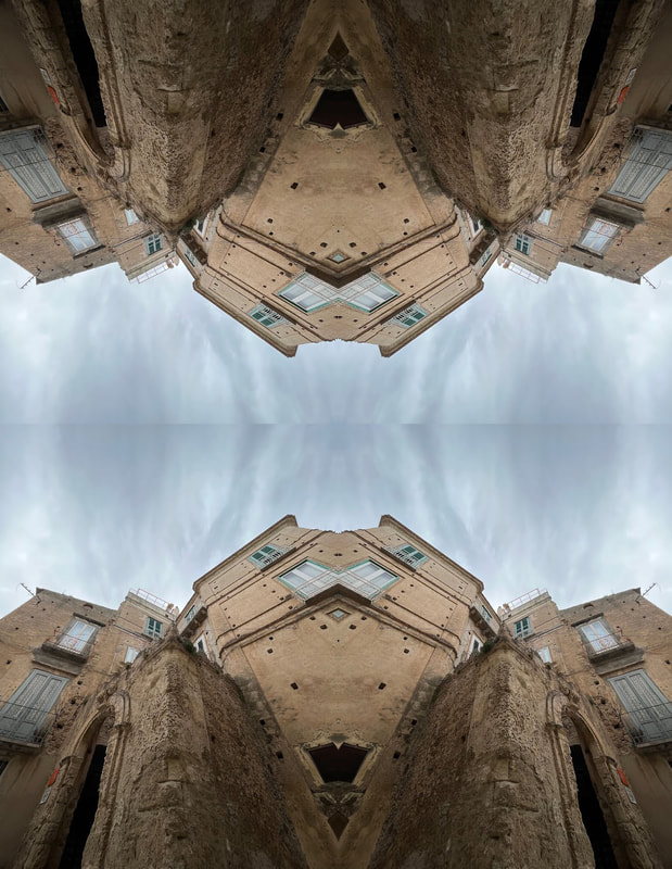
|
|
WWW: I reflected the images 4 times differently and included a screen grab process before hand so the viewer can understand how I made these reflection images. I used a ISO of 400 and a shutter speed of 1/60.
EBI: In photoshop, when I lined my images next to each other, I could of made sure the images didn't overlap or underlap since on 1 or 2 of these images theres a line where you can see they are separate images. it's rather me not spending enough time on connecting the images or rotating them the wrong way.
EBI: In photoshop, when I lined my images next to each other, I could of made sure the images didn't overlap or underlap since on 1 or 2 of these images theres a line where you can see they are separate images. it's rather me not spending enough time on connecting the images or rotating them the wrong way.
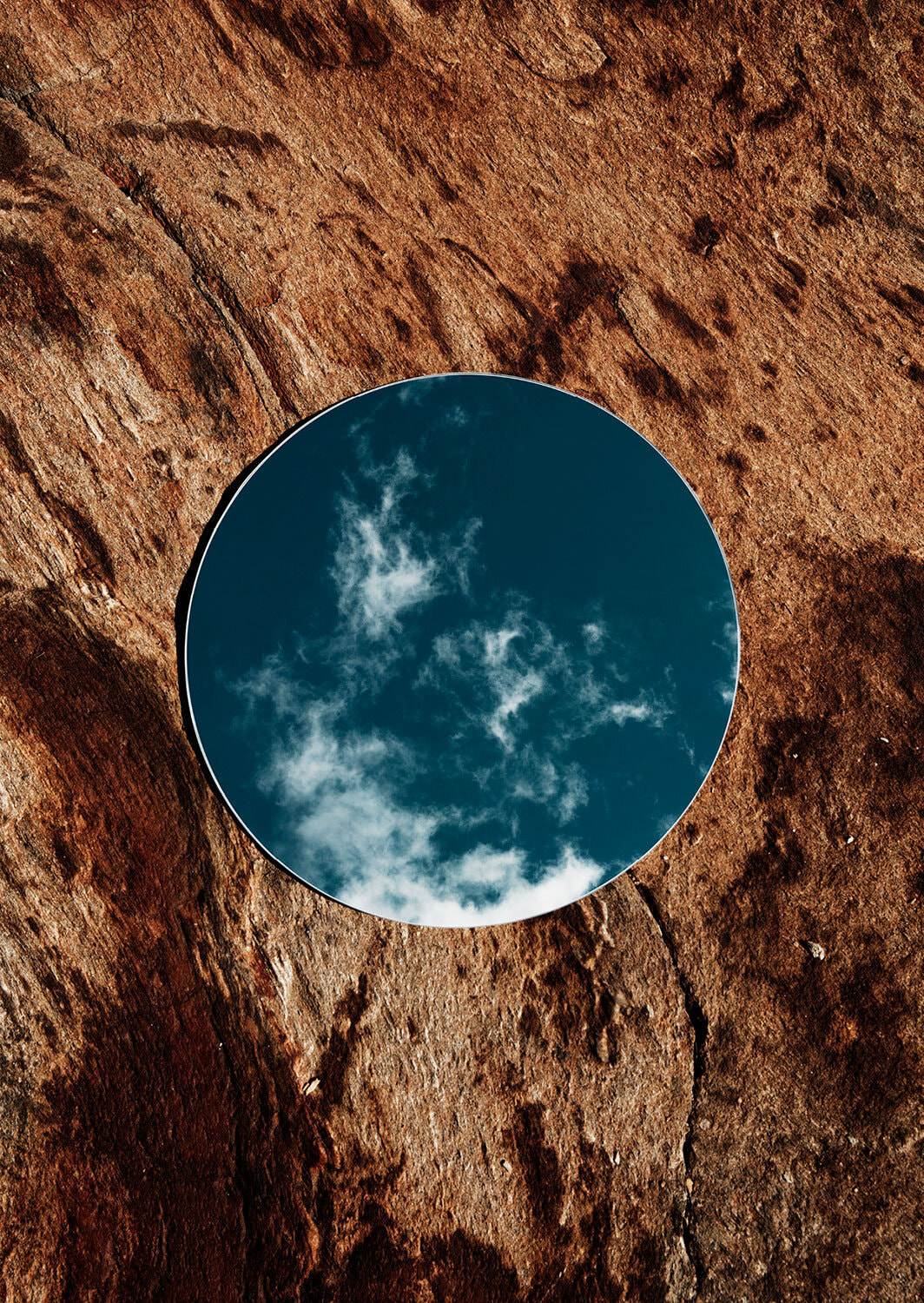
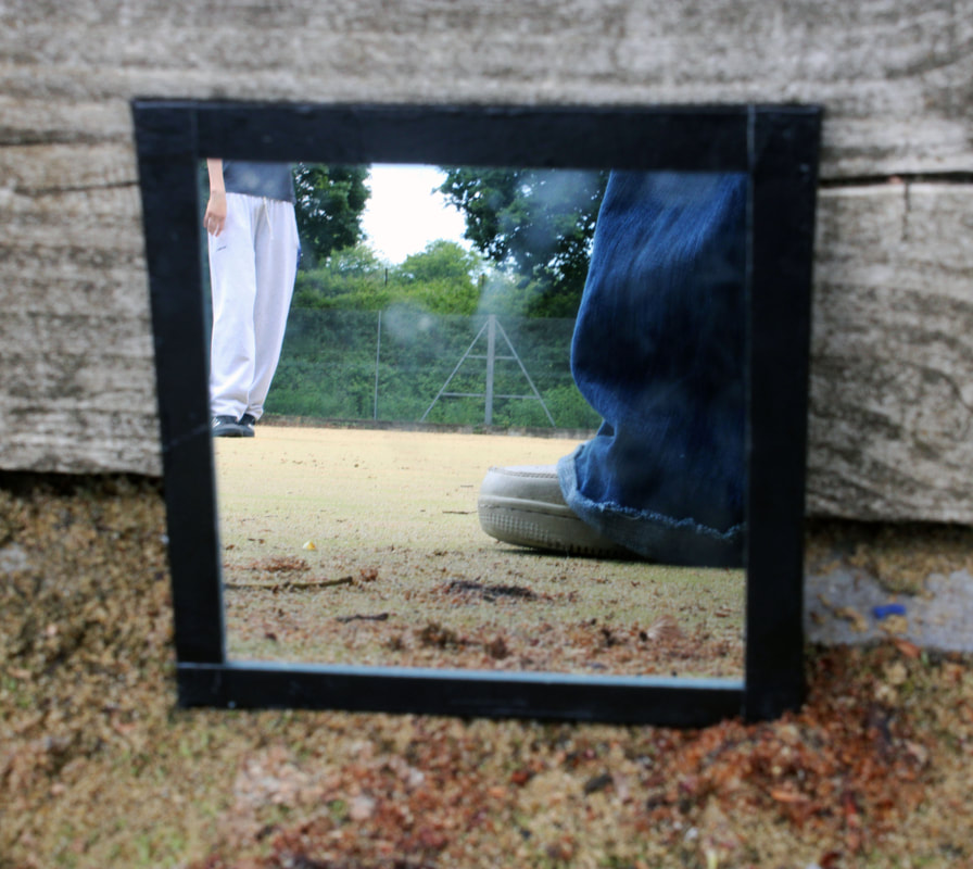
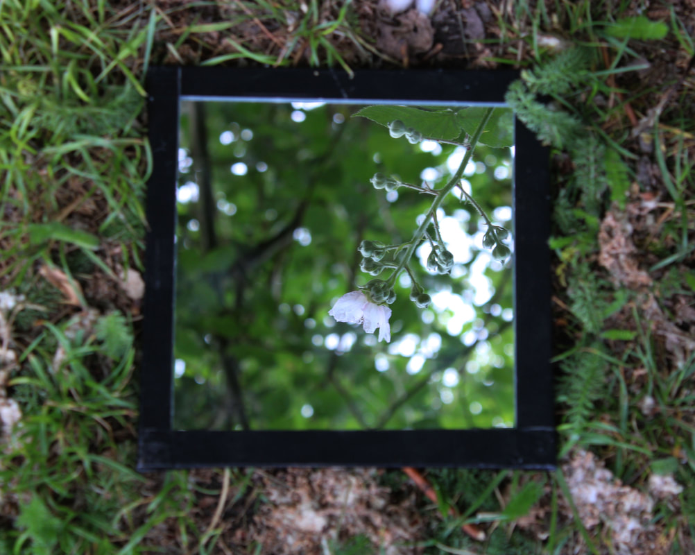
Mirroring and Reflecting
EXTENSION TASK
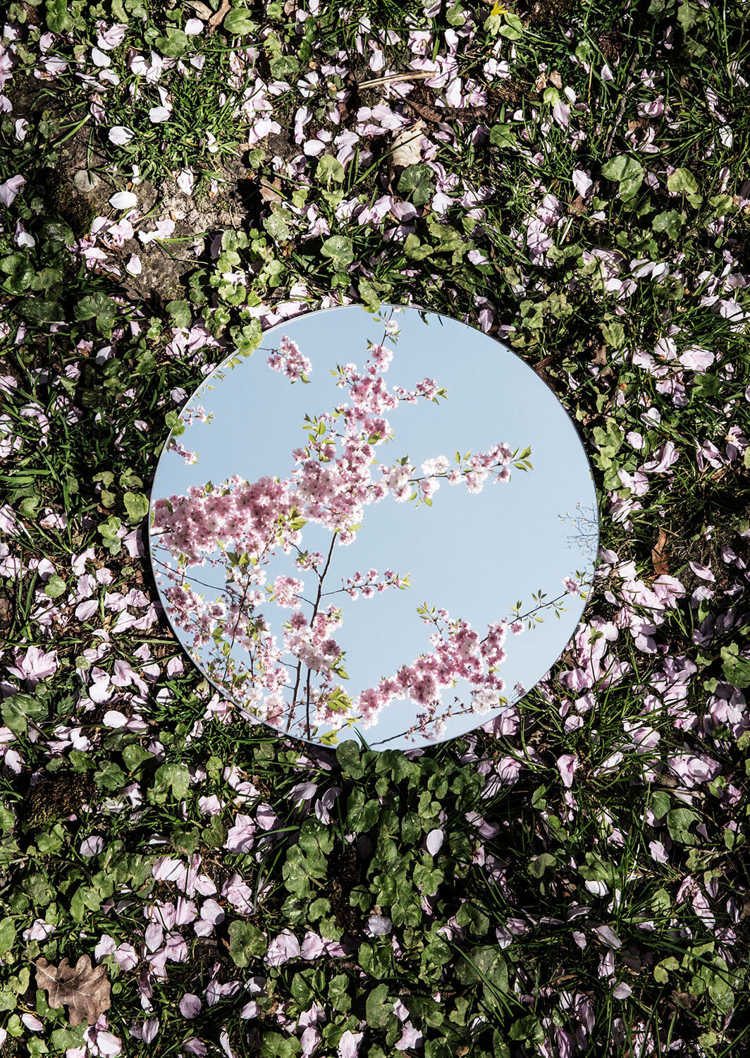
This first set it a set I did in class but I didn't like most of the photos because some aren't in focus and the photos aren't well taken so I went one and took another set of photos. the second set is better and more creative, however I had to use my phone since I don't have a camera, so I could get both the mirror and the background in frame. I put the mirror in frame in the majority of the photos because my phone doesn't have settingss like a camera does so I couldn't have both in focus.
SET 1


SET 2


BEST EDITS

|

|
WWW: I tilted the mirror on an angle to catch different images within the mirroring frame, I improved in comparison to the first set of mirroring photos I took. Even If I didn't have the daisies and the huge field I was still able to capture fascinating things.
EBI: because I was using my phone I could only have either the mirror or background in frame, and I chose to ave the error in frame because thats the main point of this project. to capture the beauty of nature and to make the image in the mirror stand out and captivate the audience. however its very unfocused around the mirror and I could of tried to get had of a professional camera so I could adjust the settings, like aperture and ISO.
EBI: because I was using my phone I could only have either the mirror or background in frame, and I chose to ave the error in frame because thats the main point of this project. to capture the beauty of nature and to make the image in the mirror stand out and captivate the audience. however its very unfocused around the mirror and I could of tried to get had of a professional camera so I could adjust the settings, like aperture and ISO.
Composition
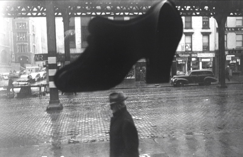
This image is by Louis Faurer who was an American candid and street photographer. He was a quiet artist who never achieved the broad public recognition that his best-known contemporaries did; In this image the silhouetted pedestrian is dwarfed by an enormous shoe. This is a powerful visual idea which is enhanced by the composition. Firstly the figure and shoe are placed centrally which makes it the central point of the picture, it catches the audiences eye because its in the centre and its the darkest bit of the image so catches the audiences attention the most. The lines in the diagram show how the composition forces us to consider the man’s precarious position. You can also notice how isolated the figure appears, as if oppressed by the indifferent city. Even apparently snapshot views like this street photograph can be carefully composed and reflect the skill of the photographer.
what is composition?
Photo composition is how a photographer arranges visual elements within their frame. A successful photographer, named Adam Long quoted“It's a pleasing organisation of objects within your rectangle,”. Photographers, like other artists, compose their images to create to create certain effects and to effect the viewer.
Photo composition is how a photographer arranges visual elements within their frame. A successful photographer, named Adam Long quoted“It's a pleasing organisation of objects within your rectangle,”. Photographers, like other artists, compose their images to create to create certain effects and to effect the viewer.
Response 1
Best edit
WWW: My images are set on a good ISO (ISO 400 as it was a bright nice day but not very sunny ) and shutter speed (1/400. the iSO refers to your camera's sensitivity to light. The higher the ISO, the more sensitive your camera sensor becomes, and the brighter your photos appear. ISO is measured in numbers.
EBI: For the best edit i could of tried to position the object in the image more on the Rule of thirds. I found this quite difficult as the obejct in the image is quite big in comparison to the frame. I should of tried to have a better understanding of the Rule of thirds as not all of these pictures follow this rule or show much composition.
EBI: For the best edit i could of tried to position the object in the image more on the Rule of thirds. I found this quite difficult as the obejct in the image is quite big in comparison to the frame. I should of tried to have a better understanding of the Rule of thirds as not all of these pictures follow this rule or show much composition.
Response 2
Rule of thirds REVISITED
|
|
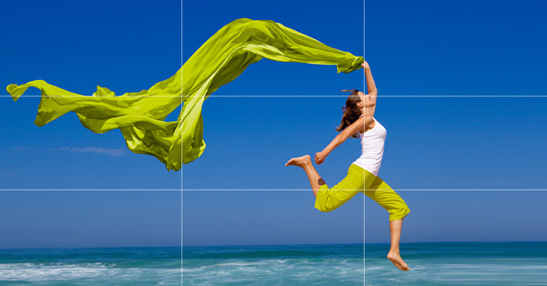
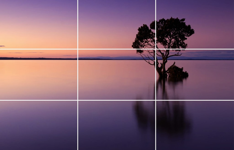
For rule of thirds imagine that your image is divided into 9 equal segments by 2 vertical and 2 horizontal lines. The rule of thirds says that you should position the most important elements in your scene along these lines, or at the points where they intersect.
|

|
|
Best Edit
Before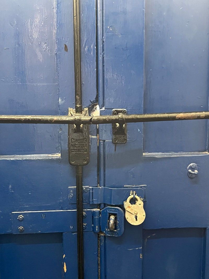
|
After
|
WWW: I edited the best image well and followed the rule of thirds very well by taking the photo looking at the guideline that places the subject in the left or right third of an image, leaving the other two thirds more open.
EBI: I could of took much more photos for the rule of thirds and tried to be more creative with my ideas.
EBI: I could of took much more photos for the rule of thirds and tried to be more creative with my ideas.
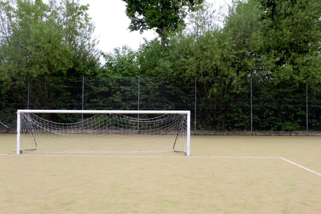
Balancing elements
Balance is a compositional technique in photography that involves arranging the main subject and other elements within the frame of a photograph so that everything in the image has equal visual weight. Visual weight refers to the object(s) within the image that draws the viewer's eye.
You balance your image by having something in an area of your image that takes up a similar amount of space without being symmetrical.
You balance your image by having something in an area of your image that takes up a similar amount of space without being symmetrical.
Shannon Kokoska

|

|
In this image the visual "weight" of the road sign is balanced by the building on the other side of the shot.
|
|
Best edit

|
WWW: These images are well composed as they have the main subject and other elements within the frame of the photograph EBI: However not everything in the image has equal visual weight. I should fo tried to angle the camera and get more similar shaped objects so that I could make them look balanced in the image. This would of made the image look more pleasing and make the objects look more equal within the frame. |
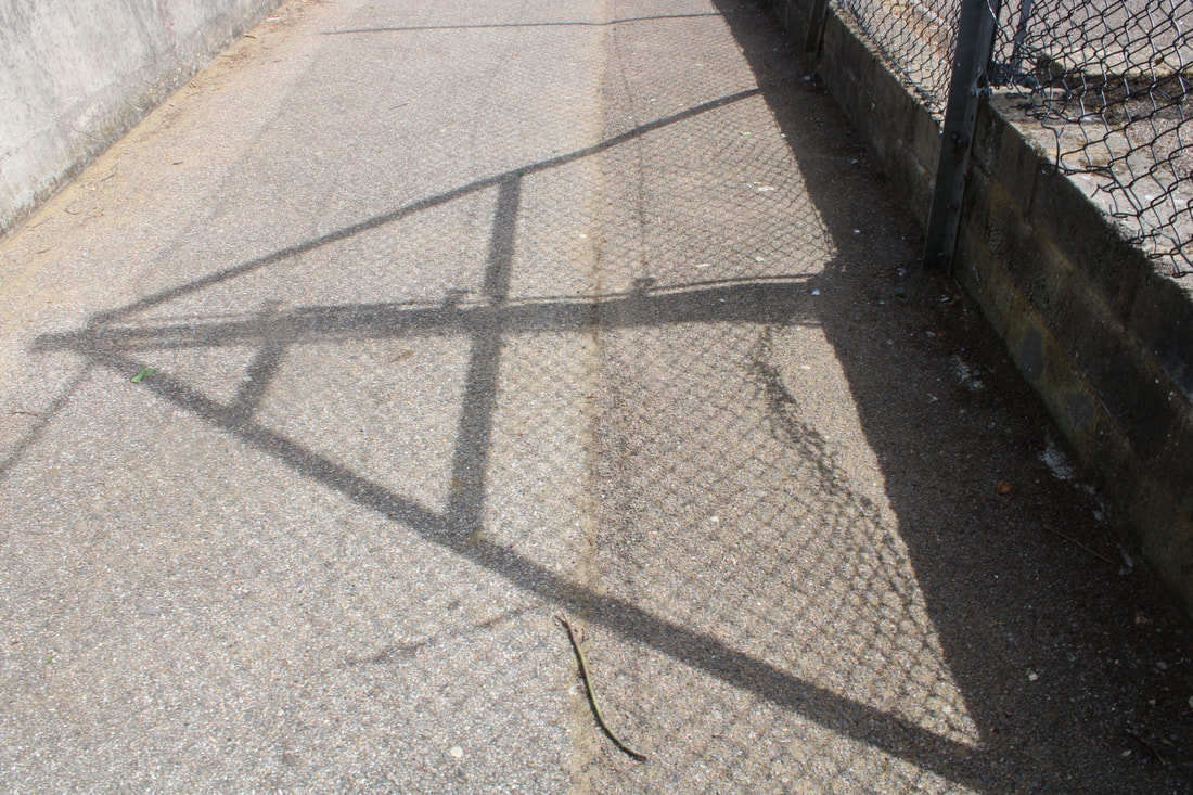
Layers
|
One of the more intriguing methods utilized in composition is called “layering”. This technique involves using foreground, subject and background so that all layers of the images work together to help tell a comprehensive story. If your subject is between layers, you instantly give the feeling of the photo being three dimensional. It also allows the viewer to feel like they’re part of the moment created with the image. |
|
Layering objects in your composition allows you to somewhat overcome one of photography's greatest limitations or its two-dimensional nature, it also gives the illusion of depth.

|
|
|
|
Best edit
BEFORE
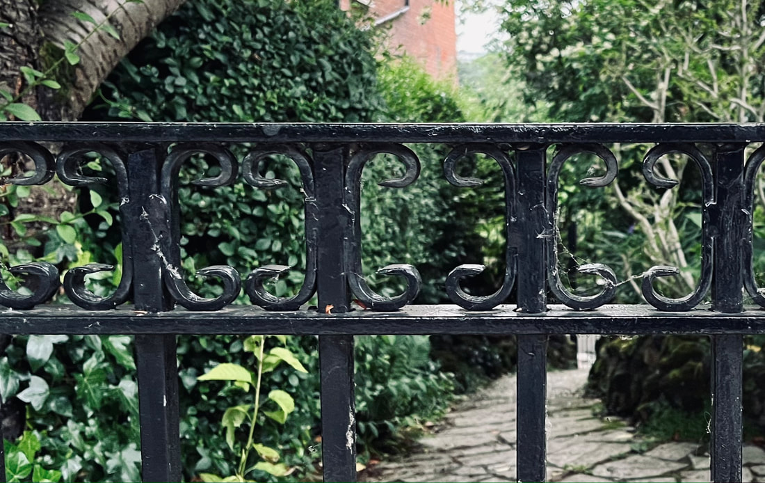
WWW: The edited image is very well focused on the fence which is the layering element of the image, the image is quite creative and its very straight (not crooked or taken from a weird angle)
EBI: I could of cropped out the tress and background so I could just have the fence in frame. this way it would catch the viewers attention a bit more and look neater. |
AFTER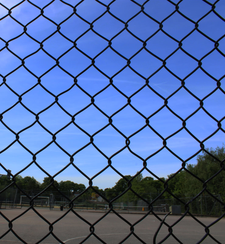
|
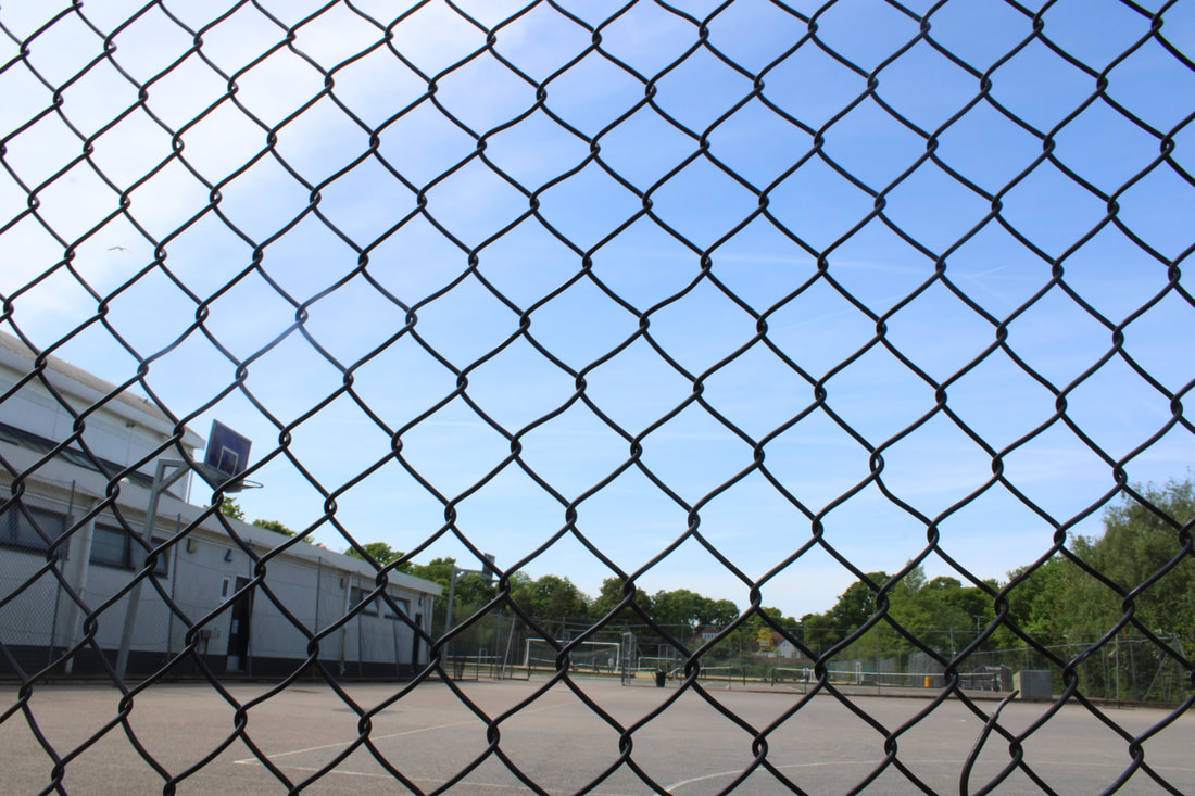
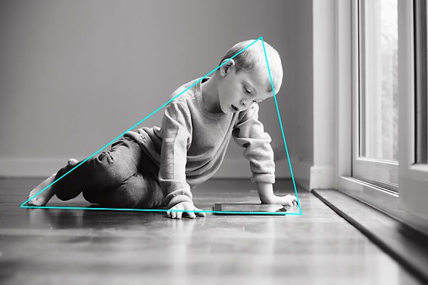
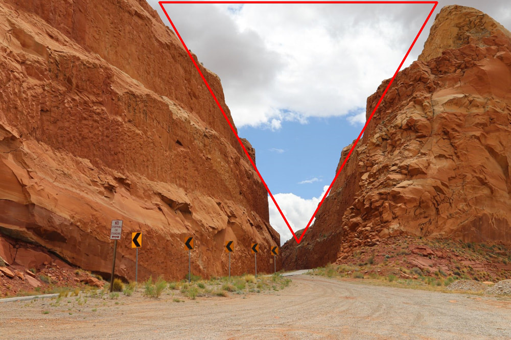
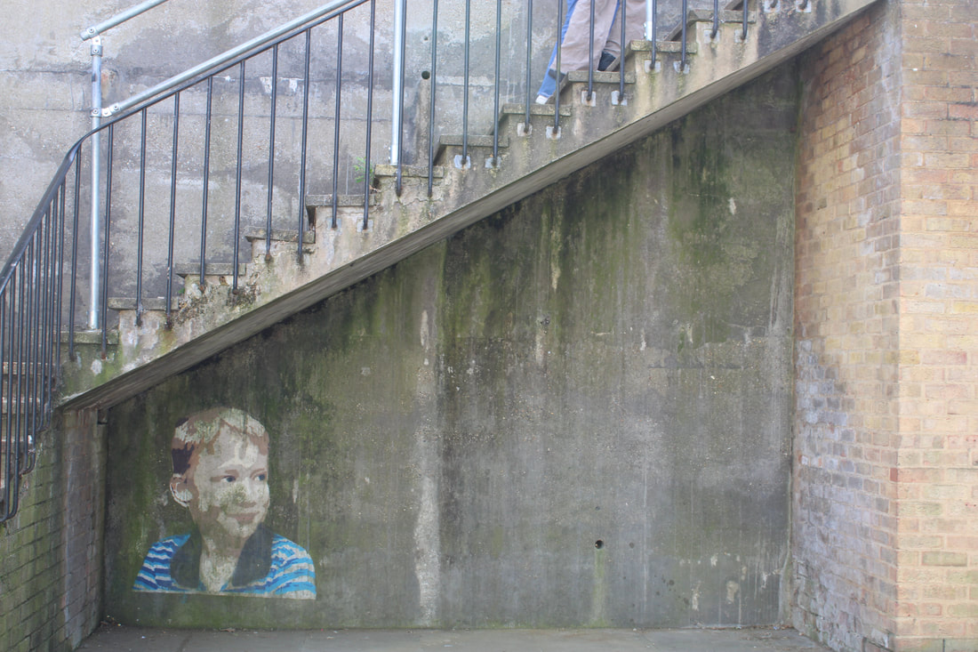
Triangles
Triangles are a good way of grouping elements of an image and organising them so they suggest stability.Three key elements of the composition creates a triangle and establishes a relationship between the objects.
|
|
|
These photos are very appealing to the eye and i love this type of composition because you can be very creative with this style.
|
|

|
|
BEST EDIT
|
WWW: I liked how I looked at the shadows around me as thy created nice triangles and made the images different to ones that other photographers took. I also think I cropped the best edited image well so that the triangle is the main subject in the frame and theres a equal amount of space on each side (making the triangle centred). i also made the colours look darker and more vivid but not too much that the image looks fake/ overly edited.
EBI: I could of tried to take more, for example I could of gone in the netball court or tennis court and looked to see if there were any triangles there. I also could of edited the shadowed images so that the shadows are darker and more contrasted with the concrete in the image. |

RESPONSE 3 HOMEWORK: 4 COMPOSITIONS
Rule Of Thirds


RULE OF THIRDS:
WWW: I had a very good understanding of the rule of thirds in all of these images compared to the two last times we did this same type of composition. (rule of thirds). Additionally my images are well focused and well exposed. EBI: I could of experimented a bit more by putting the objects on the different lines of the grid. For example in almost all of my images I had the object on the left and right, so I could of placed the key part of the image along the other vertical lines to have some images with the object In different places to make the viewer see the object on the other aesthetically pleasing side. Also I could of had some images with the objects in the centre like the photo from the photographer named, Louis Faurer. 
In his photograph, the figure and shoe are placed centrally, The lines in the diagram show how the composition forces us to consider the man’s precarious position and the figure appears isolated as if oppressed by the indifferent city. Even apparently snapshot views like this street photograph can be carefully composed and reflect the skill of the photographer. Also he had more than one thing in the image to make the photograph appeal more to the viewer and so it catches the viewers eye.
|
Balancing Elements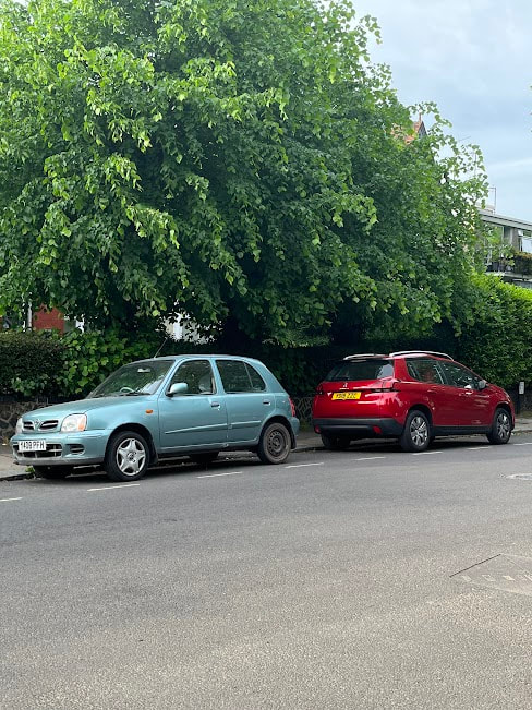


BALANCING ELEMENTS:
WWW: I especially like the water bottle and nail polish one as I followed the composition of balding elements completely. the nail polish is around 12x smaller than the water bottle, however I positioned them well and took my image from a low point near the nail polish so I could try to make them look roughly the same size. I also really like the photograph with the trees and the car because made the two cars which were actually quite a different size look the same size with my phone. I also really like the big tree in the background as it adds more to the image and makes the viewer more captivated by the image. Lastly I think I improved a lot on these balancing elements photos from last time and made two objects which we know or can tell are different sizes look silt In size and also had a good exposure and saturation. EBI: I could of tried to focus my images a bit better but I had to zoom in to make the two elements look the same size which resulted in me forgetting to focus on the main objects in the frame. Also in the photo with the shed and brick square, its not very pleasing to the eye as its not very clear which two elements are the main focus in the image that I was trying to balance . Here are two examples of really good 'balancing elements' photography:
|
Triangles
|
Layers
|


TRIANGLES
WWW: I found this triangle composition quite fun because when I was walking around outside I tried to spot different triangles and figure out what angle to photograph them from and I had to consider if I wanted anything else in frame or just the triangle. All these photos are creative and they have good brightness and contrast. EBI: I could of tried to take some triangle photographs of people or pets or with nature, instead of just man made things. |


LAYERS
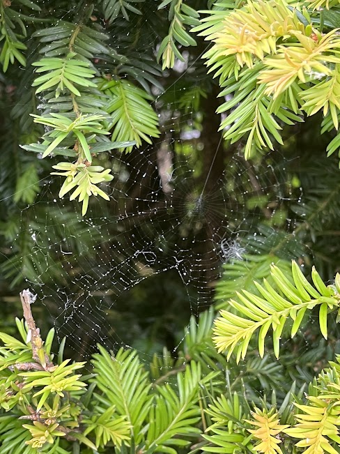
WWW:i took loads of layered photos of different things, not just stairs and walls. I like the spider web photo because its fascinating and all of the spider webs and the leaves in the background are layers. I'm happy that I spotted it and was able to focus on the spider web even just on my phone. EBI: When I edit the spider web photo I need to try bring out more of a contrast between the leaves in the background and the spider web because it isn't so visible. I wish I could of used a camera because then I would be able to focus on the spider web way better and I could of controlled my settings for that precipice time of the day. Lastly I need to dial down the yellow colour in the photo because it takes the viewers eye aways from the spider web, I will also need to make the yellow green. |
Framing
Sebastian Magnani
Sebastian Magnani is Switzerland based photographer known for his intimate portraits masterfully utilising light and colour to create emotional scenes. Sebastian Magnani developed an interest in photography while completing an apprenticeship in media design. In 2011, after 5 years of creative work at an advertising agency, he decided to turn his passion into his profession.
|
|
|
RESPONSE 1
In this task using the mirrors to do framing, i had to
Make sure that everything was in focus and well exposed, Contrast the floor with what is being reflected, Include the area around the mirror AS WELL AS the reflection and lastly i had to experiment with composition. I also had to use depth of field in the images. Depth of field is the distance between the closest and farthest objects in a photo that appears sharp.Don't forget to mention Depth of Field, how difficult was it to get everything in focus.
The camera settings for this task:ISO: 400-800
Program: Shutter Speed Priority (TV)
Shutter Speed: 1/60


RESPONSE 2


Best edits
|
Before

|
After
|
|
Before

|
After
|
WWW: I achieved a good depth of field by setting the aperture to an f/16, i also stationed the camera as far away as the subject as possible, and chose a lens with a shorter focal length.
EBI: My first photos weren't well exposed, my shutter speed was on too high and my ISO was also way too high.
EBI: My first photos weren't well exposed, my shutter speed was on too high and my ISO was also way too high.
Formal Elements
Look around the school and capture images which you think can illustrate the elements listed below. Upload them onto your weeblys and give each image the correct heading.
Formal elements are visual features, that when applied in composition, have the potential to transform simple subjects into extraordinary shots and also help you emphasise the most important aspects of the scene.
The Formal Elements are the language of picture making. They are often used together, and how they are organised in a piece of art determines what the finished piece will look like; There are traditionally seven but are sometimes extended for photography to more. These are 7 formal elements photographs taken by other photographers :
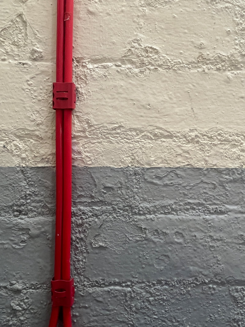
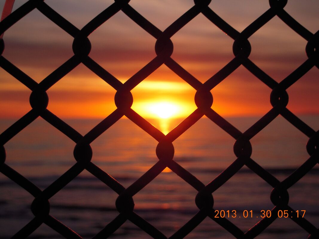
LINE A connection between the two elements of the photo that makes each one more impactful. Lines don't have the same weight as points. Instead, they connect points, or divide them, or guide a viewer's eye toward the one you want.
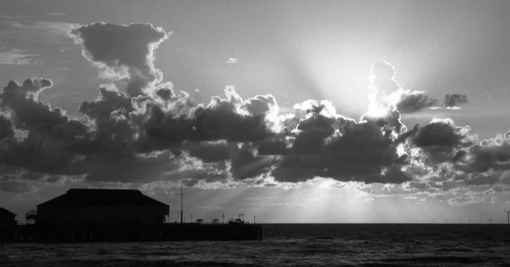
TONE Tone is simply the lightness or darkness of an object. Sometimes referred to as value, tone is one of the most powerful design e e l elements. The area of highest contrast between light and dark will always demand maximum attention.
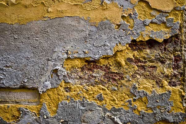
TEXTURE Texture brings life and vibrance to images that would otherwise appear flat and uninspiring. Capturing high levels of detail is extremely important when attempting to capture lifelike textures making exposure choices are critical.
|
FORM Form is an element of design in photography composition. Like all elements of design, it works to get the viewer's attention, then helps them understand the photo. When a shape in a photo takes on form, it becomes three dimensional.

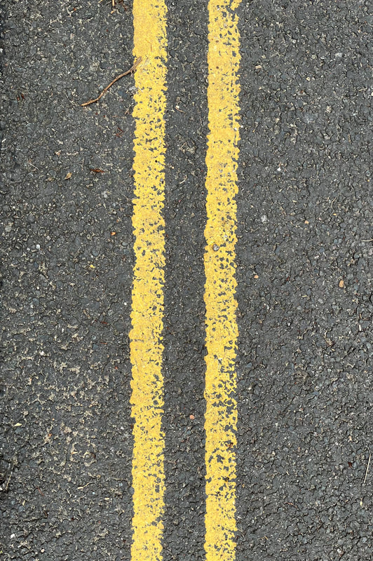
PATTERN Pattern in Photography is a regularity within a scene. It's elements of the scene that repeat themselves in a predictable way, Pattern can be found everywhere
COLOUR We use colour in photography to create visual contrast, direct attention, evoke mood, and more. Of all the Elements of Art, colour is perhaps the most complex, but also, often has the most immediate impact because colour can impact our viewers' emotional response to an image.

|
CONTRAST
Contrast is the degree of difference between the elements that form an image. Higher contrast will give your image a different feel than a lower contrast. The type of contrast can also influence your images.

MY PHOTOGRAPHS
LINE
|
|
|
TONE

|


|
PATTERN
|
|
TEXTURE
|
|
COLOUR
|
|
CONTRAST
|

|
|
FORM
|
|
|
BEST EDITS

|
|
i found examples for all of the seven formal elements, and took well exposed pictures for most of them. The two best edits, tone and colour are i think well edited and stand out as their formal elements.
i found the element 'form' quite difficult because i couldn't capture shadows which made an object look like it was coming out of the picture and like it was three dimensional.
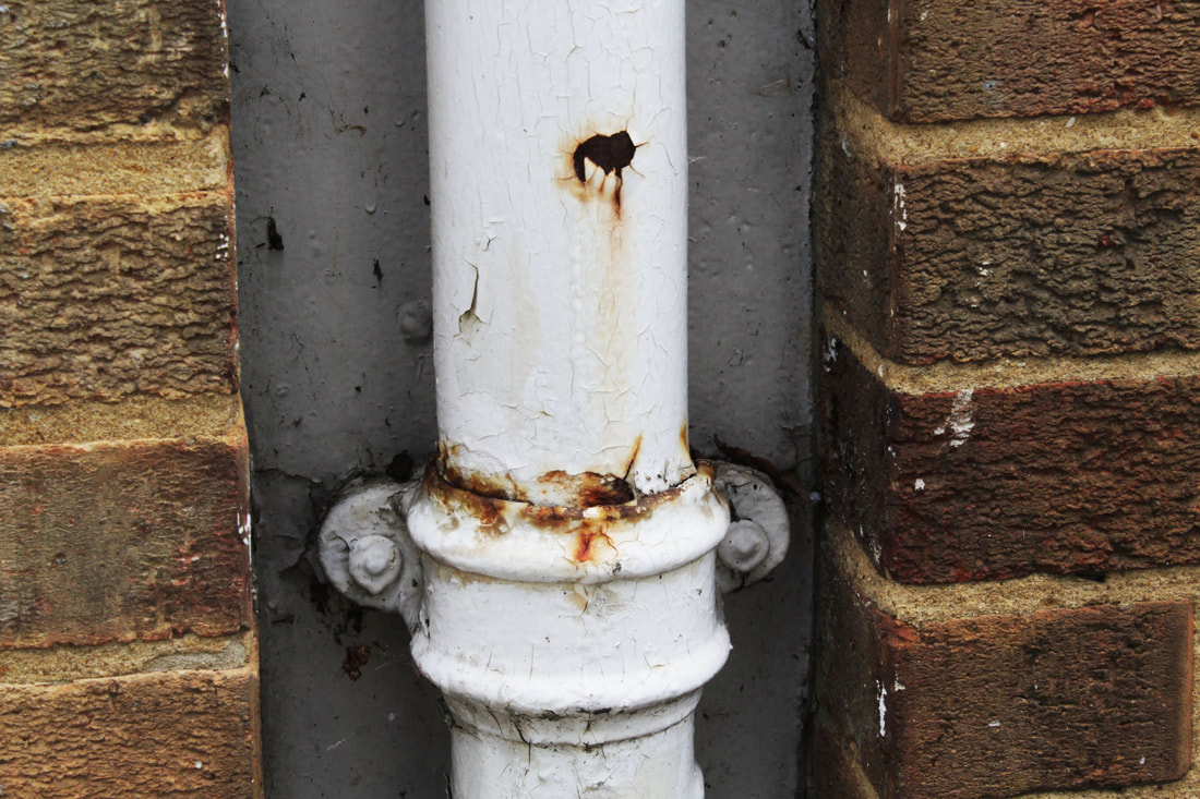
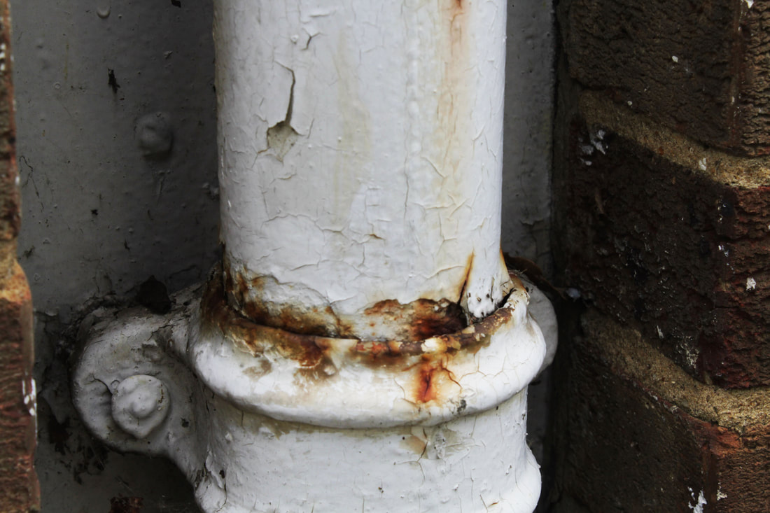
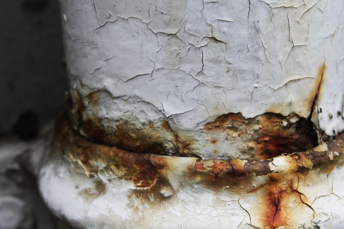
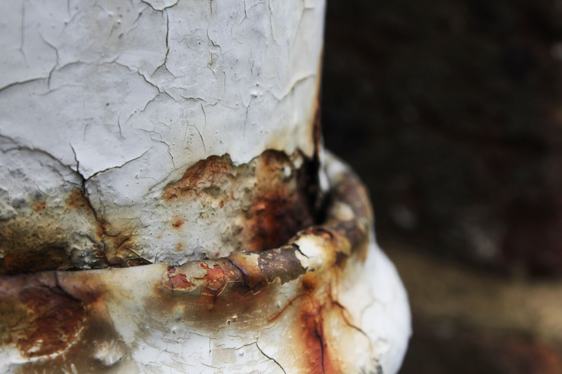
BEAUTY IN DECAY
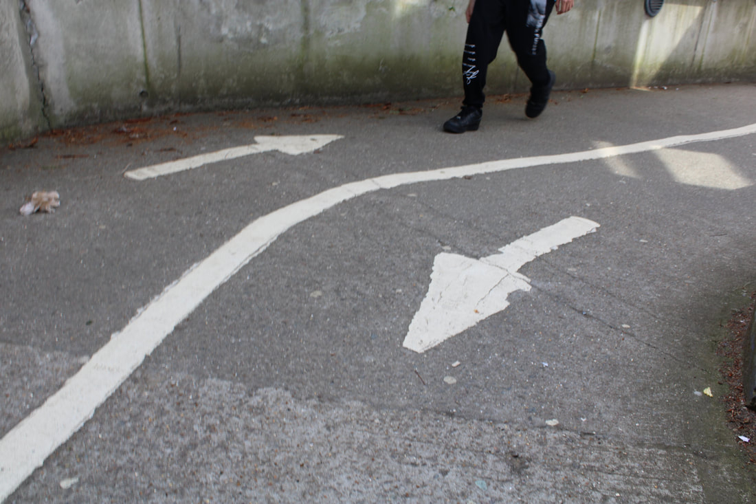
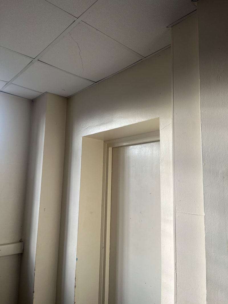
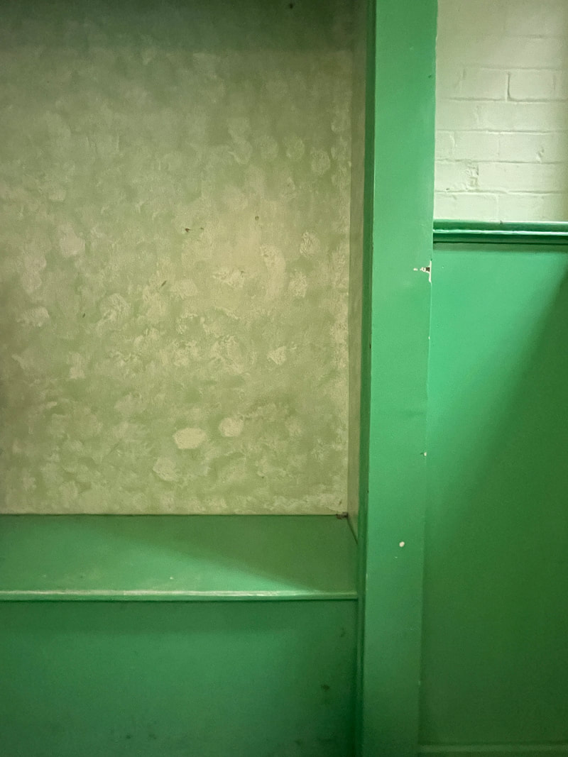
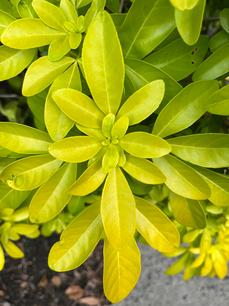
Romain Jacquet Lagreze's created a project called 'Wild Concrete' in Hong Kong, 2014. He focused solely on the phenomena of trees sprouting from residential buildings in Hong Kong. Wild Concrete compares the living conditions between plants and humans and it captures plants growing randomly and naturally. it shows us how wild and amazing/creative nature can be when humans don't interfere with it.


In this task i had to walk around the school and look for areas where nature has started to take over the man made environment. Flowers sprouting from cracks in the pavement ivy growing up walls green shoots sprouting under doorways.
Capturing the natural growth in the man made environment experiment shooting at different angles and viewpoints.
Capturing the natural growth in the man made environment experiment shooting at different angles and viewpoints.


BEST EDITS
|
|
|
|

|
|
WWW: I really like my best edits because its in focus and has good composure, also it captures the beauty and wildness in structure when we leave it alone.
EBI: In some of the photographs the exposure is too light or too dark because we had it on manual and didn't adjust the settings properly.
EBI: In some of the photographs the exposure is too light or too dark because we had it on manual and didn't adjust the settings properly.
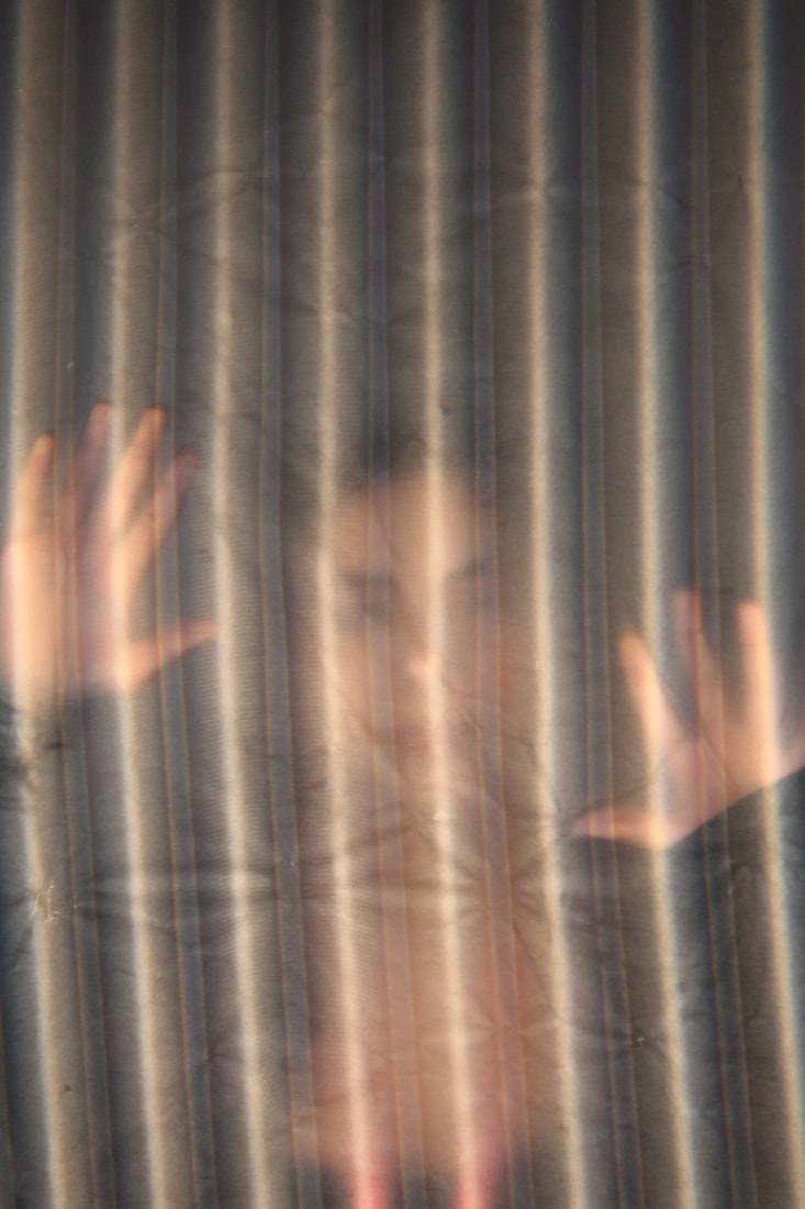
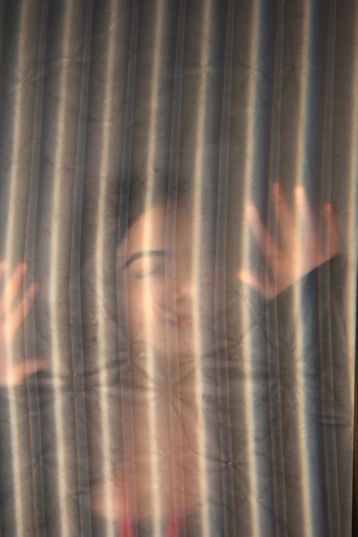
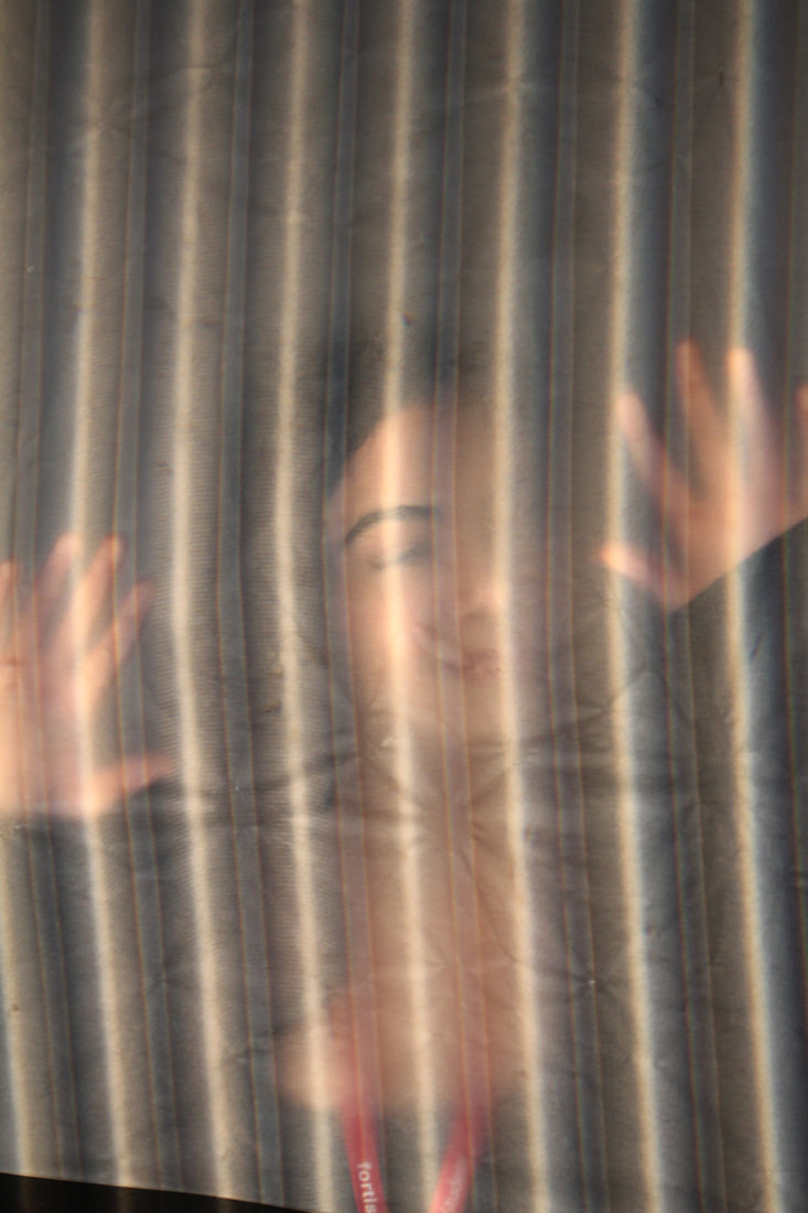
Independent Development 1
In this first independent development task I mirrored and flipped sections of my images and combined sections of my different image together.


|

|

|
|
INDEPENDENT DEVELOPMENT 2
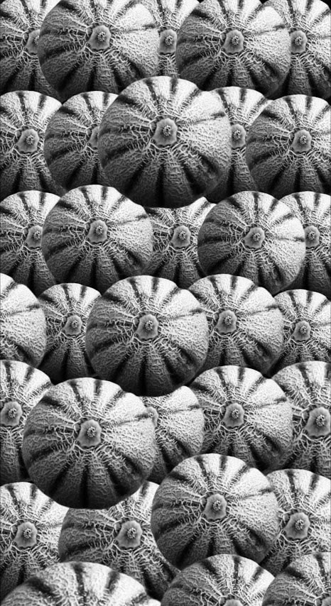
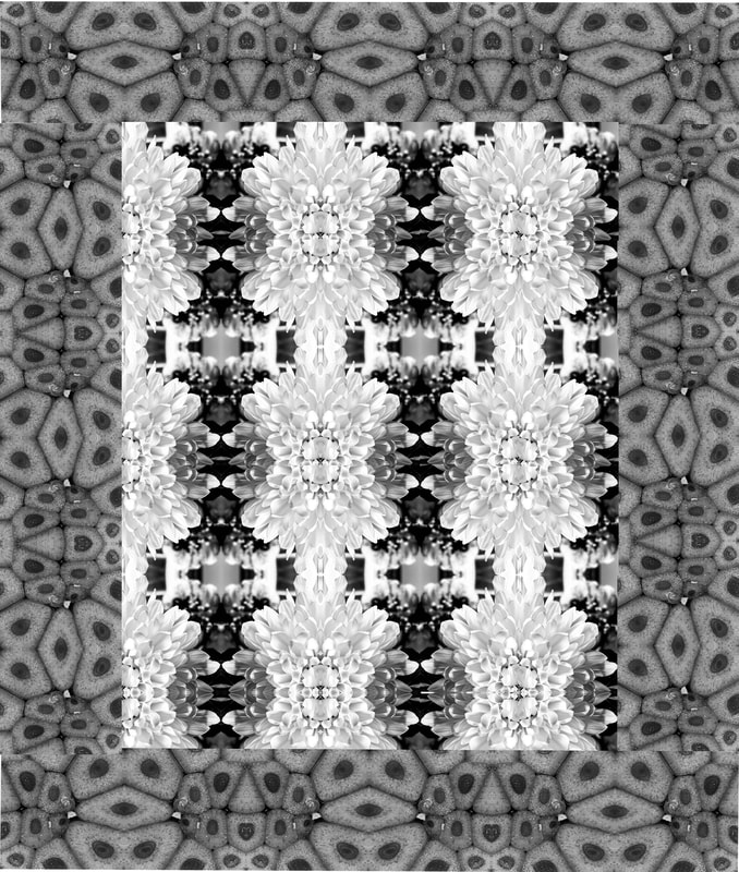
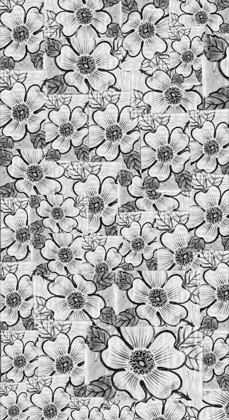
i took photos inspired by Horst P Horst. Horst P horst was a pioneer of the genre now known as classic fashion photography. He produced outstanding, elegant work that made him one of the most influential fashion photographers of the mid-20th century. Born Horst Paul Albert Bohrmann, in 1906 in Germany, Horst studied architecture early on. known for his work with Vogue—who called him “photography's alchemist”: Photograph smaller objects / texturs and mirror. Keep it b&w and high contrast like images of buildings.
this is his most famous image:
this is his most famous image:
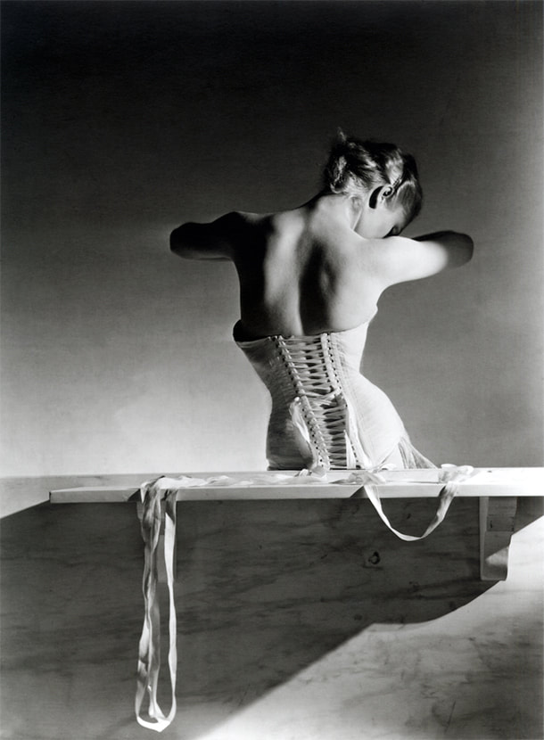
This is the image that I'm basing my work of off and it really inspired me. Im going to use various objects with cool shapes, textures and forms and try to make a intriguing eye captivating image that looks as if its one image and not loads of the same image being put together.
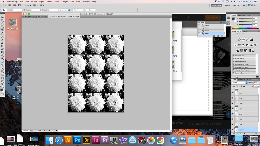
Im going to edit and crop all of these photos and make them in a pattern.
Im going to edit and crop all of these photos and make them in a pattern.
MY PHOTOGRAPHS


Screen grab process
|
|
|
|
BEST EDITS

|
|

|
|
www and ebi, what's next
WWW: I love the first two images and I think they went way better than the other two because I used a section of the original image so it would make a pattern rather than layers of the image on top and underneath each other. it looks like some sort of extraordinary carpet and has maximum amount of detail and different textures
EBI: I should of done way more best edits like the first two as it is more like Horst P Horst's images. His technique of only using a part of the original image makes more of a pattern and makes the object in the photo look distinctive and comely.
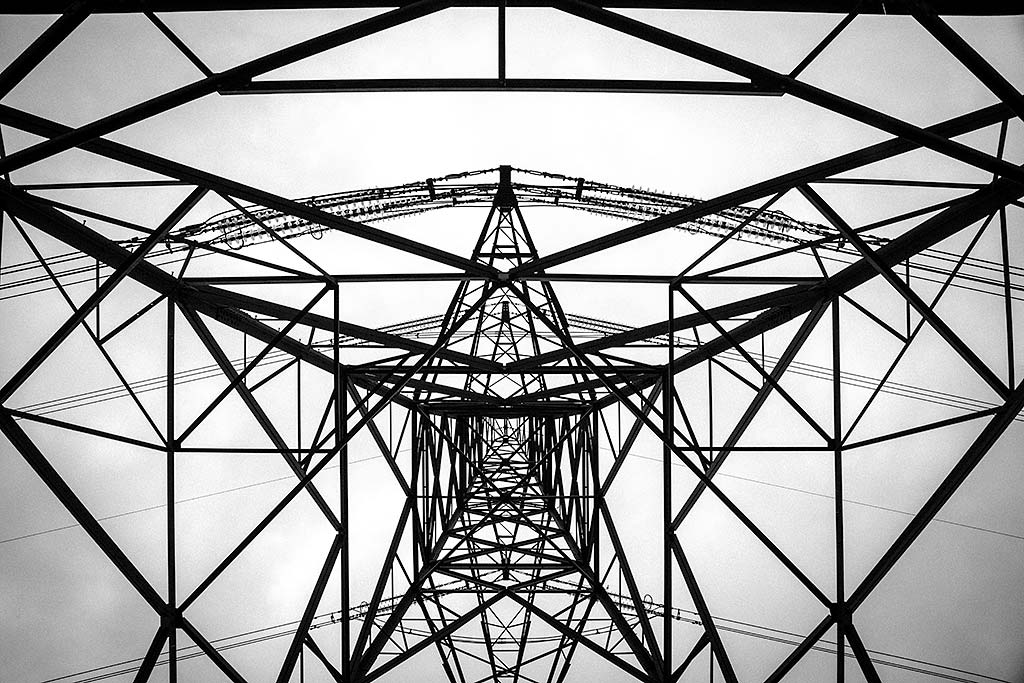
INDEPENDENT DEVELOPMENT 3
Mirroring
Brad Solan
|
|
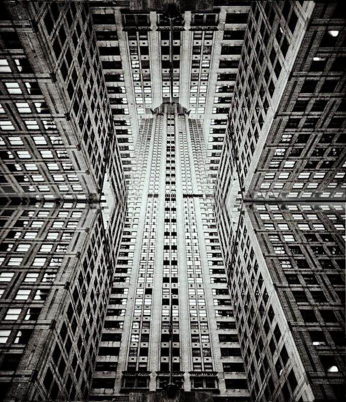
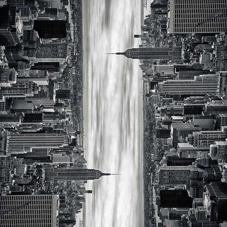
For my independent development i am focusing on Brad Sloan. Oregon-based photographer Brad Sloan fell in love with Manhattan’s urbanscape on a 3-day trip to New York City and managed to capture some spectacular shots of the Big Apple in that short amount of time.Sloan, who modestly refers to photography as his hobby, turns oft-photographed streets and landmarks into incredible images of architecture that seem like surreal, continuous skylines straight out of the film Inception.
The angular, reflective, and soaring architecture provides a sense of the city, but Sloan’s artistic renderings present something beyond the norm. The photographer’s cleverly manipulated, monochromatic images translate both the enormity of the structures as well as an inexplicably eye-catching geometric pattern. The skyscrapers are both mirror images of one another and seemingly unique entities separated by a thin stream of skylight. In some cases, there isn’t even a separation, but rather a continuous path of buildings populating the frame.
For my 3rd independent development project i'm going to be focusing on buildings and the structure of them, i will be mirroring all of the original photographs and experimenting with the different reflections the images can make. its very interesting and i can explore the different patterns and shapes the buildings provide, i will be keeping all of my images black and white so you can focus on all of the details and contrast of the light and dark colours on the buildings
My photographs


WWW: GOOD CONTRAST OF THE BALC AND WHITE, ALSO GOOGD FOCUSED IMAGES.
EBI: SHOULD HAVE TAKEN MORE LANDSCAPE IMAGES BECAUSE I THINK THE LANDSCAPE IMAGE TURNE3D OUT THE BEST AND THE MOST DETAILED AND UNIQUE LOOKING.
EBI: SHOULD HAVE TAKEN MORE LANDSCAPE IMAGES BECAUSE I THINK THE LANDSCAPE IMAGE TURNE3D OUT THE BEST AND THE MOST DETAILED AND UNIQUE LOOKING.
SCREEN GRAB PROCESS OF MIRRORING PHOTOS
|
|
|
BEST EDITS


PHOTOGRAPHY EXAM
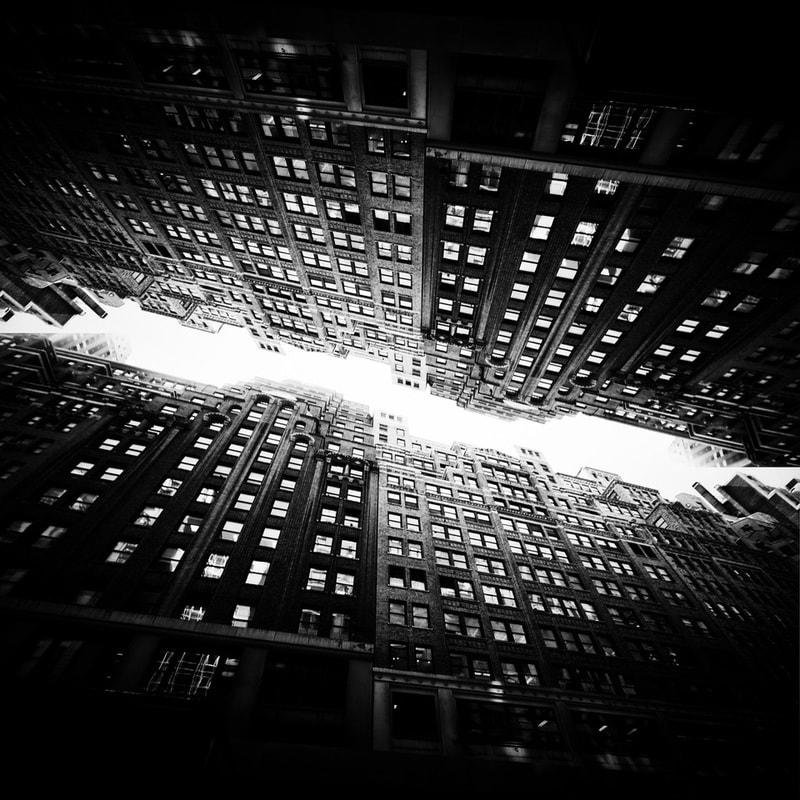
For my final independent development i am focusing on Brad Sloan. Oregon-based photographer Brad Sloan fell in love with Manhattan’s urbanscape on a 3-day trip to New York City and managed to capture some spectacular shots of the Big Apple in that short amount of time.Sloan, who modestly refers to photography as his hobby, turns oft-photographed streets and landmarks into incredible images of architecture that seem like surreal, continuous skylines straight out of the film Inception.
|
|
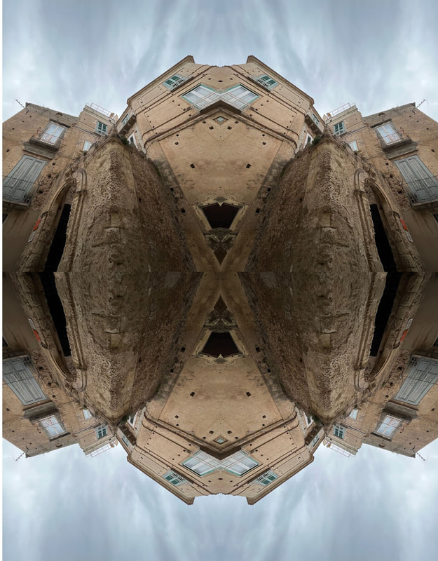
For my final independent development project i'm going to be focusing on buildings and the structure of them, i will be mirroring all of the original photographs and experimenting with the different reflections the images can make. its very interesting and i can explore the different patterns and shapes the buildings provide, i will be keeping all of my images black and white so you can focus on all of the details and contrast of the light and dark colours on the buildings. I'm going to improve this set of photos from the previous development by taking better angles of the buildings and I'm going to take photos of higher more unique looking buildings so when I flip them they catch the viewers eye a bit more and look more advanced.


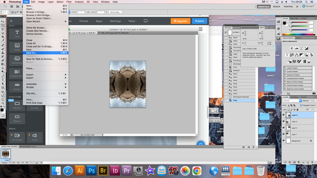
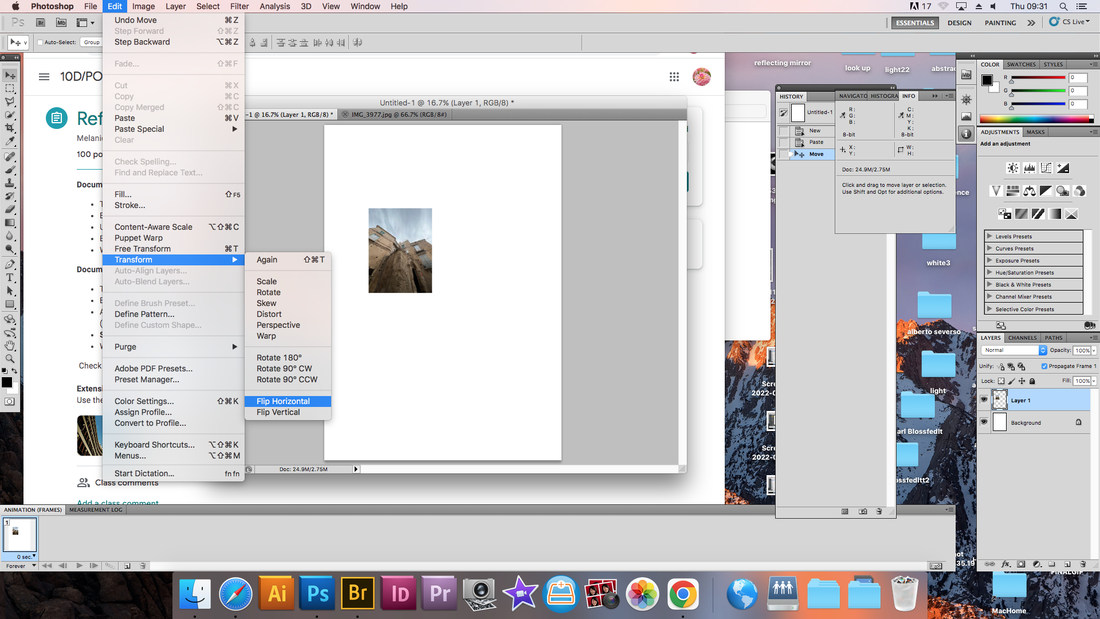
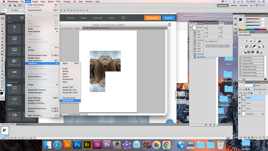
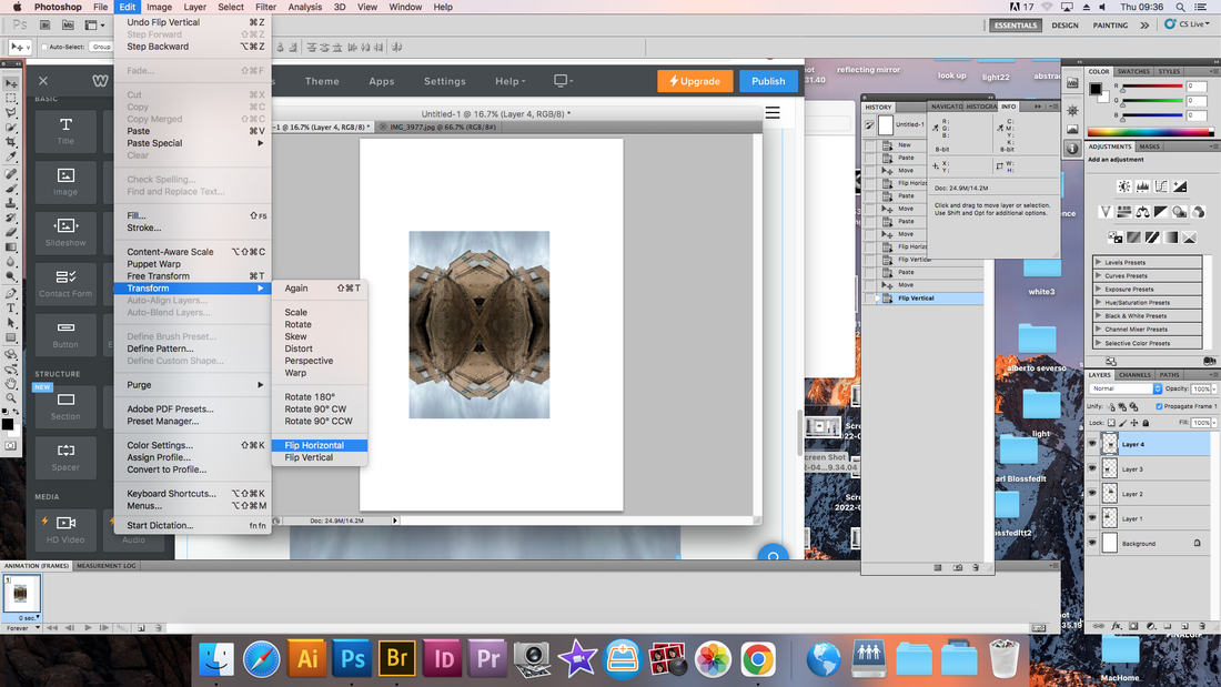
IM GOING TO MIRROR SOME OF THESE IMAGES, I USED PHOTOSHOP TO MAKE THEM ALL BLACK AND WHITE USING GRAYSCALE:


|


|
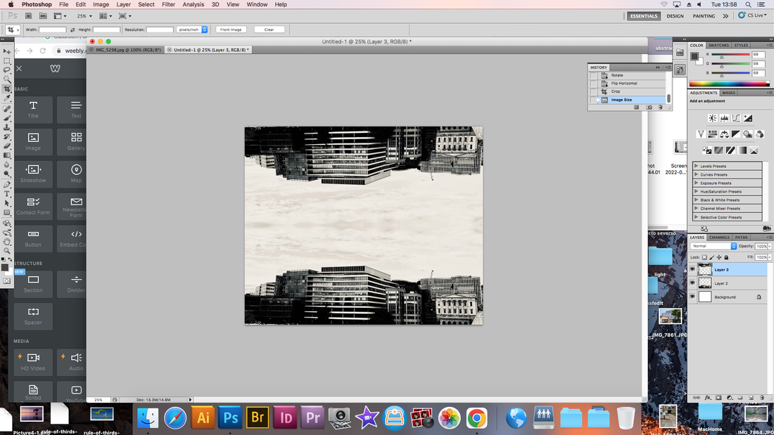
FINAL PIECES
BEST EDIT

|
|

|
|
WWW: i improved my final development from the third development by taking better angles of the buildings and taking photos of higher more unique looking buildings so they catch the viewers eye a bit more and look more advanced. The images are well centred and mirrored neatly. i also changed the middle point when i flipped them on photoshop so you see the different perspectives of the image and to play with the different patterns and shapes they can make.
EBI: i could have taken better quality images by using a camera or focusing the images a bit better so the quality was perfect. Also when I put the images into photoshop and mirrored them the resolution became quite low, where as the revolution should of been very high. Higher resolutions mean that there more pixels per inch (PPI), resulting in more pixel information and creating a high-quality, crisp image.
EBI: i could have taken better quality images by using a camera or focusing the images a bit better so the quality was perfect. Also when I put the images into photoshop and mirrored them the resolution became quite low, where as the revolution should of been very high. Higher resolutions mean that there more pixels per inch (PPI), resulting in more pixel information and creating a high-quality, crisp image.
